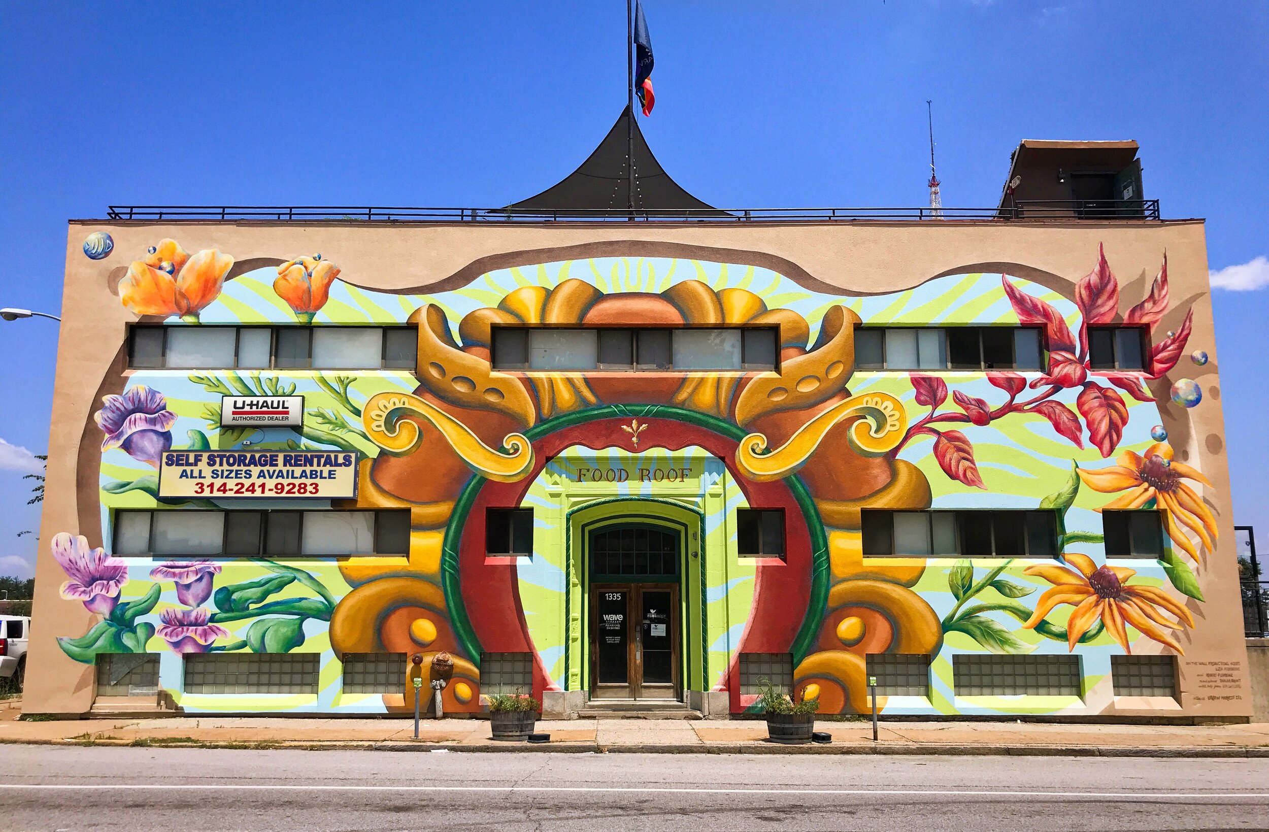
Acrylic on DryVit / Stucco, 73’ x 31’
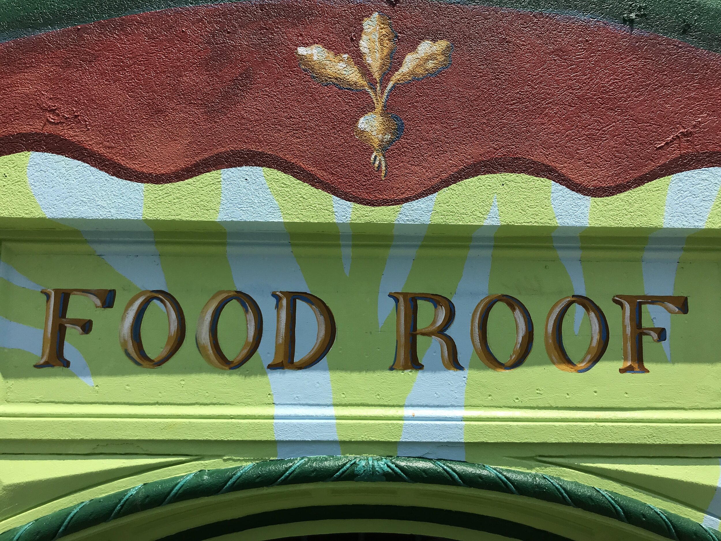
Urban Harvest StL is a non-profit that sets up and manages community gardens to benefit people who live in what are known as ‘food deserts’: easy to buy chips, hard to find fresh vegetables. Their signature garden is on the roof of this building, thus FOOD ROOF. However the obscure location coupled with an anonymous looking building made it almost impossible for people to find them.
The directors had seen the mural we painted for St Louis Style House (also in this decade) and felt that we could create a unique mural that would give them the exposure they needed, and provide visual nourishment for the surrounding community. It has already become a landmark.
(See Video in Media and Press)
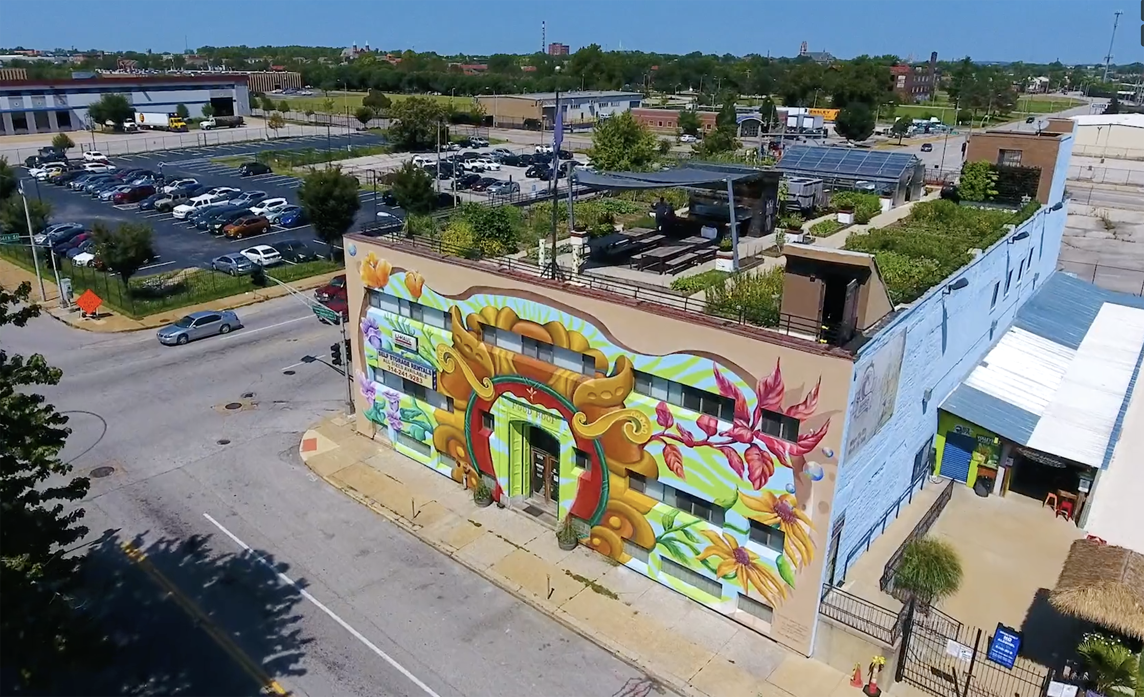
This stunning picture clearly shows the FOOD ROOF as well as the mural.
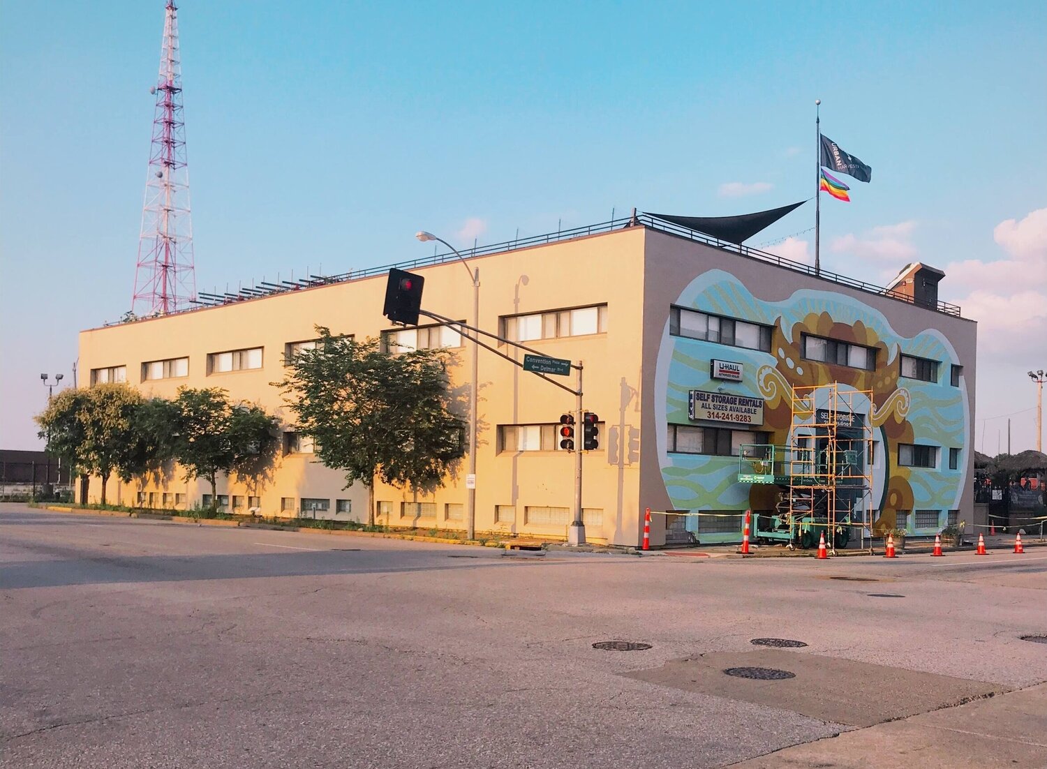
Urban Harvest, StL hopes to raise additional funds so we can continue the mural theme around the corner onto the long, west-facing wall.
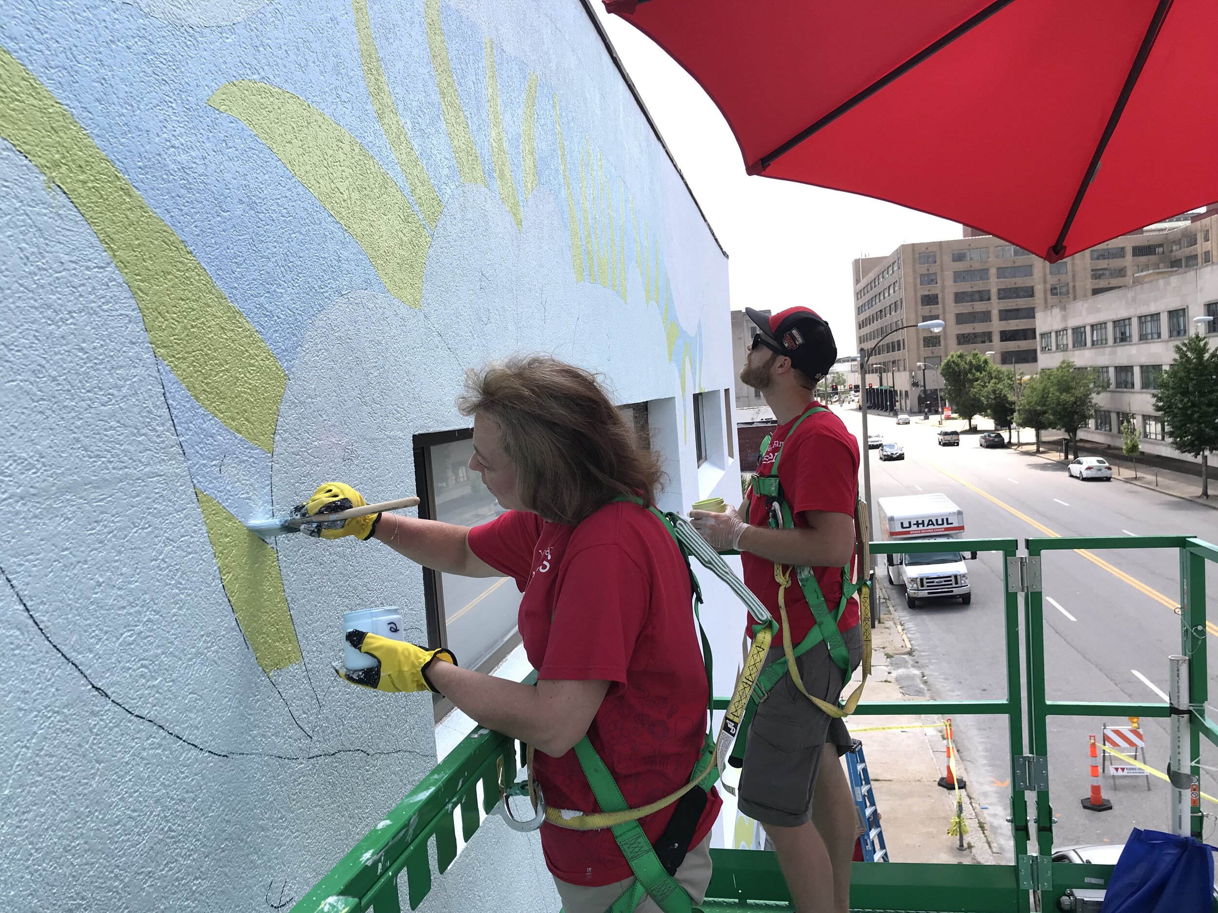
The mural was designed so that volunteers, under Robert Fishbone’s direction, could help with significant prep work, as well as base out the different color areas. Liza Fishbone then joined her father to add all of the shading and more complex elements to the mural. These volunteers are from Wells Fargo, which also contributed to the cost of the project.

We always work from a full color design, which invariably goes through changes as we translate a small printed picture into a huge, painted mural seen in changing lighting. It is important that the public gets to see the process, including all the tools we use…they see that not only is there magic, there is a LOT of hard work!

No, were not fishing!
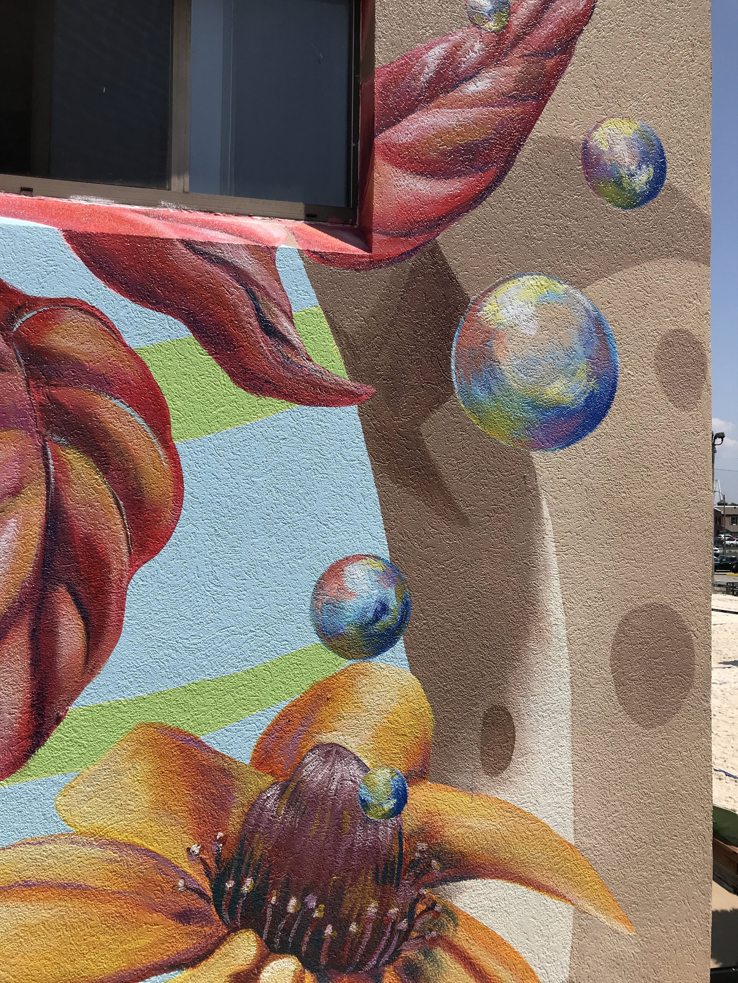
We added ‘pollen bubbles’ as an additional design element to create a sense of movement and whimsy. To properly place them we dangled samples in various spots until the person on the ground yelled, “Hold it right there!”, and took a picture. We then painted them on the wall, with shadows.

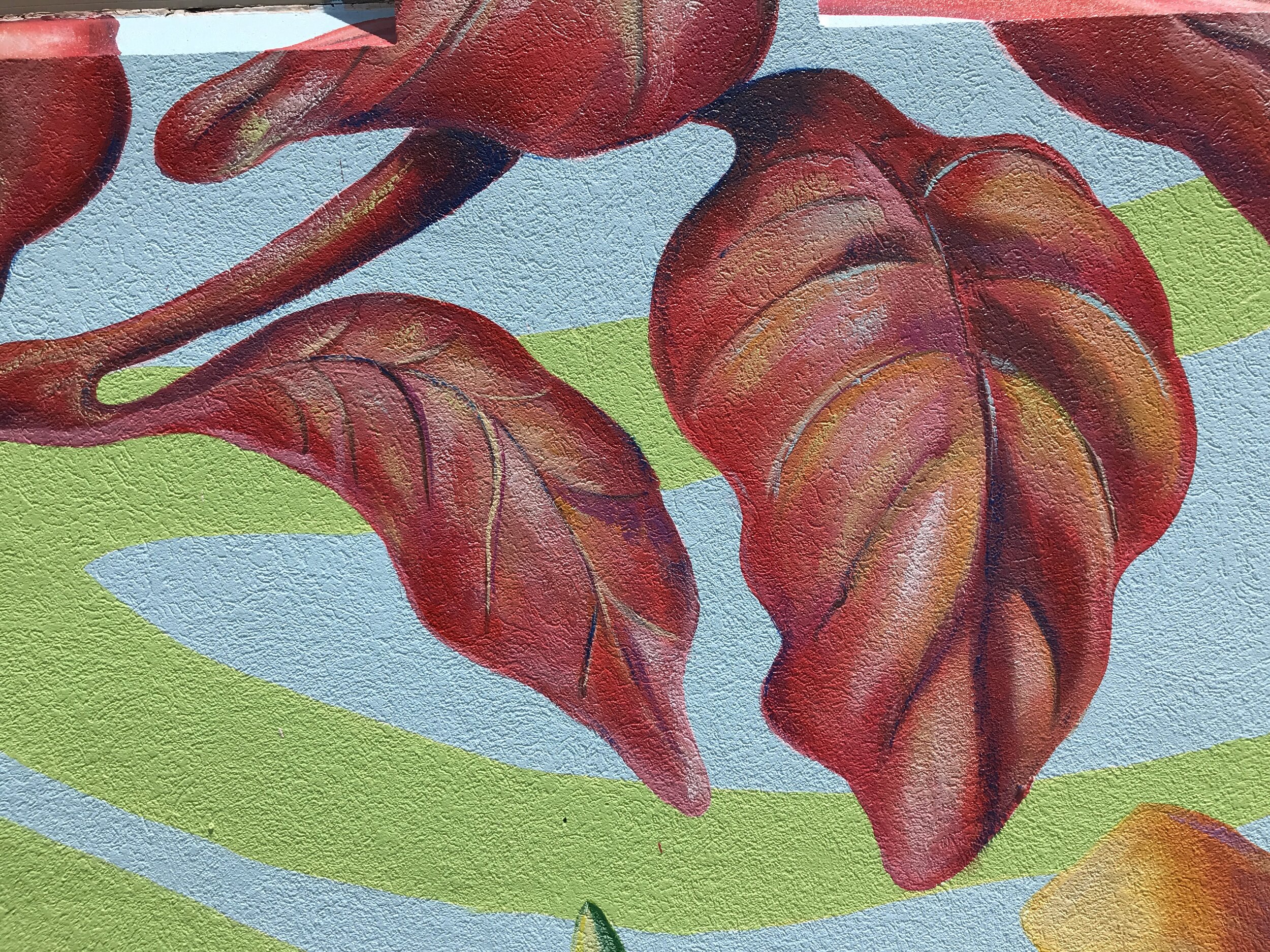
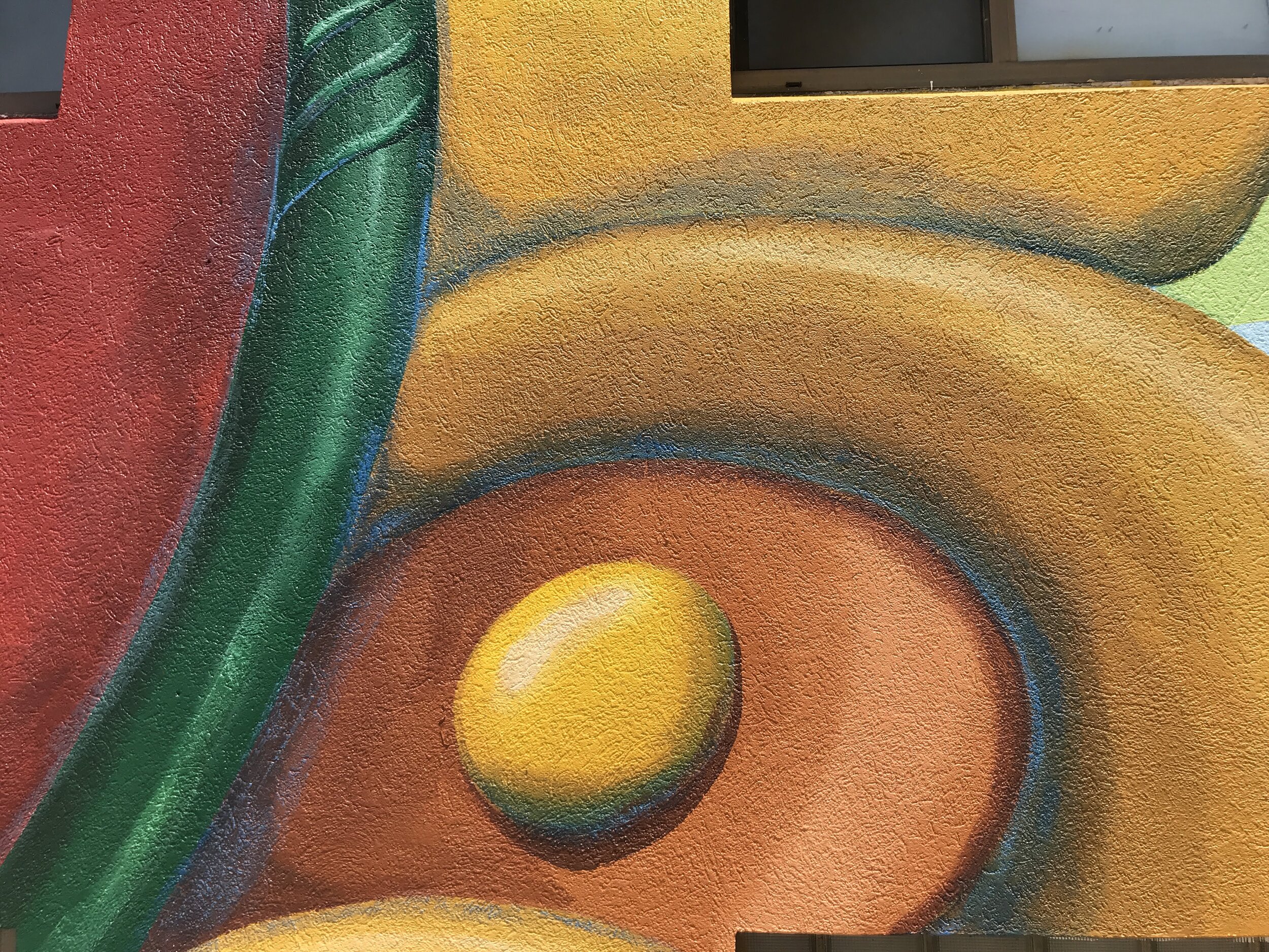
These elements were based on architectural details from a nearby building.
We added more dimension by painting it to look like the building had been ‘cut away’. Shading and shadows help maintain the effect.
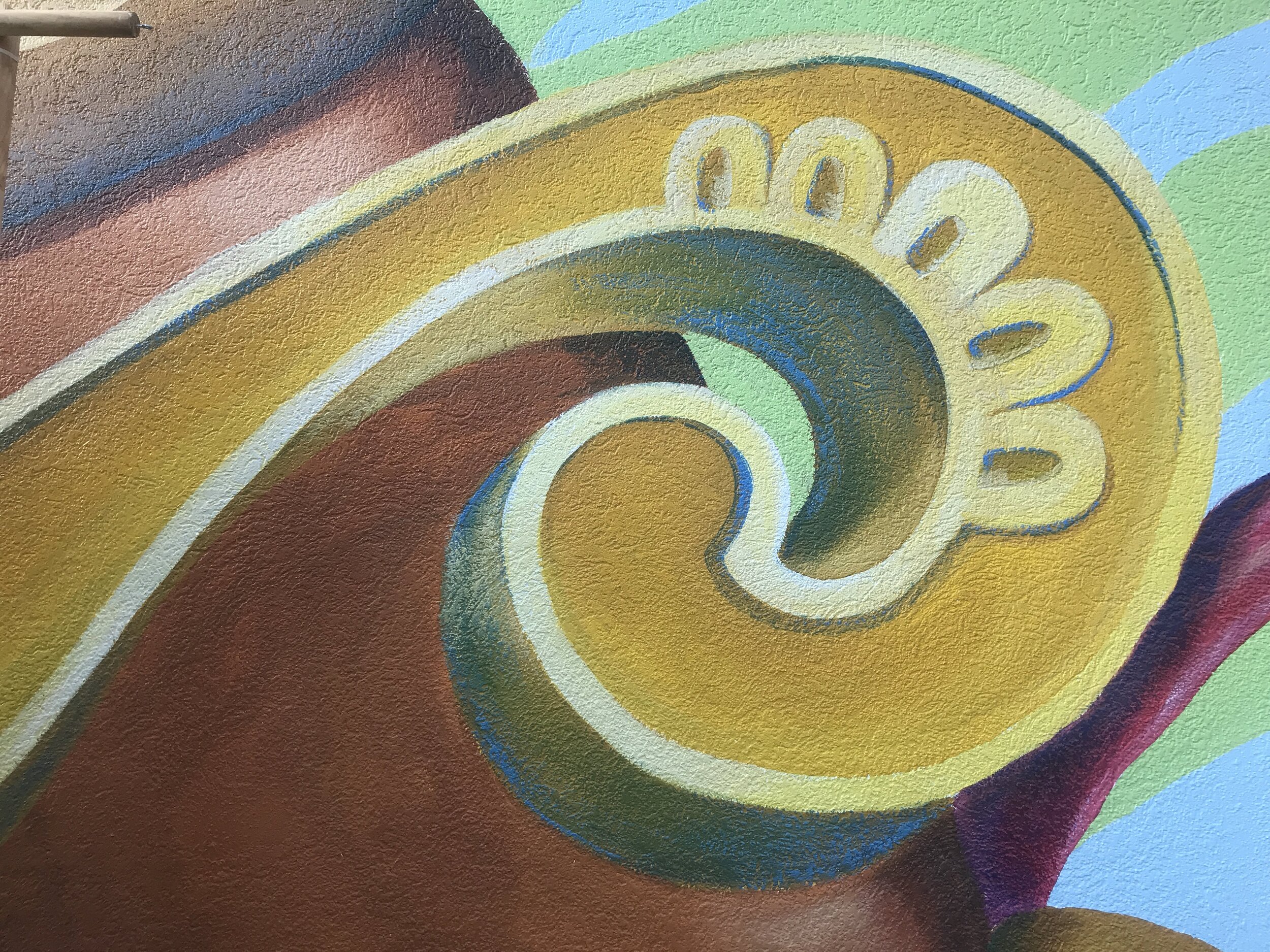
This element was also based on an architectural detail from a nearby building.
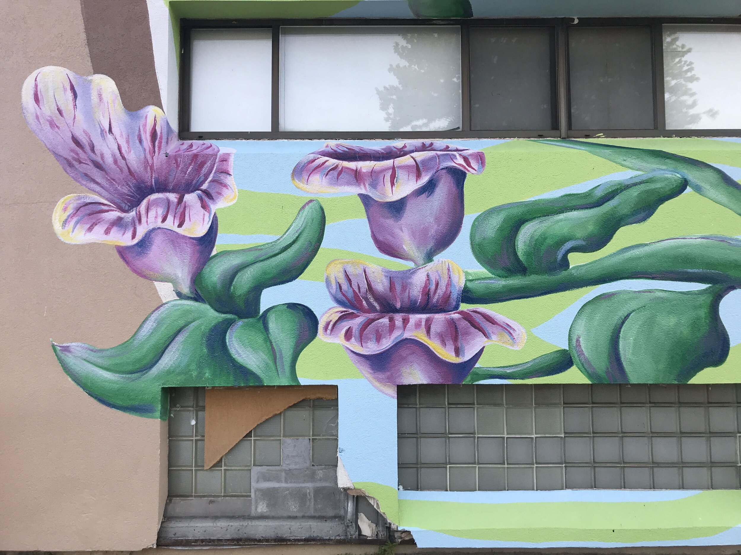
The window underneath was eventually repaired.
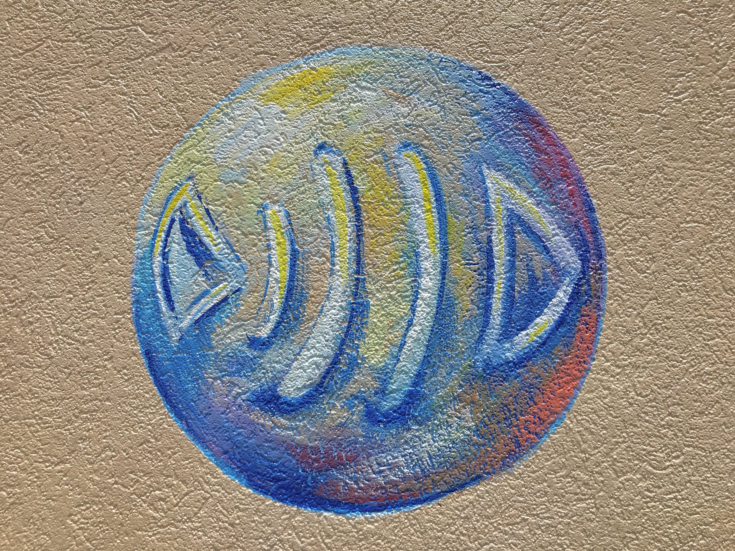
This is actually the logo for our last name, ‘Fishbone’. We integrate it into all of our murals.
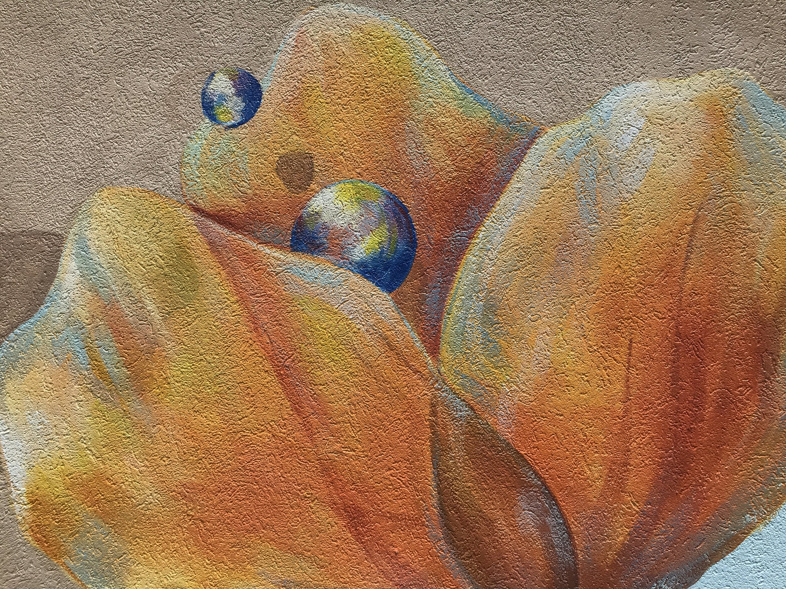
Pollen bubbles emerging from a California Poppy, one of the plants grown on the roof to attract pollinators.
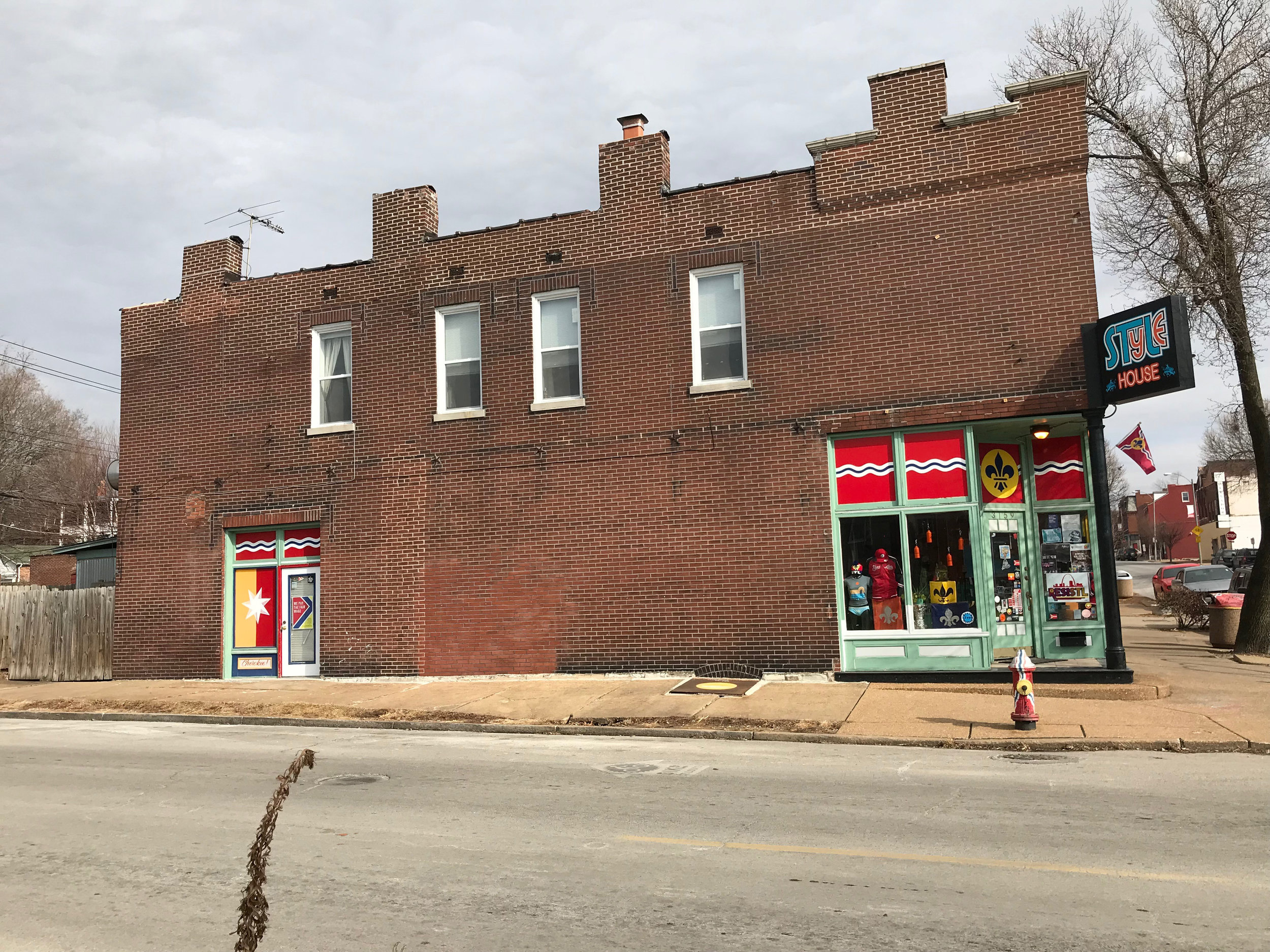
Jeff and Randy Vine, the owners of St. Louis Style House, had been longtime fans of our mural work and had often dreamed of having a mural on their building to help both identify their own business, and also the western entrance to the very popular Cherokee District.
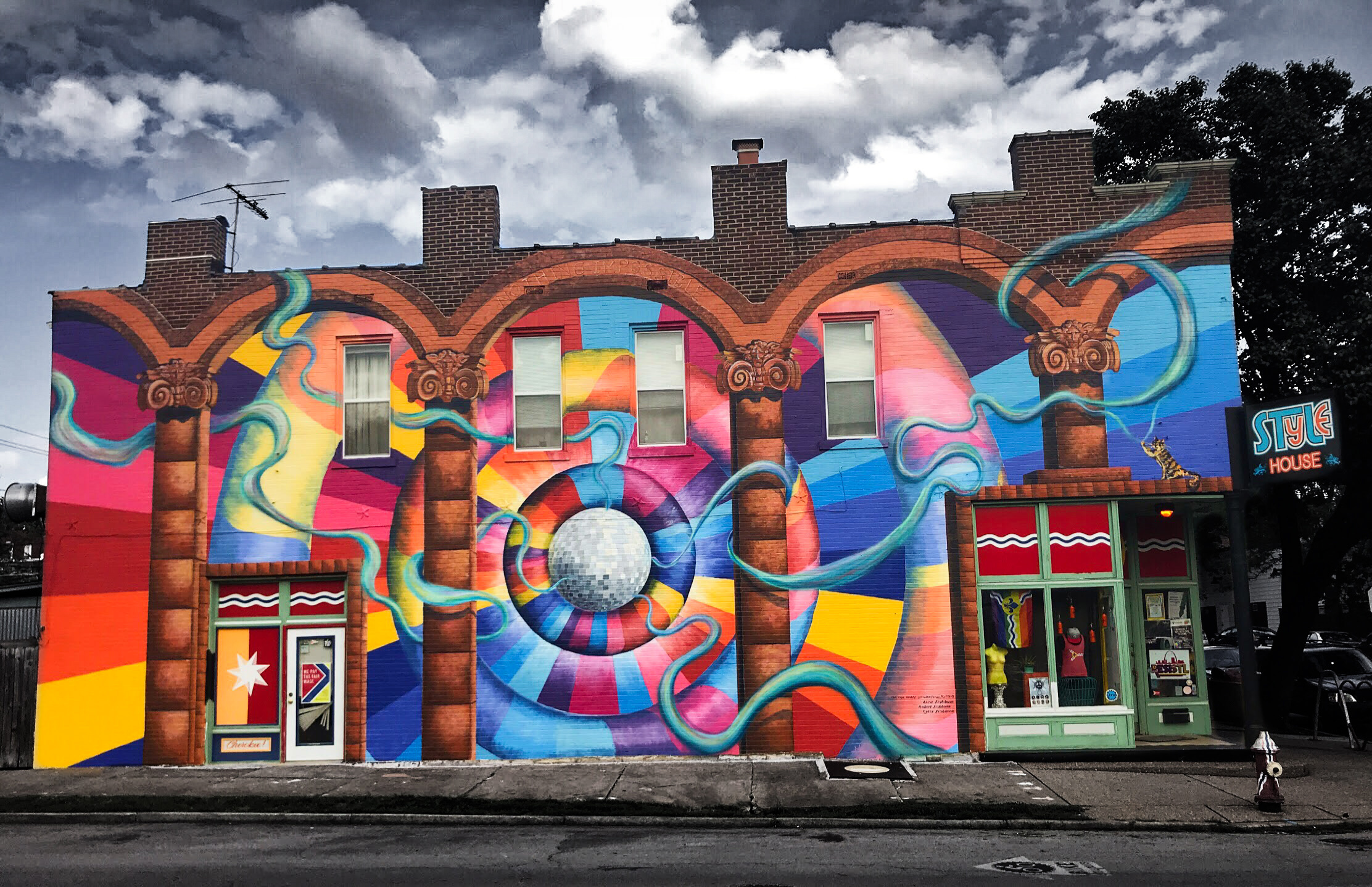
The Vines have been amazing cheerleaders for St. Louis neighborhoods. We also noted that they are fascinated with all things 1970’s. So we developed a vibrant design that incorporated St. Louis architectural elements, and behind them have expanding ‘doughnuts’ in a 70’s color palette, framing a giant disco ball…of course! It has become a very popular spot for selfies.
(See Video in Media and Press)
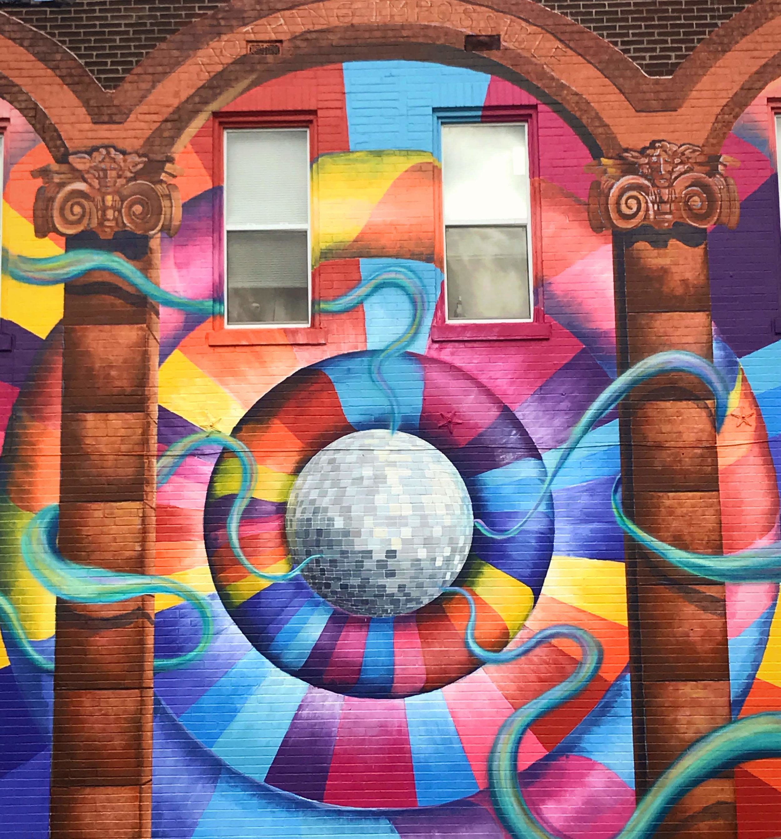
The disco ball…
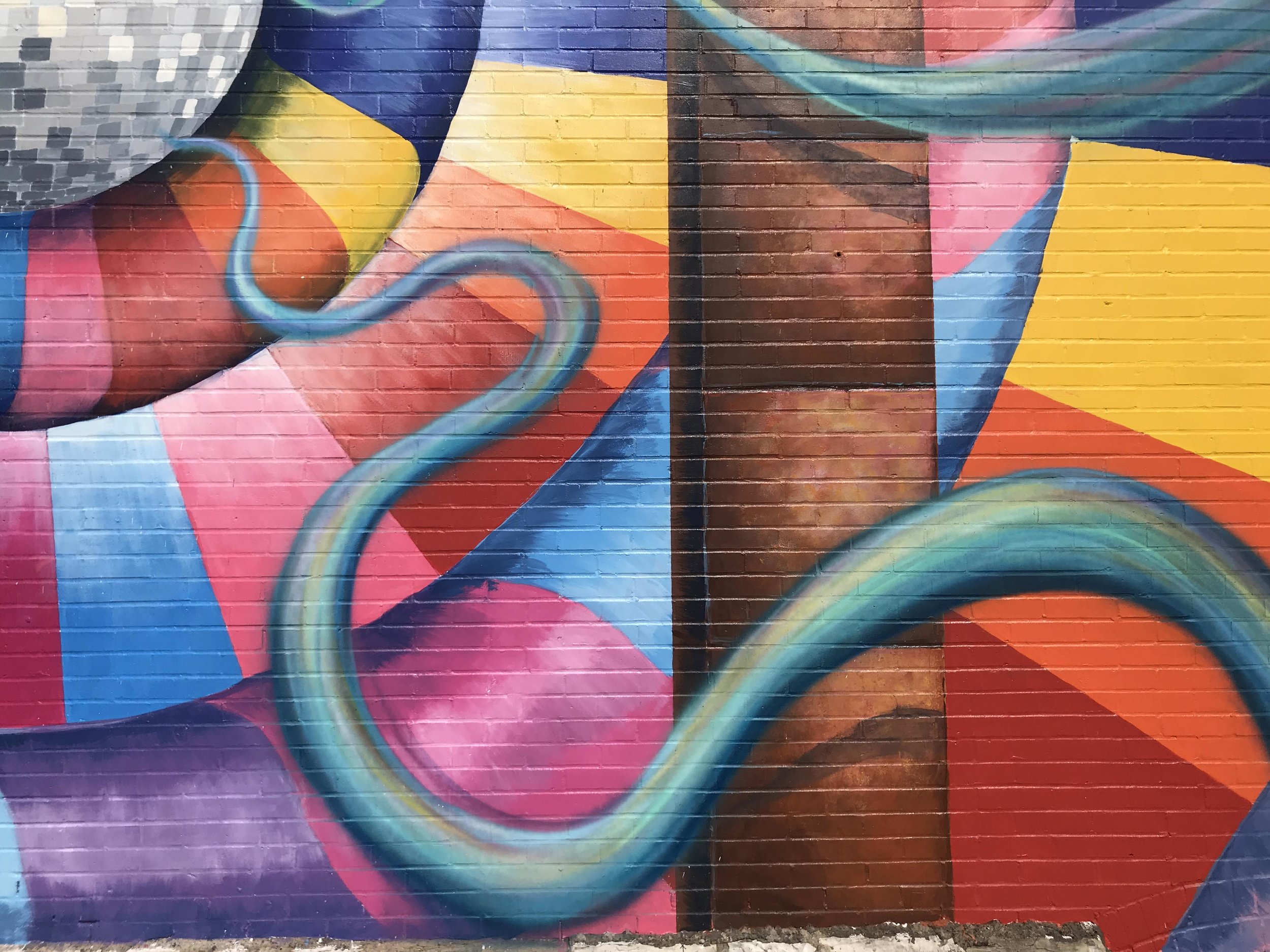
Liza sprayed ribbons of blue light emanating from the disco ball.
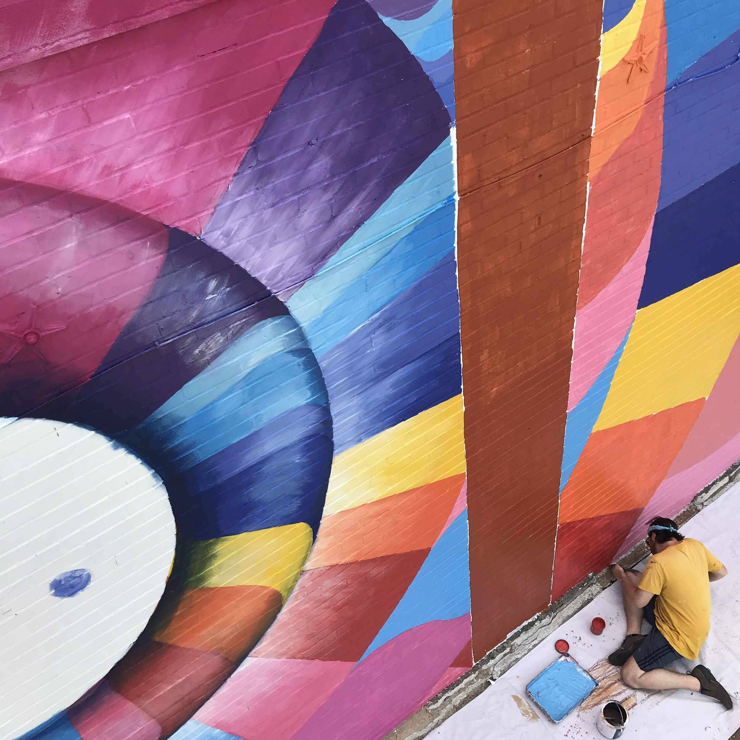
Tyler Fishbone, the third member of Team Fishbone doing detail work.
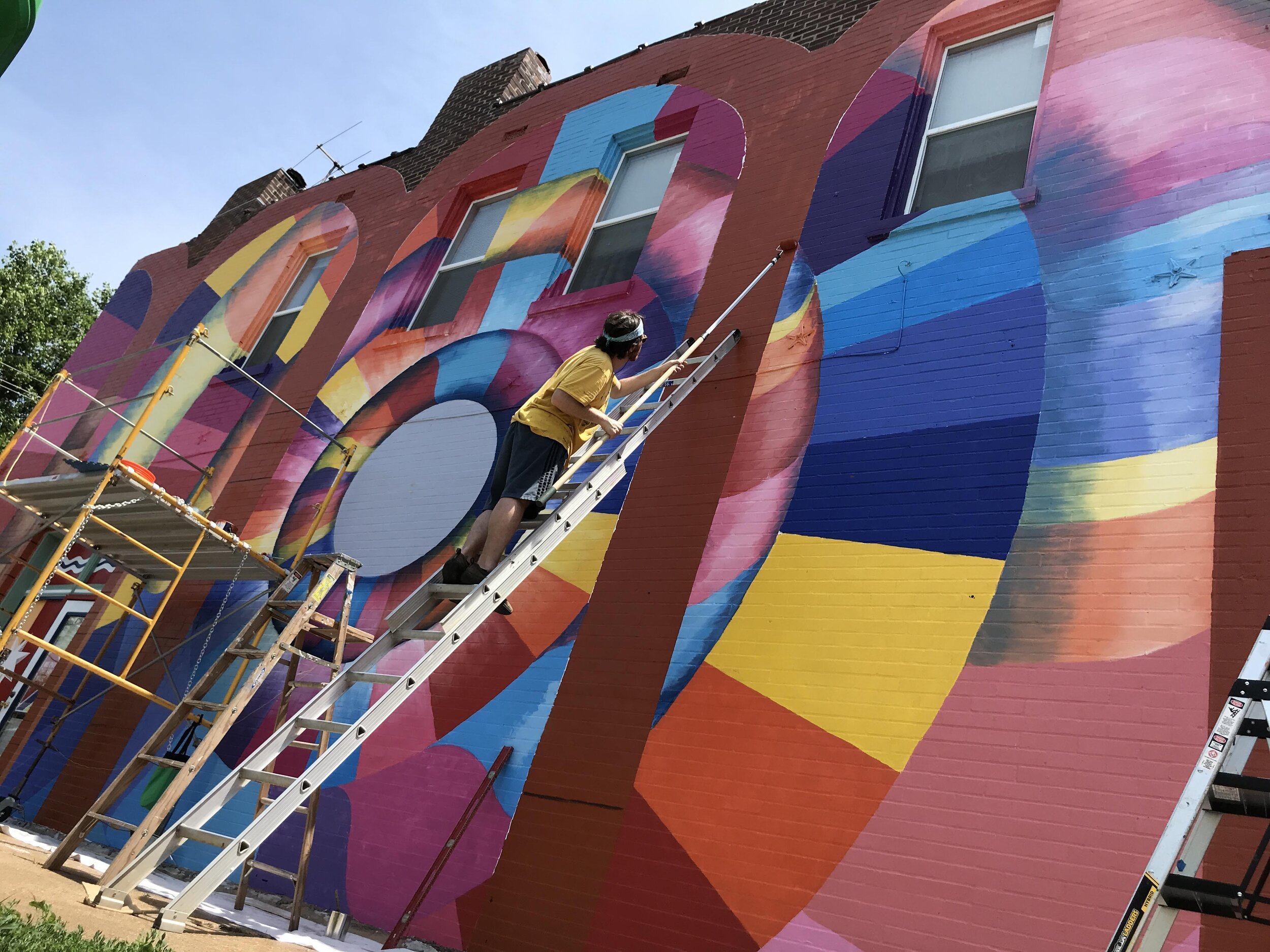
To do this painting we used a combination of ladders, tower scaffolding and a 49’ boom lift.
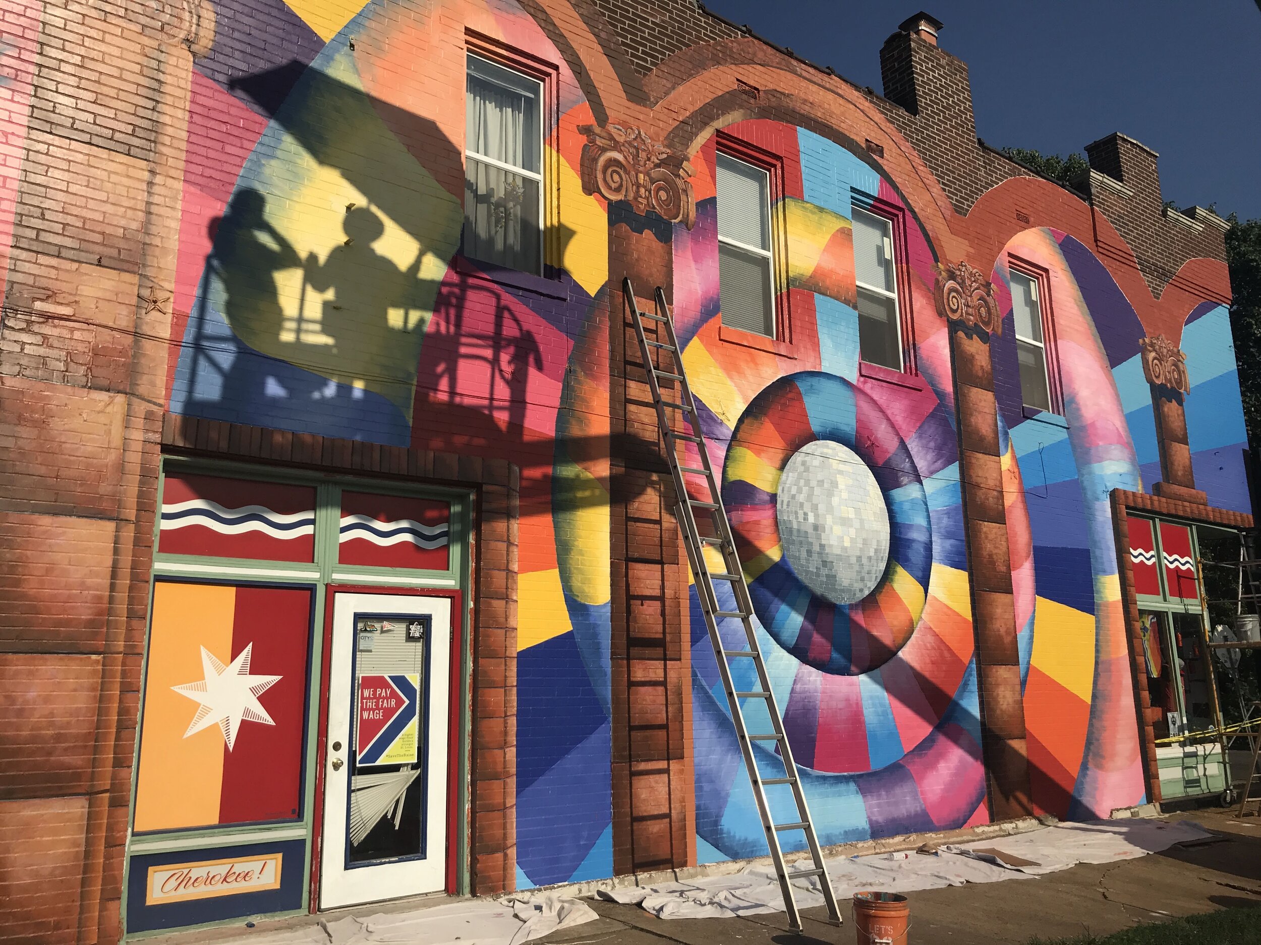
We are fascinated with the process of mural making. From seemingly endless containers of colors, to the physicality needed, to our shadows cast on the wall, it is a never-ending adventure that carries from project to project.
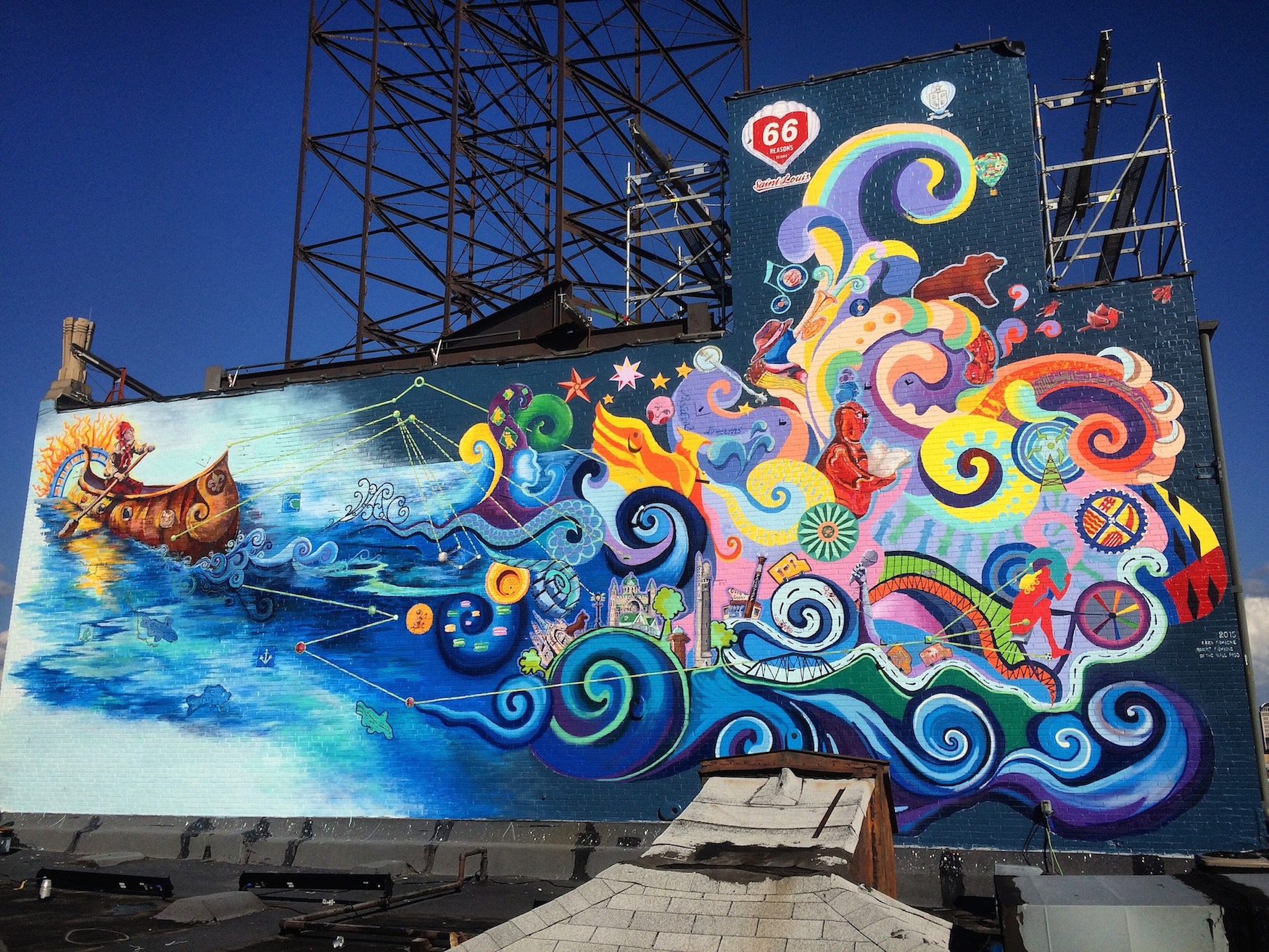
This mural is a gift to the city from Phillips 66 and is located on the western-facing wall of KDHX at 3524 Washington Ave in the Grand Center Arts District.. After 20 artists auditioned, we were selected to design and paint the mural. In fact this project is what got Liza and I working together, and officially launched us as Team Fishbone. The list of the 66 Reasons to Love St. Louis contains many places unfamiliar to most St. Louisians and will take you all over the city and county.
As the mural has to do with exploration, we chose to have an actual, 18th century French Voyageur padding through the waters that identify this part of the country. His canoe is churning up the river in front of him, and unveiling the future, which is our present.
(See Video in Media and Press)
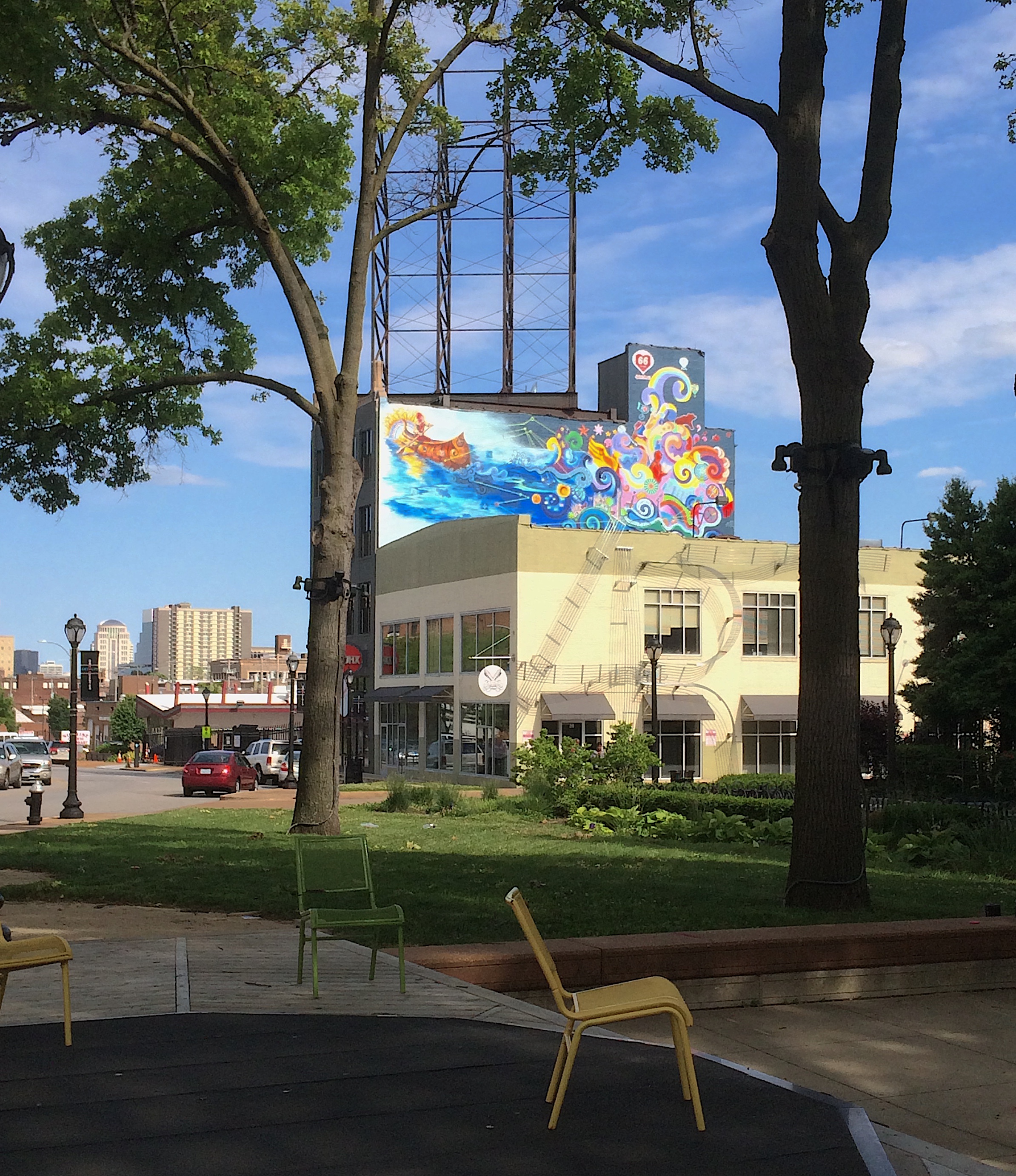
The mural is actually perched above another building. This picture is taken from a nearby park where the sponsor placed high powered binoculars so you can closely inspect, and look for the 66 Reasons.
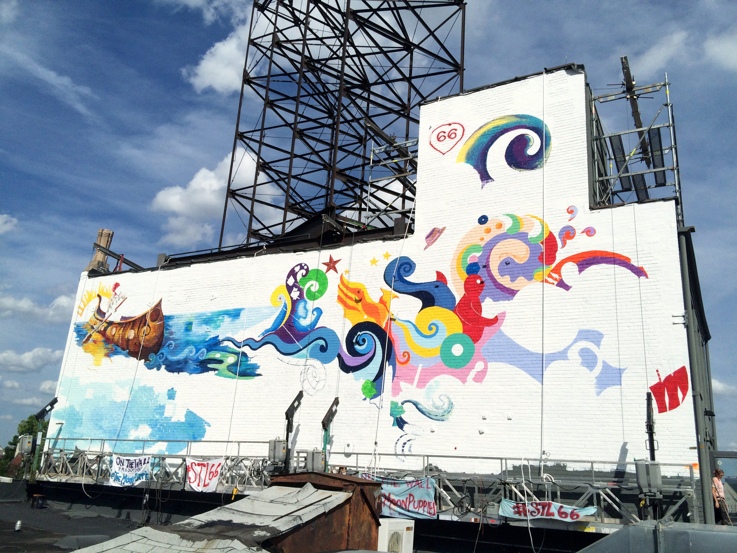
Bit by bit the mural seems to emerge from the wall.
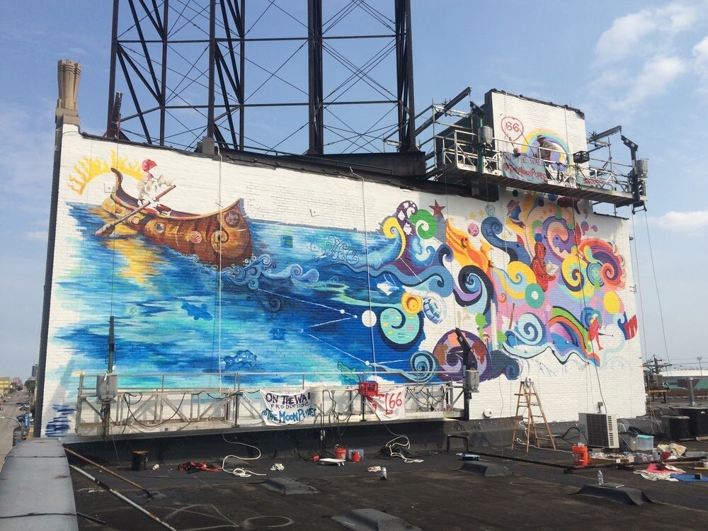
We used Spider hanging staging to do our painting. It was by far the easiest way to reach the entire wall. Having two units meant that Liza and I could either work together or separately.

Lots and lots of colors were used on this mural.
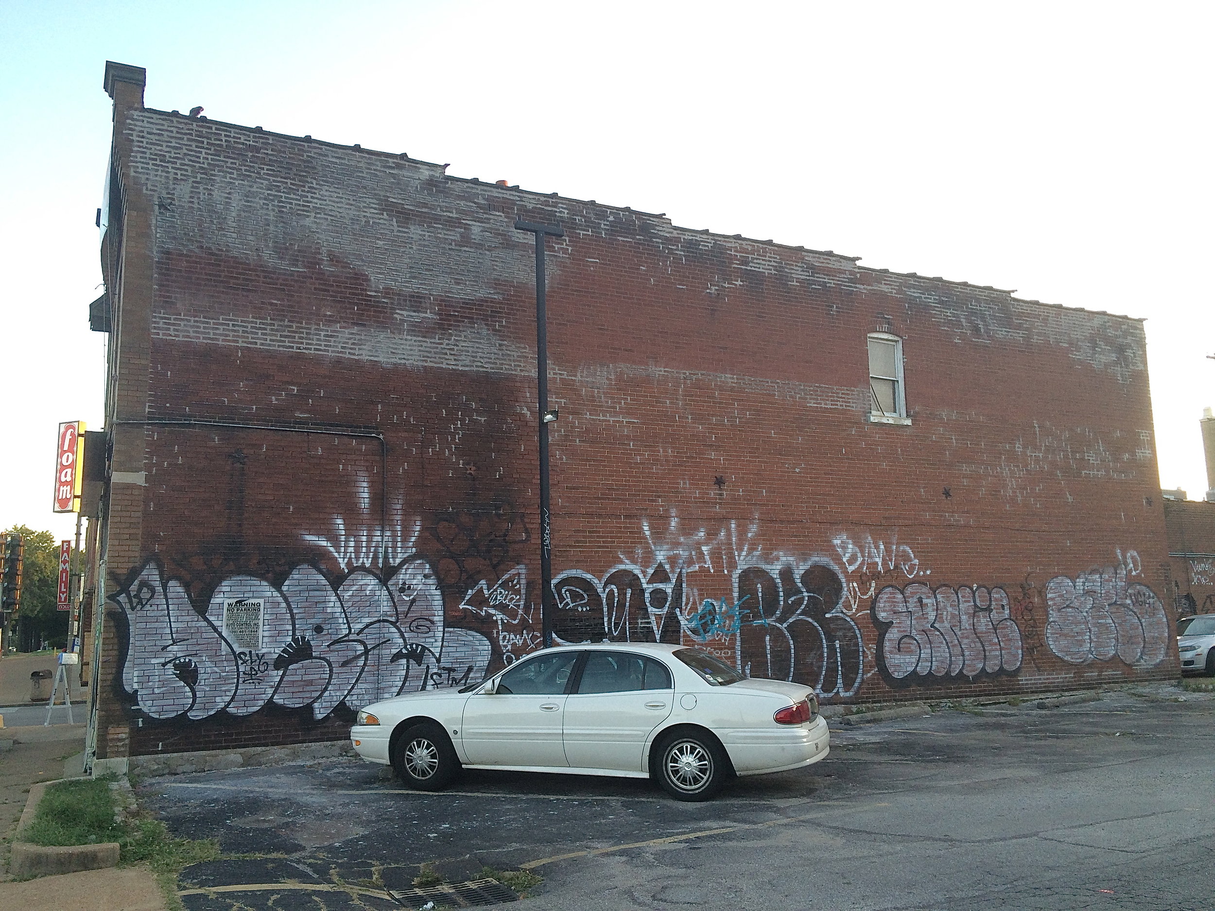
A wall in need of help at Jefferson and Cherokee in the midst of the Cherokee District.
I applied for and received an Artist Support Grant from the Regional Arts Commission to facilitate a workshop, “The Art and Business of Mural Making”. Not only did we design and paint a large, complicated mural as part of the class, we also had lawyers and accountants explain what it really entails to be in business. And though they may not think this way, ALL artists are in business. There were 7 artists in the workshop.
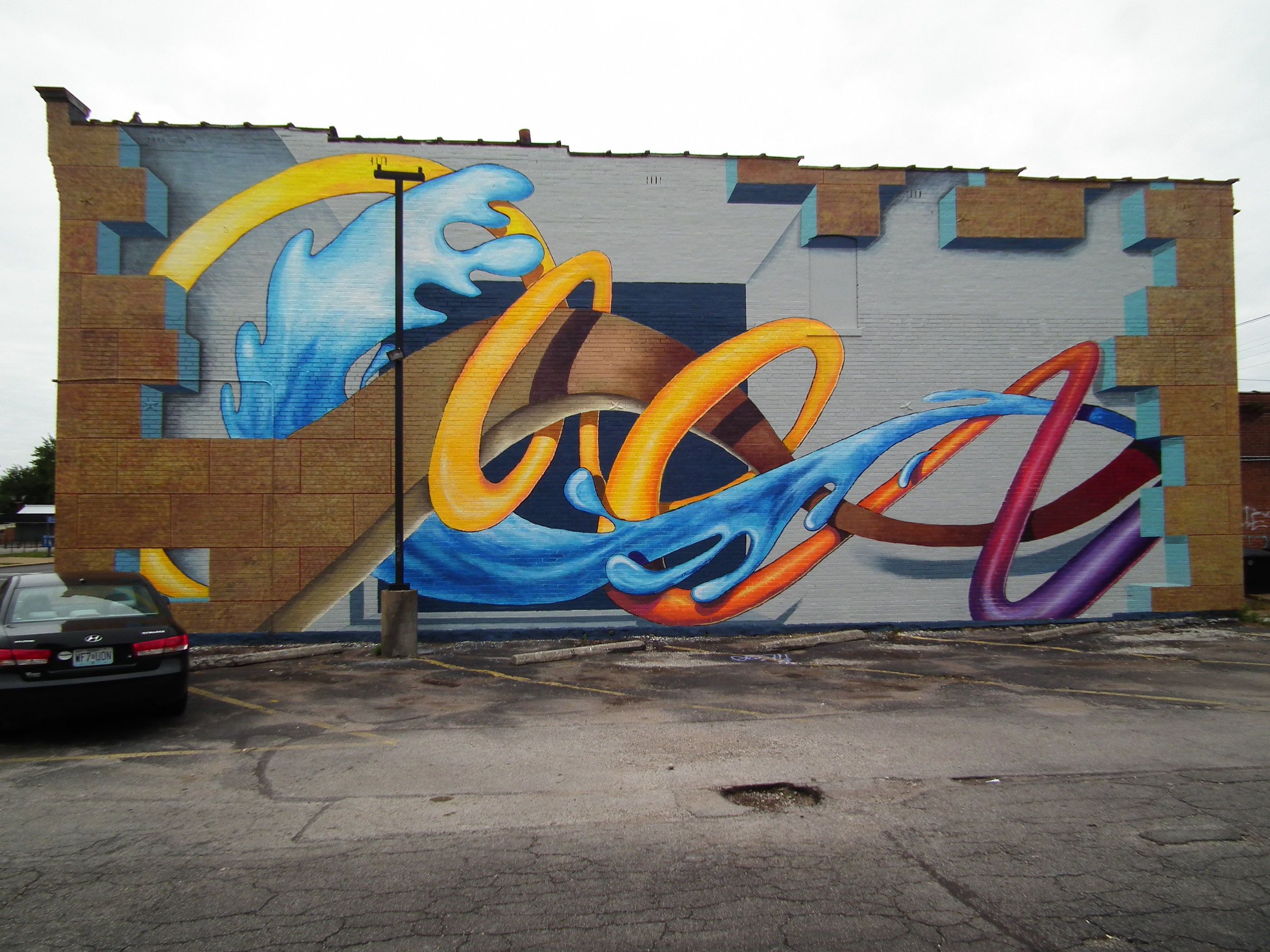
The design came about after weekend of brainstorming. We decided to play with the dimensionality of the wall and weave a graffiti like graphic through the entire composition.
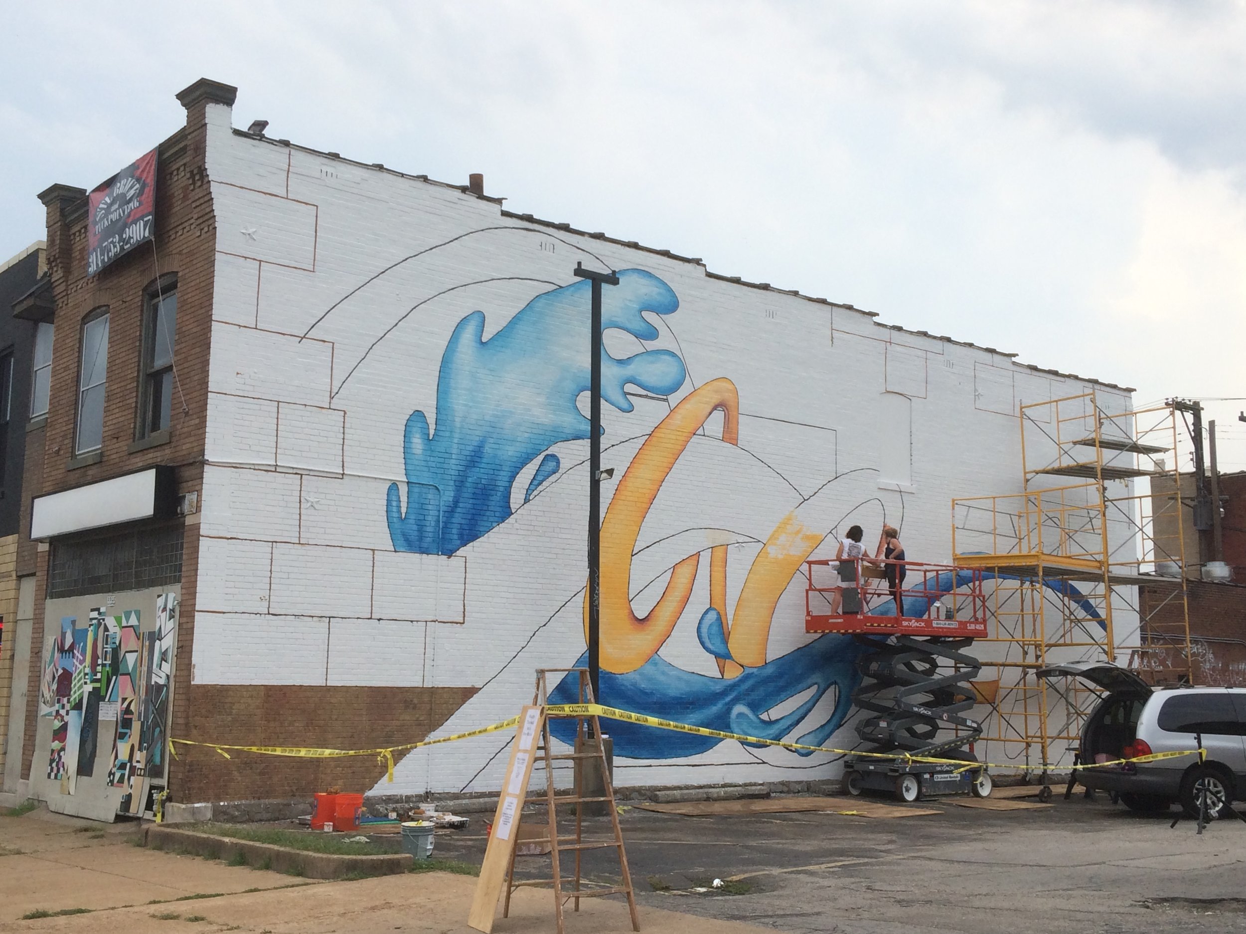
Whenever possible we use projections at night to draw the design, which is based on a full color rendering. Then we assigned tasks to the different members and started painting.
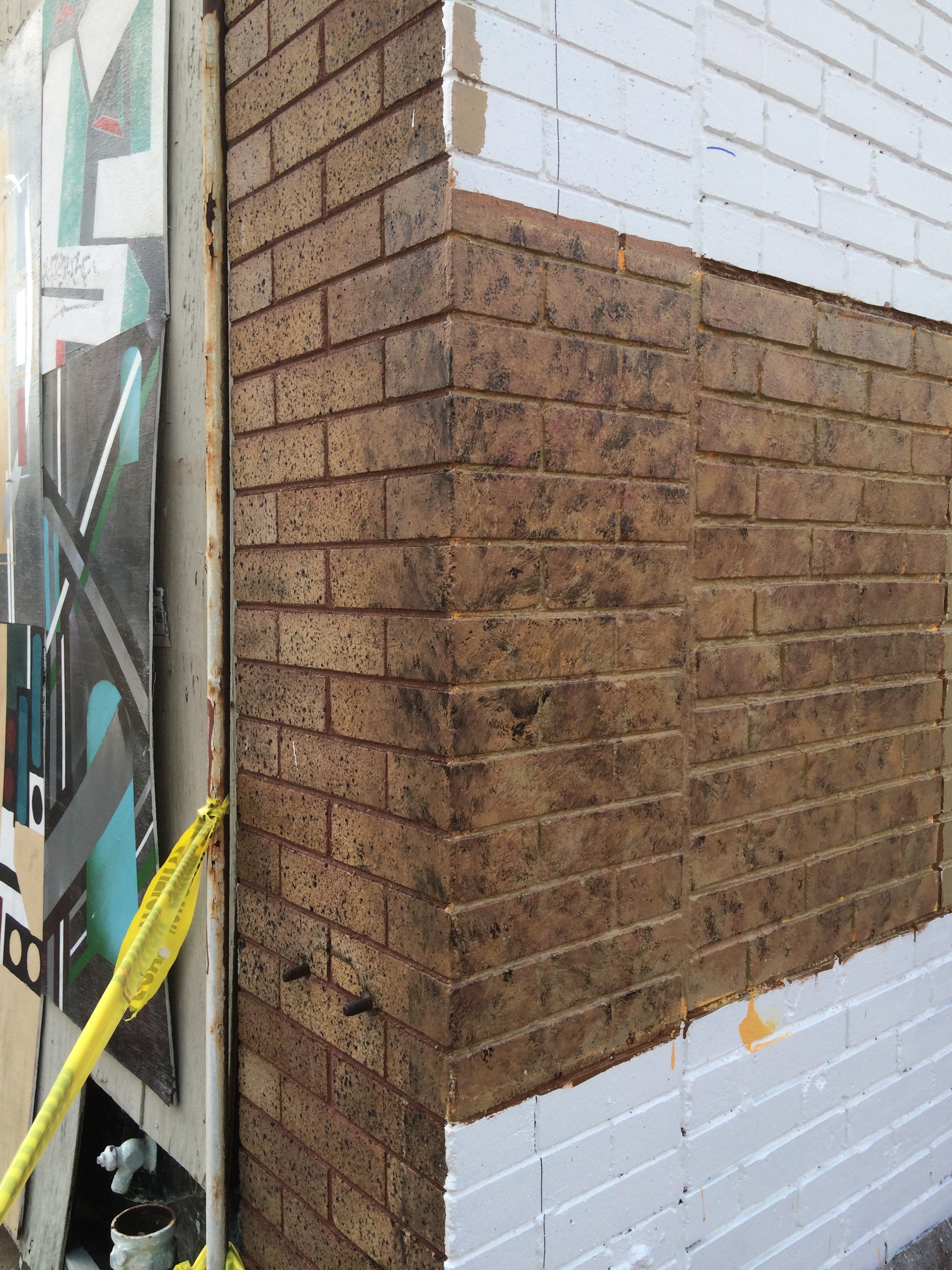
We needed to match the painted brinks (on the right) with the actual bricks on the front of the building (on the left). But then we grouped painted bricks together as large blocks of stone. The texture is achieved by using sponges and many colors.
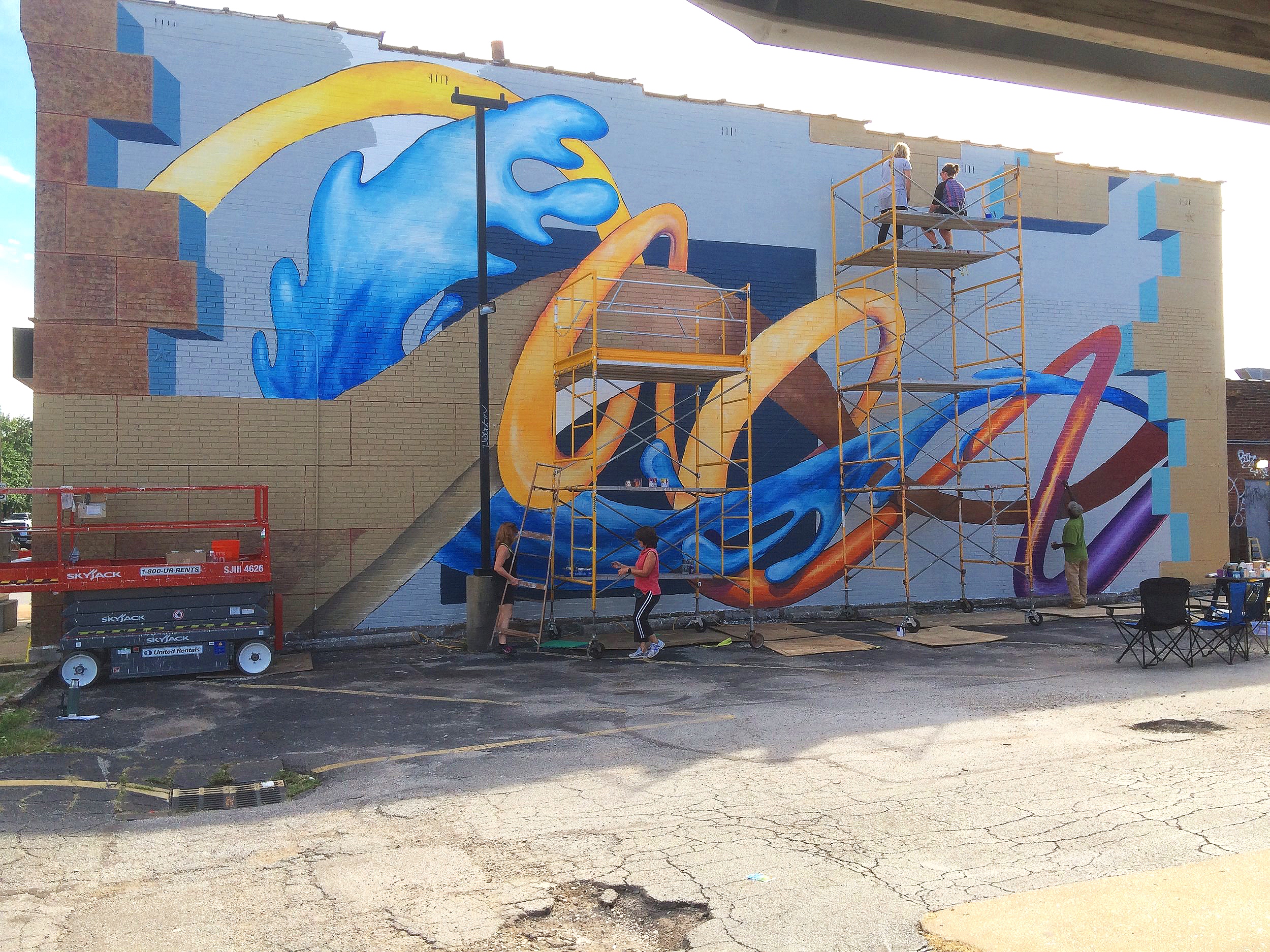
Working together.
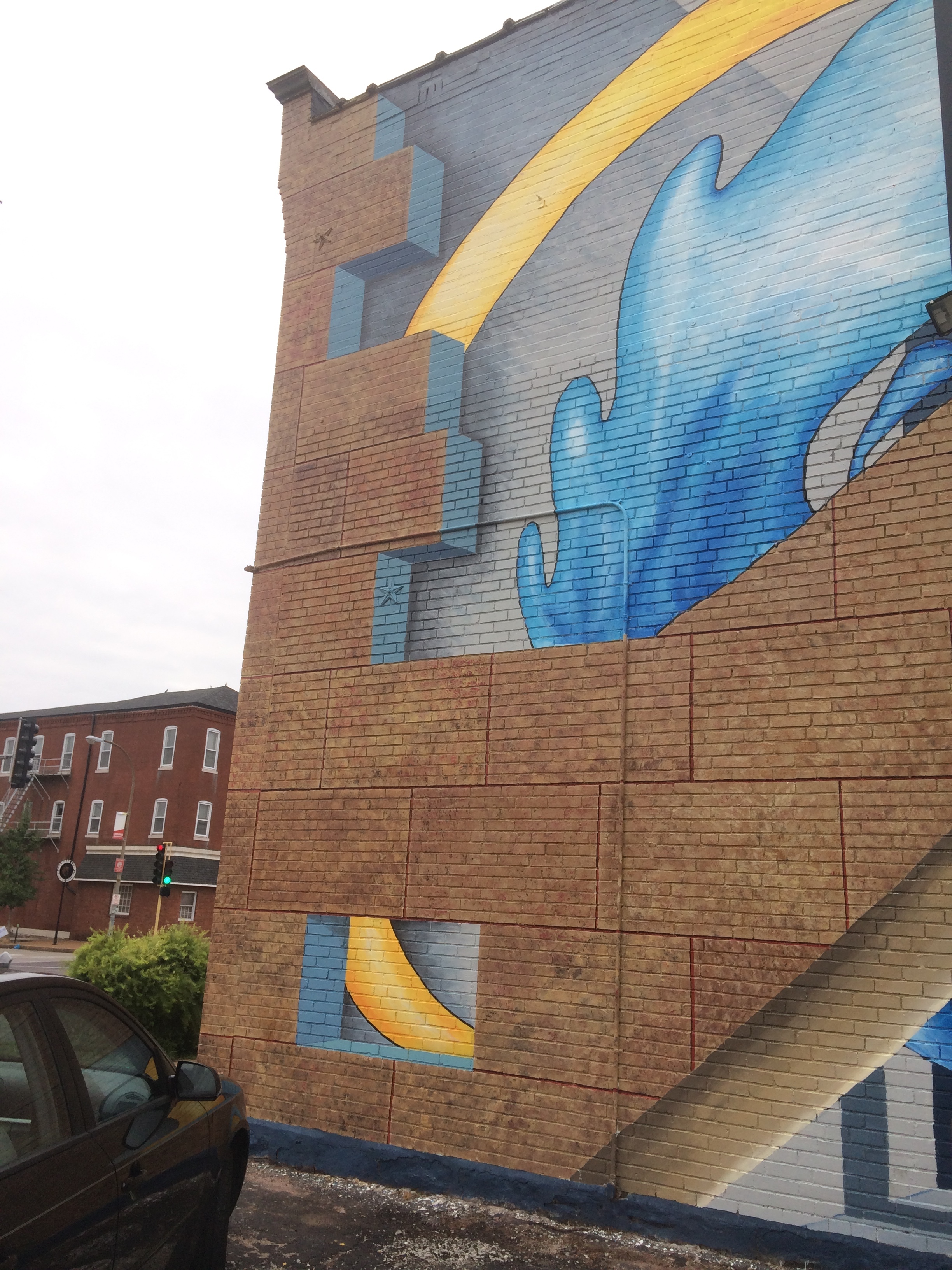
This angled shot helps to show the 3-D quality of the ‘stone’. The cutaway view also helps with the illusion.
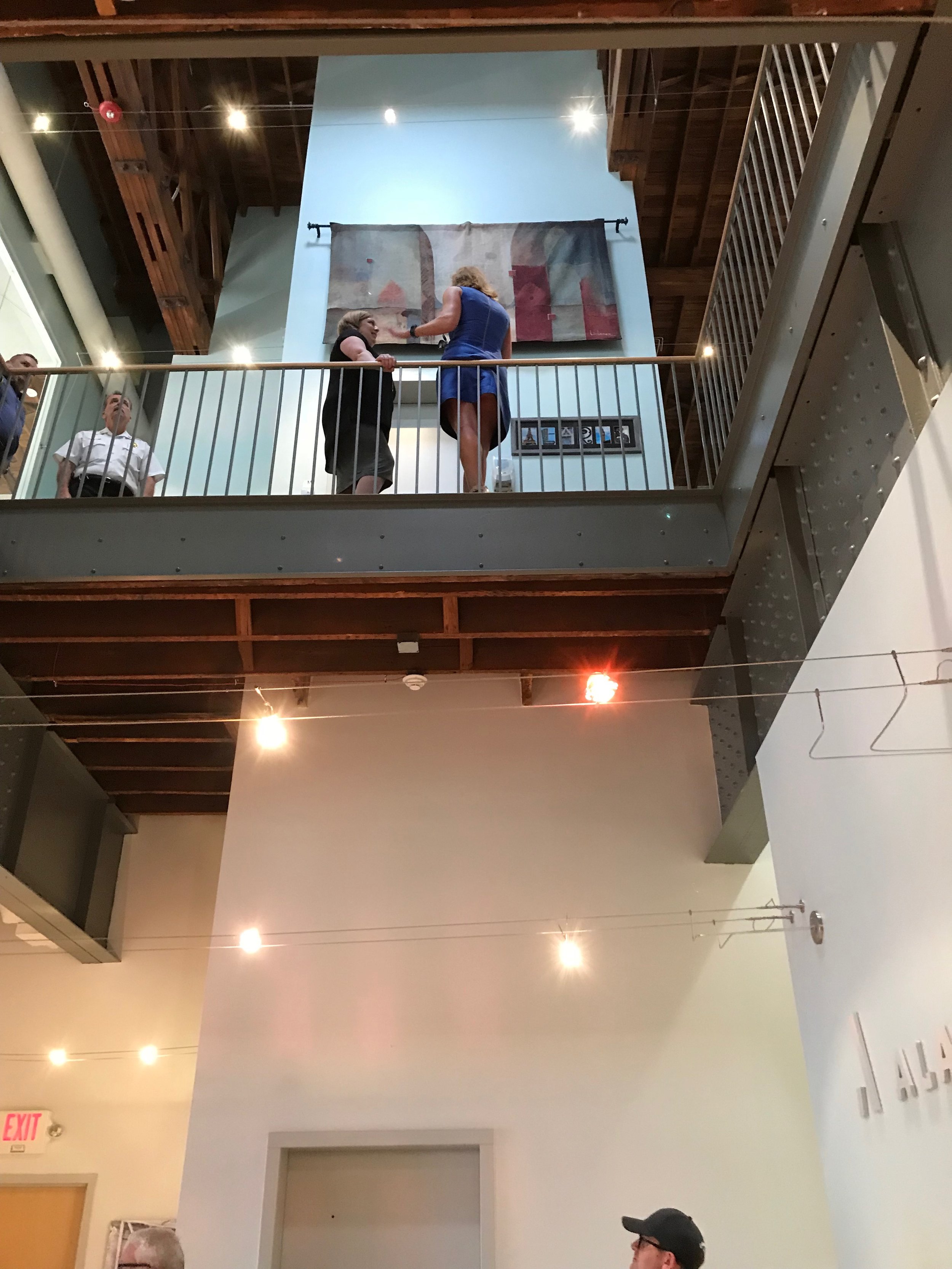
The client at first imagined a smallish mural to take the place of the tapestry hanging on the front of the elevator shaft on the second floor. We however suggested she let us design for the entire elevator shaft, on both floors. We saw it as a single, 3-D surface…she loved the idea.
Their goal was to have something inspiring and beautiful, that would help to relax clients as they entered the building…the finished piece has been embraced by clients and employees alike.
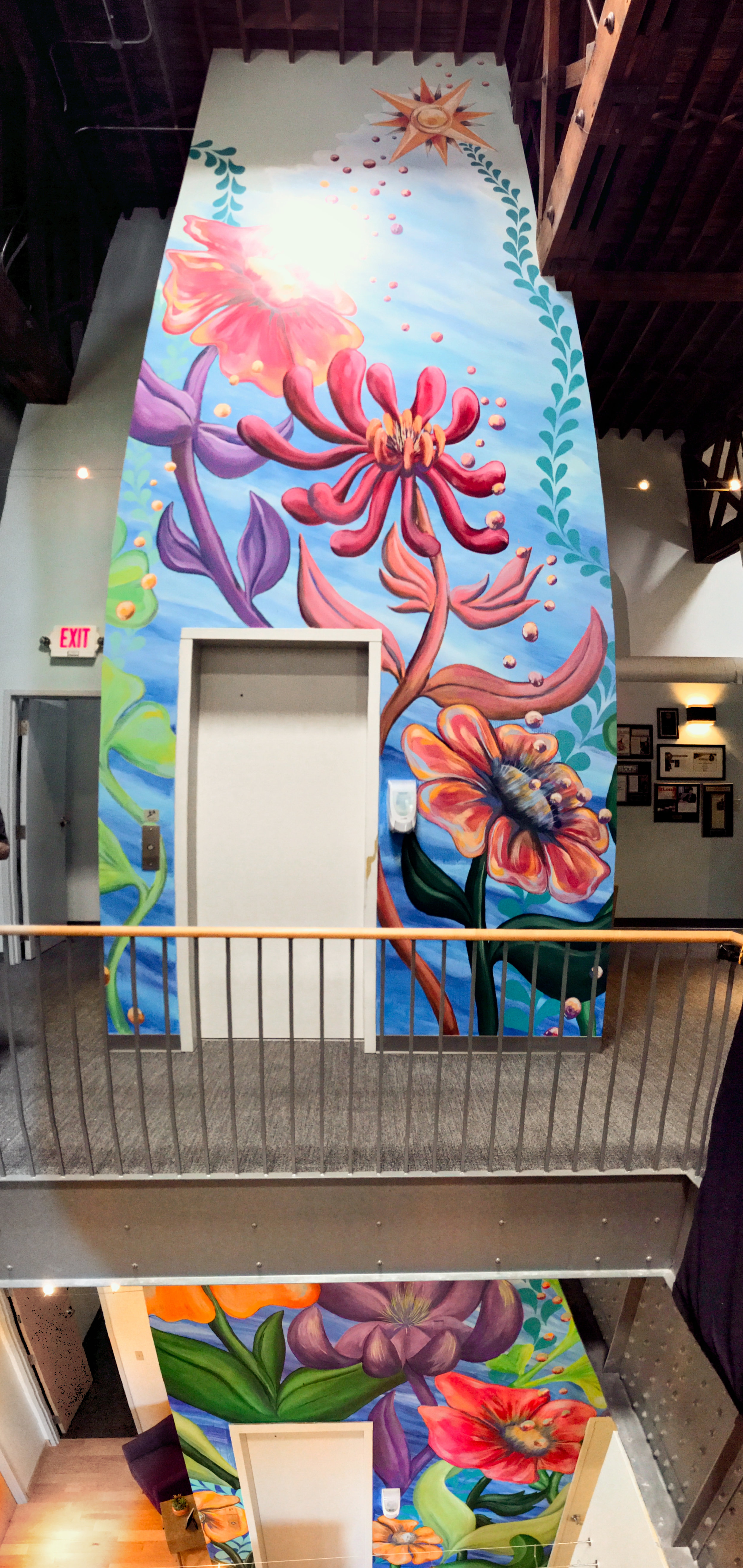
Seen from the second floor atrium.
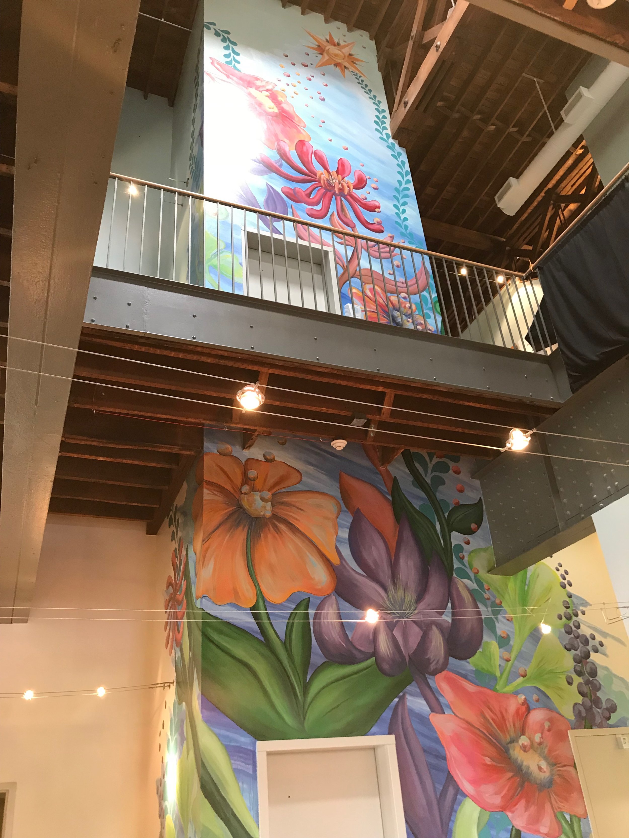
Looking up trough the atrium.
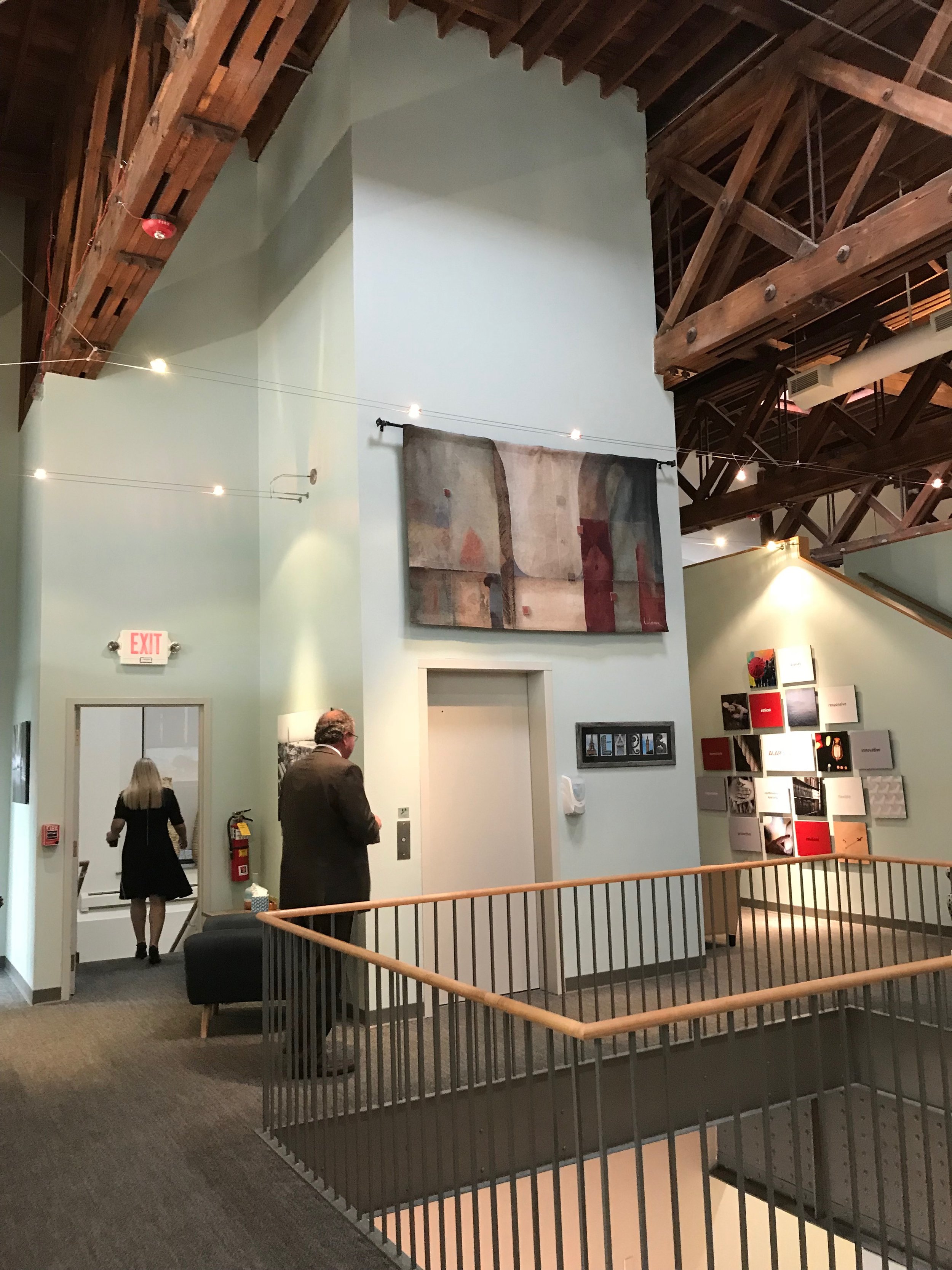
Second floor, before.
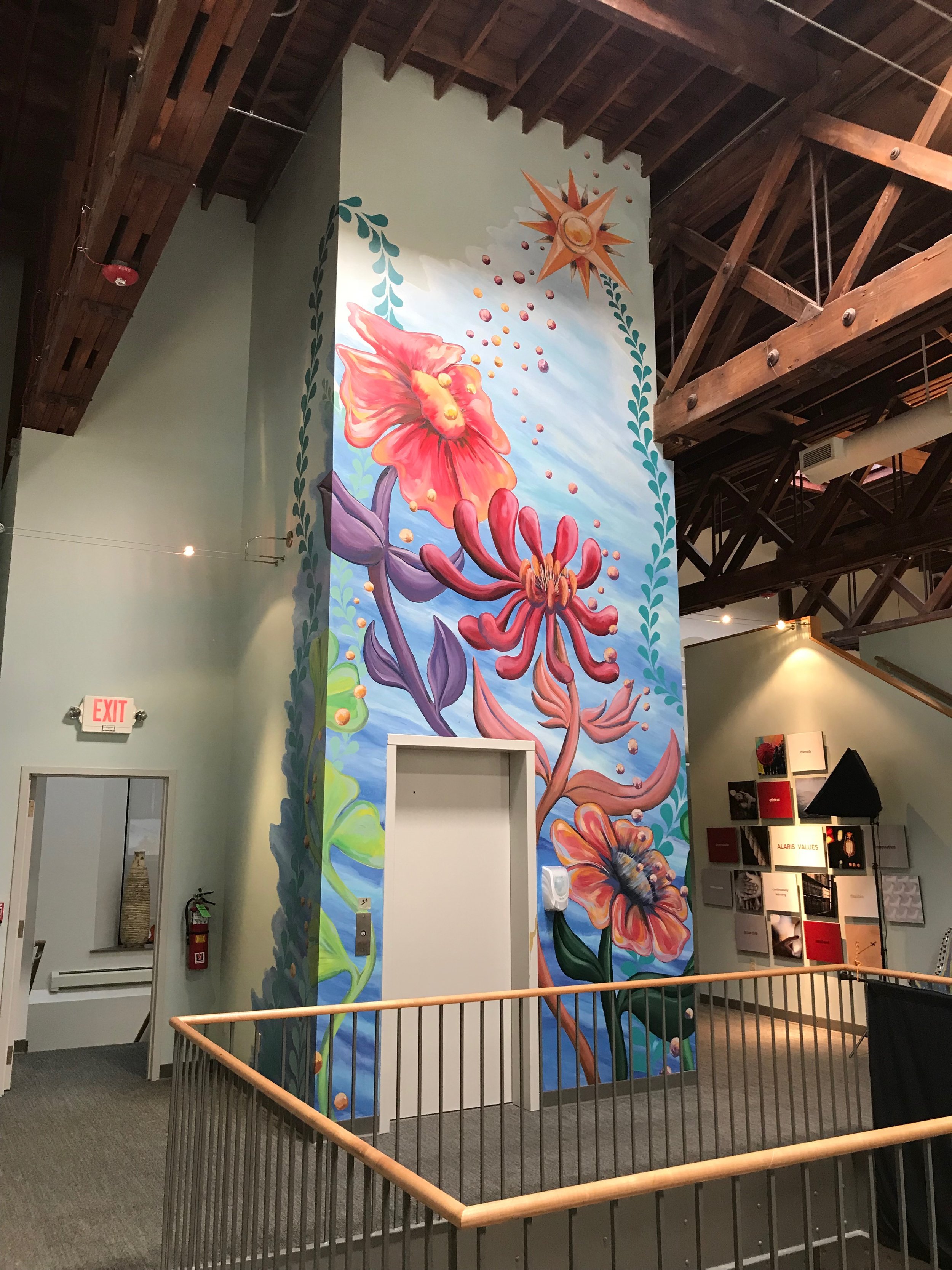
Second floor, finished detail

First floor, what you see when you enter the building. No one is prepared for how lovely this is, and everyone is wowed.

Another view of the first floor.

We love our pollen orbs.
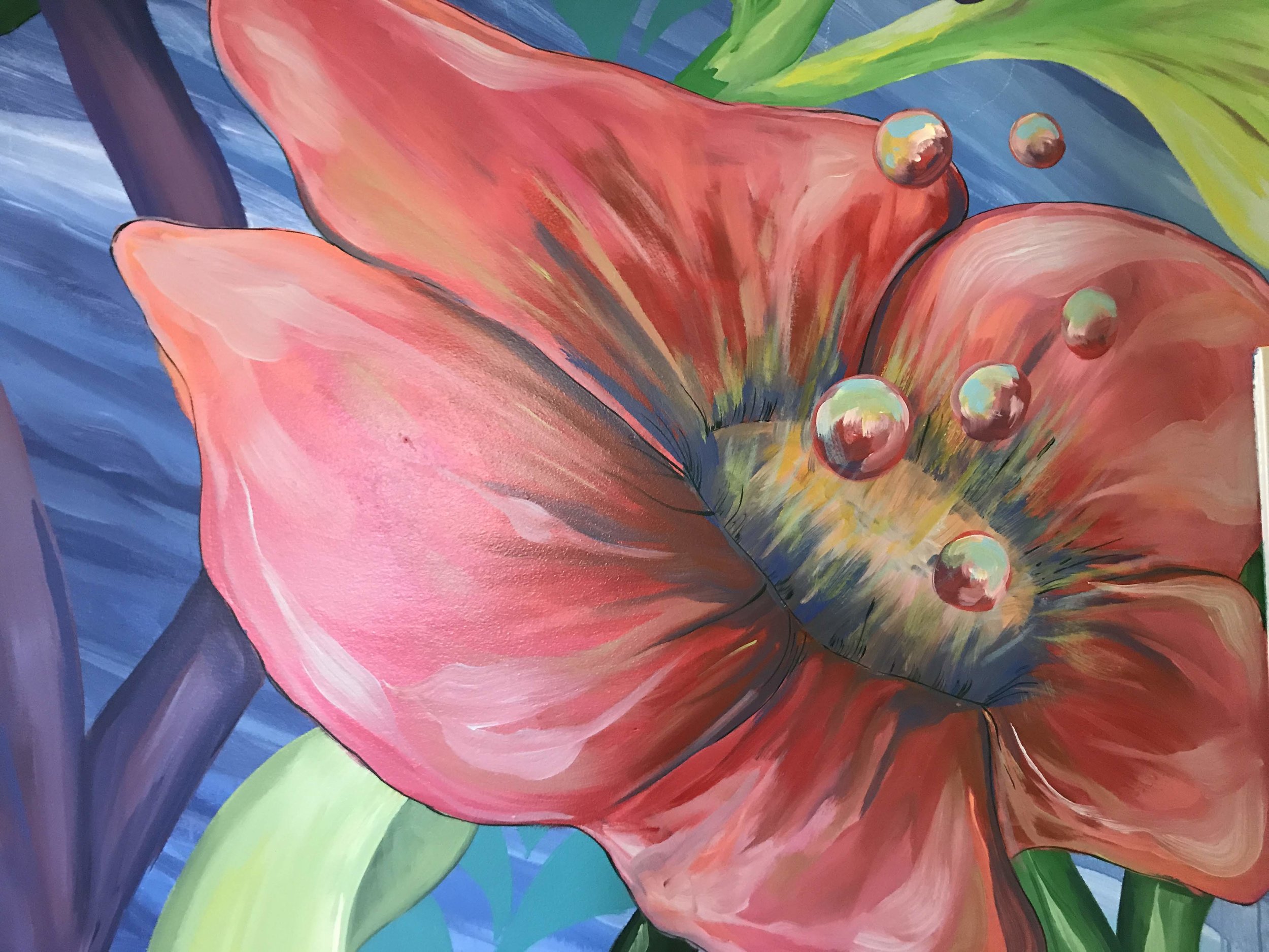
More pollen orbs.

Second floor detail


Acrylic on DryVit / Stucco, 73’ x 31’
Urban Harvest StL is a non-profit that sets up and manages community gardens to benefit people who live in what are known as ‘food deserts’: easy to buy chips, hard to find fresh vegetables. Their signature garden is on the roof of this building, thus FOOD ROOF. However the obscure location coupled with an anonymous looking building made it almost impossible for people to find them.
The directors had seen the mural we painted for St Louis Style House (also in this decade) and felt that we could create a unique mural that would give them the exposure they needed, and provide visual nourishment for the surrounding community. It has already become a landmark.
(See Video in Media and Press)
This stunning picture clearly shows the FOOD ROOF as well as the mural.
Urban Harvest, StL hopes to raise additional funds so we can continue the mural theme around the corner onto the long, west-facing wall.
The mural was designed so that volunteers, under Robert Fishbone’s direction, could help with significant prep work, as well as base out the different color areas. Liza Fishbone then joined her father to add all of the shading and more complex elements to the mural. These volunteers are from Wells Fargo, which also contributed to the cost of the project.
We always work from a full color design, which invariably goes through changes as we translate a small printed picture into a huge, painted mural seen in changing lighting. It is important that the public gets to see the process, including all the tools we use…they see that not only is there magic, there is a LOT of hard work!
No, were not fishing!
We added ‘pollen bubbles’ as an additional design element to create a sense of movement and whimsy. To properly place them we dangled samples in various spots until the person on the ground yelled, “Hold it right there!”, and took a picture. We then painted them on the wall, with shadows.
These elements were based on architectural details from a nearby building.
We added more dimension by painting it to look like the building had been ‘cut away’. Shading and shadows help maintain the effect.
This element was also based on an architectural detail from a nearby building.
The window underneath was eventually repaired.
This is actually the logo for our last name, ‘Fishbone’. We integrate it into all of our murals.
Pollen bubbles emerging from a California Poppy, one of the plants grown on the roof to attract pollinators.
Jeff and Randy Vine, the owners of St. Louis Style House, had been longtime fans of our mural work and had often dreamed of having a mural on their building to help both identify their own business, and also the western entrance to the very popular Cherokee District.
The Vines have been amazing cheerleaders for St. Louis neighborhoods. We also noted that they are fascinated with all things 1970’s. So we developed a vibrant design that incorporated St. Louis architectural elements, and behind them have expanding ‘doughnuts’ in a 70’s color palette, framing a giant disco ball…of course! It has become a very popular spot for selfies.
(See Video in Media and Press)
The disco ball…
Liza sprayed ribbons of blue light emanating from the disco ball.
Tyler Fishbone, the third member of Team Fishbone doing detail work.
To do this painting we used a combination of ladders, tower scaffolding and a 49’ boom lift.
We are fascinated with the process of mural making. From seemingly endless containers of colors, to the physicality needed, to our shadows cast on the wall, it is a never-ending adventure that carries from project to project.
This mural is a gift to the city from Phillips 66 and is located on the western-facing wall of KDHX at 3524 Washington Ave in the Grand Center Arts District.. After 20 artists auditioned, we were selected to design and paint the mural. In fact this project is what got Liza and I working together, and officially launched us as Team Fishbone. The list of the 66 Reasons to Love St. Louis contains many places unfamiliar to most St. Louisians and will take you all over the city and county.
As the mural has to do with exploration, we chose to have an actual, 18th century French Voyageur padding through the waters that identify this part of the country. His canoe is churning up the river in front of him, and unveiling the future, which is our present.
(See Video in Media and Press)
The mural is actually perched above another building. This picture is taken from a nearby park where the sponsor placed high powered binoculars so you can closely inspect, and look for the 66 Reasons.
Bit by bit the mural seems to emerge from the wall.
We used Spider hanging staging to do our painting. It was by far the easiest way to reach the entire wall. Having two units meant that Liza and I could either work together or separately.
Lots and lots of colors were used on this mural.
A wall in need of help at Jefferson and Cherokee in the midst of the Cherokee District.
I applied for and received an Artist Support Grant from the Regional Arts Commission to facilitate a workshop, “The Art and Business of Mural Making”. Not only did we design and paint a large, complicated mural as part of the class, we also had lawyers and accountants explain what it really entails to be in business. And though they may not think this way, ALL artists are in business. There were 7 artists in the workshop.
The design came about after weekend of brainstorming. We decided to play with the dimensionality of the wall and weave a graffiti like graphic through the entire composition.
Whenever possible we use projections at night to draw the design, which is based on a full color rendering. Then we assigned tasks to the different members and started painting.
We needed to match the painted brinks (on the right) with the actual bricks on the front of the building (on the left). But then we grouped painted bricks together as large blocks of stone. The texture is achieved by using sponges and many colors.
Working together.
This angled shot helps to show the 3-D quality of the ‘stone’. The cutaway view also helps with the illusion.
The client at first imagined a smallish mural to take the place of the tapestry hanging on the front of the elevator shaft on the second floor. We however suggested she let us design for the entire elevator shaft, on both floors. We saw it as a single, 3-D surface…she loved the idea.
Their goal was to have something inspiring and beautiful, that would help to relax clients as they entered the building…the finished piece has been embraced by clients and employees alike.
Seen from the second floor atrium.
Looking up trough the atrium.
Second floor, before.
Second floor, finished detail
First floor, what you see when you enter the building. No one is prepared for how lovely this is, and everyone is wowed.
Another view of the first floor.
We love our pollen orbs.
More pollen orbs.
Second floor detail