
Acrylic on brick and cement, 30’ x 40’.
1200 squares painted in 72 shades of gray, seen as an abstract matrix close up, it resolved into a continuous-tone photograph from far away.
Located in the heart of downtown St. Louis, this became a much visited and much loved landmark for the short time it was up. A new version will be put on display at the Missouri History Society Museum in 2023/2024.
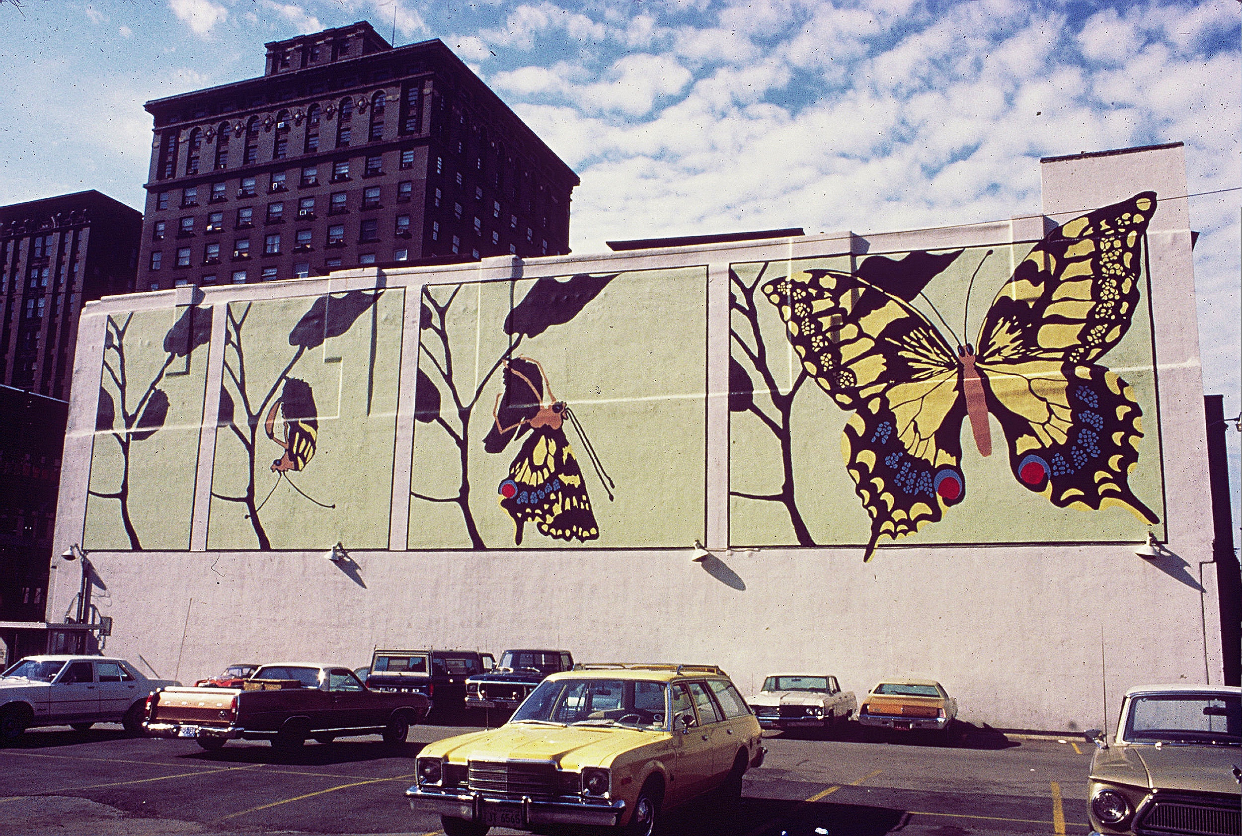
Acrylic on stucco, 125’ x 45’
Located in the heart of downtown St. Louis
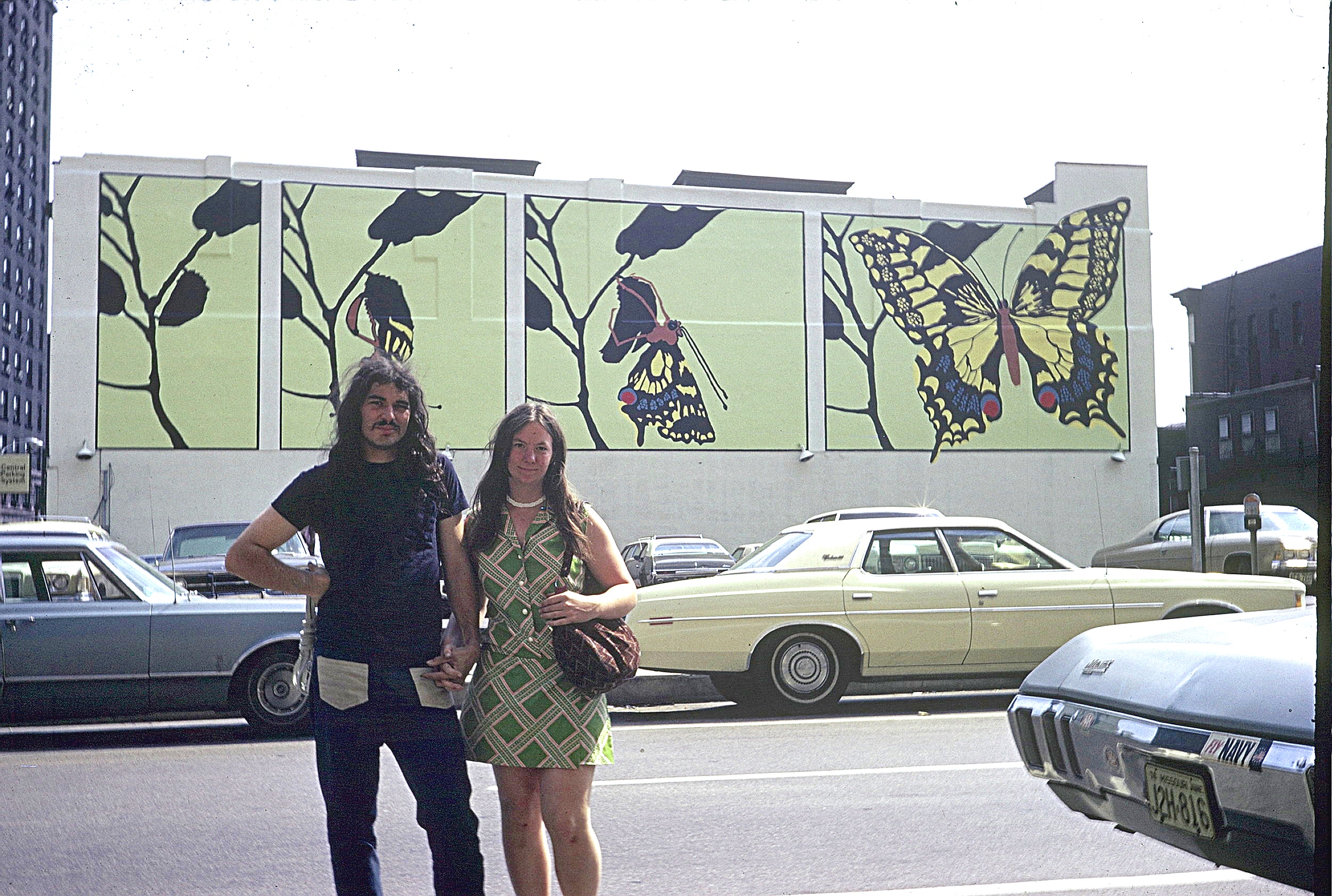
The artists, Robert Fishbone and Sarah Linquist, just out of Antioch College
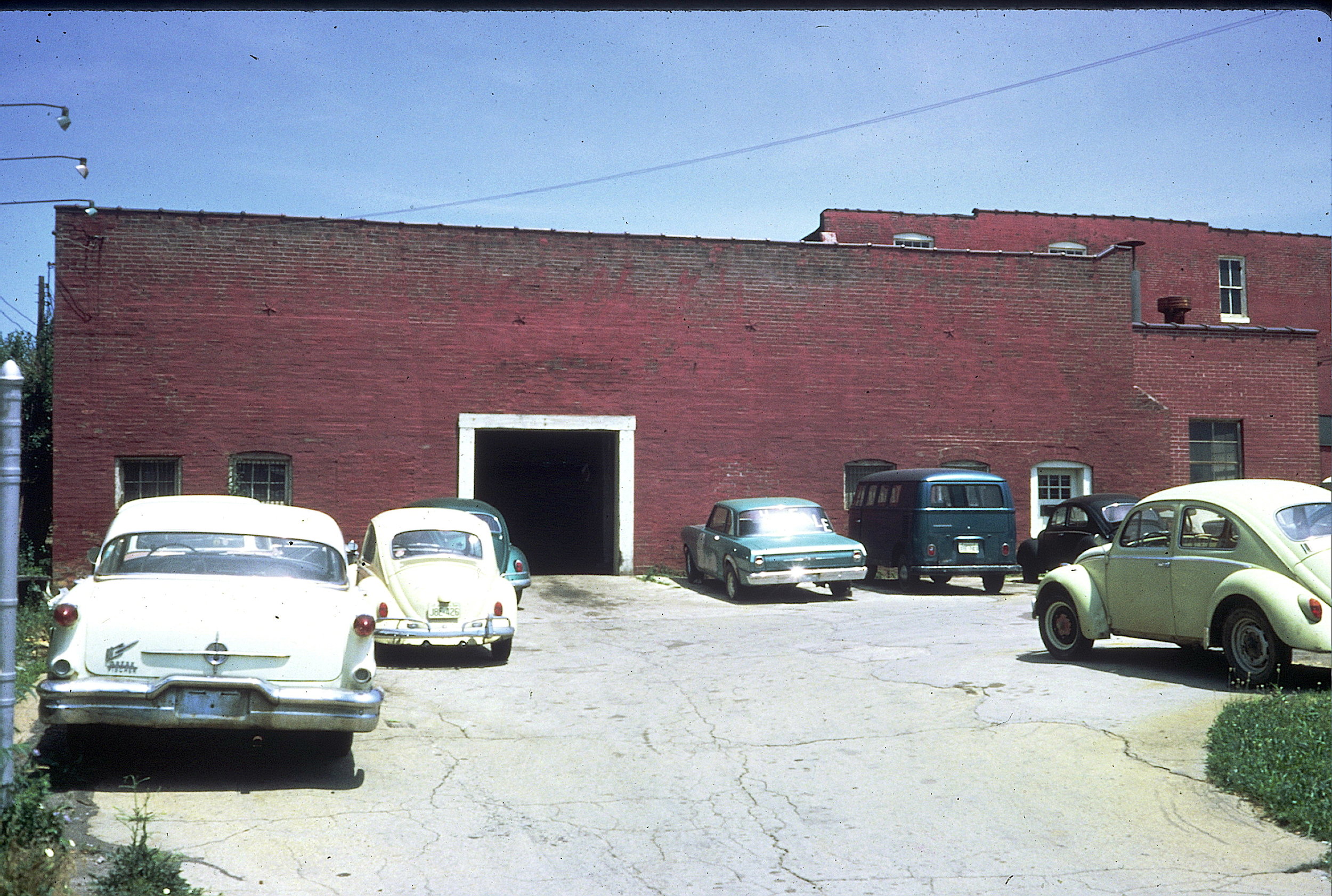
Volks and Vans Auto Repair
Building before mural
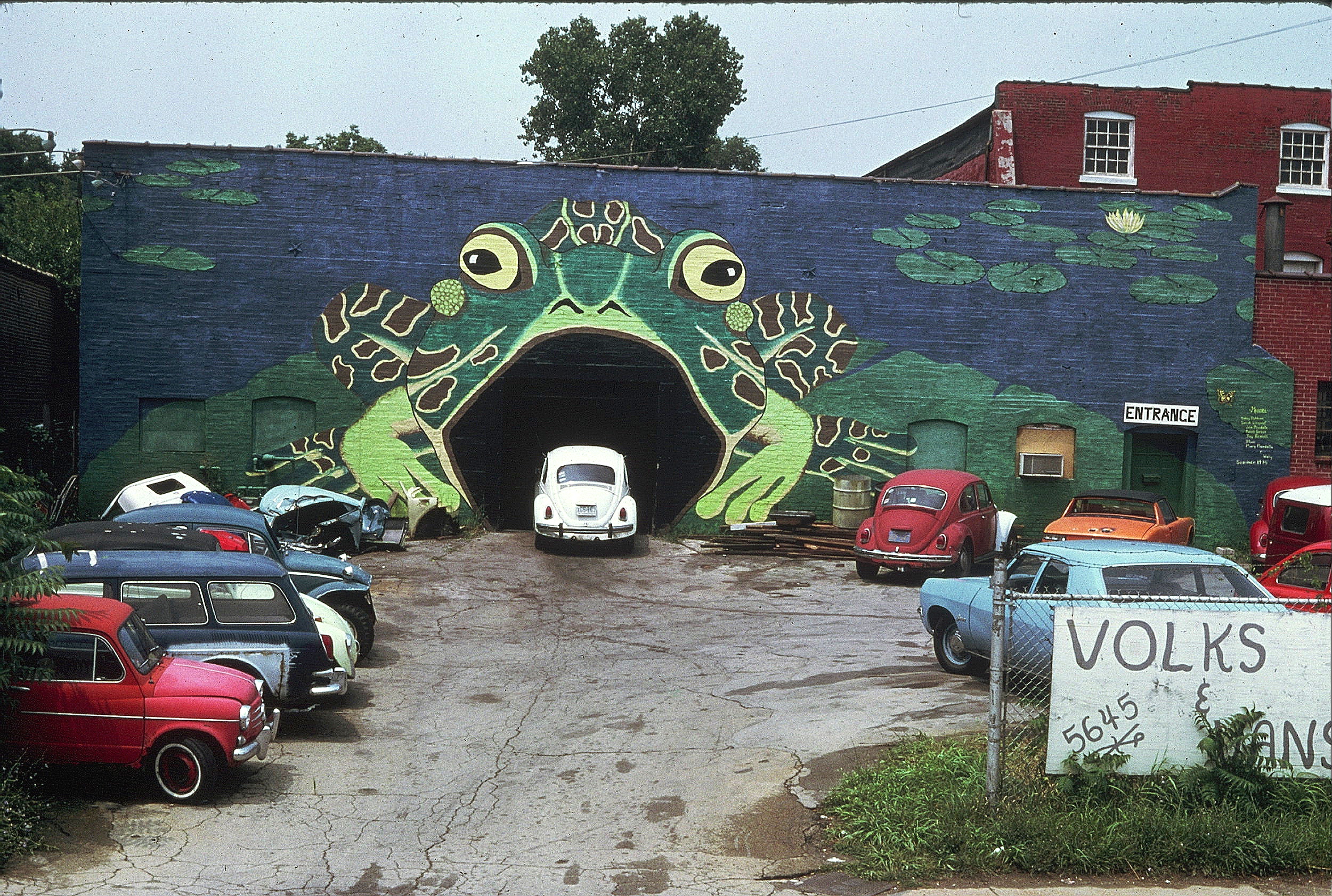
Acrylic on brick, 65’ x 20’
People asked if we painted muriels (murals), so we painted our second and named it Muriel. You would drive your ‘Bug’ into the frog’s mouth to get it repaired.
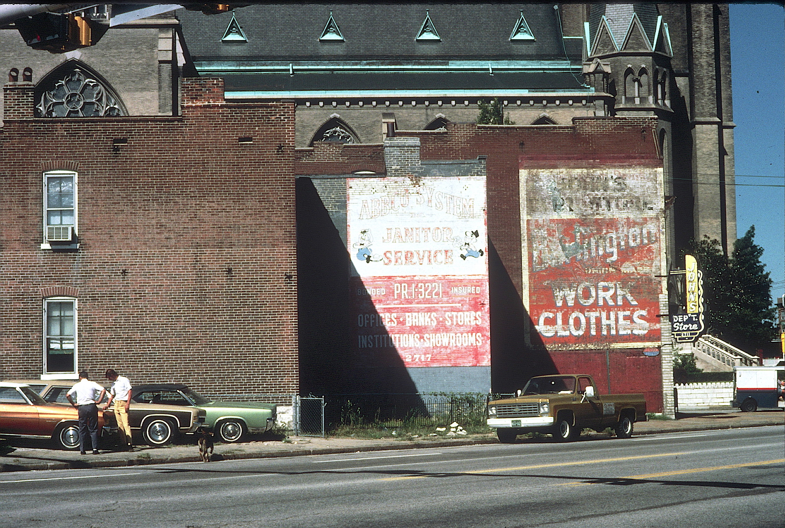
Commuters would pass these three walls as they drove to downtown St. Louis in the morning.
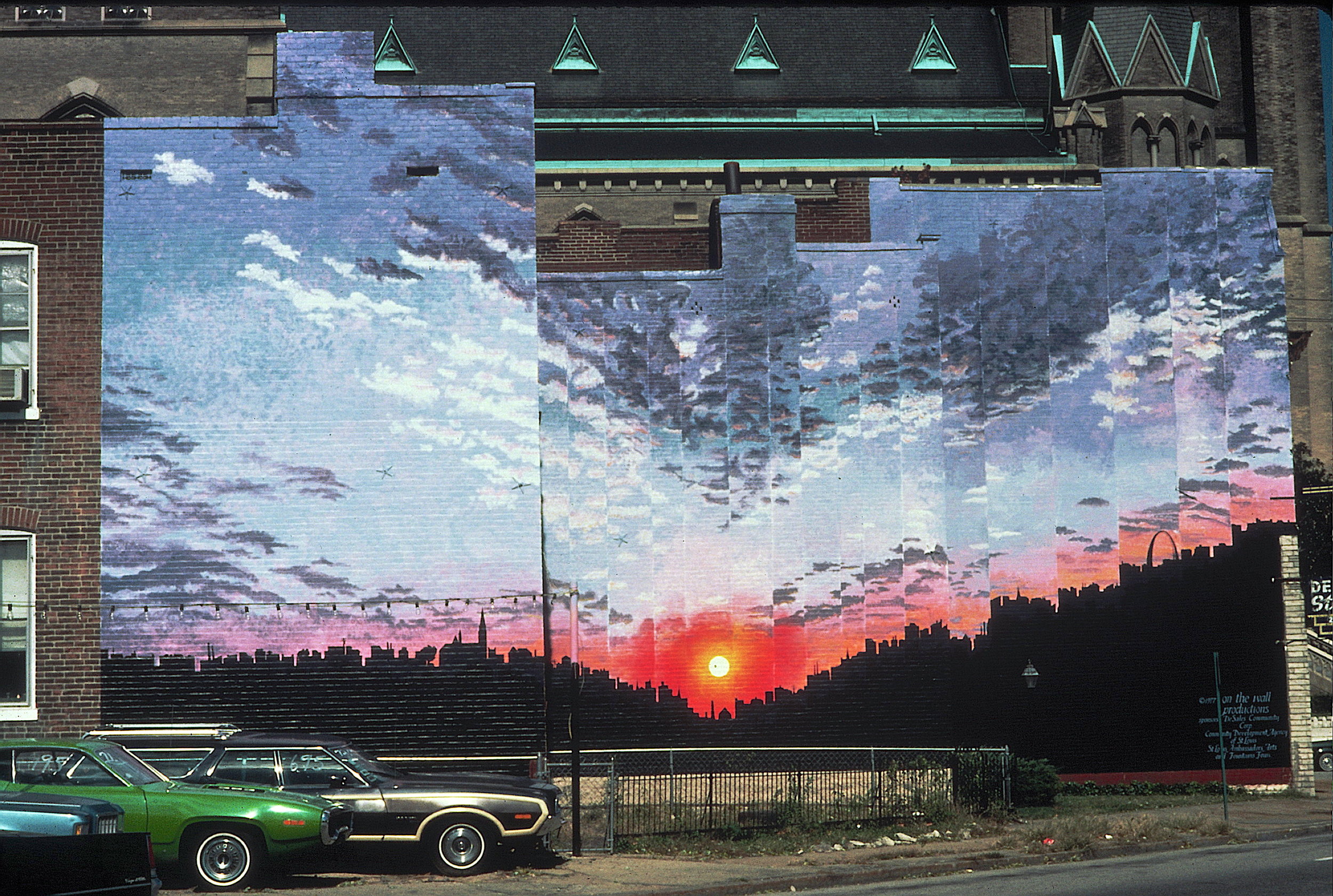
Acrylic on brick, total of 60’ x 28’ on three stair-stepping buildings. From far away you only saw the left most building. As you approached the walls they would spread out to line up at one moment. At some times of the year you could see the real sunrise as well as our painted sunrise. Some people described this as the mural with the Arch in it…
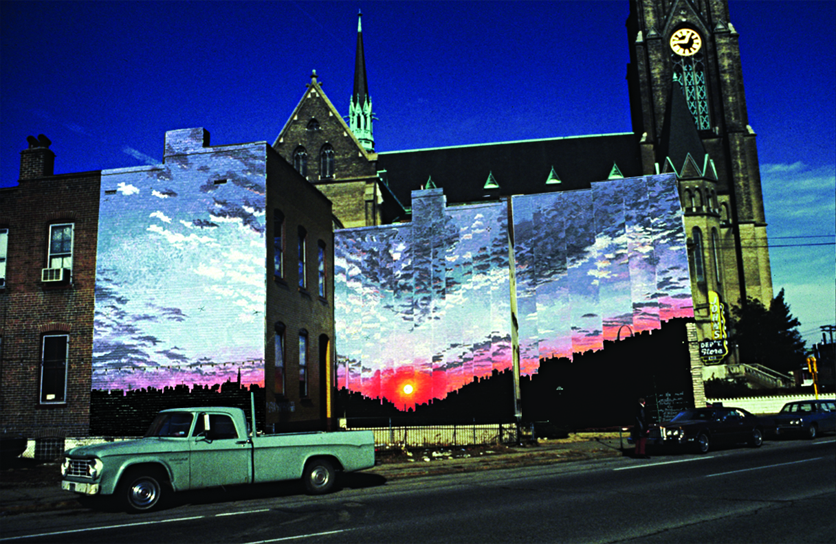
Acrylic on brick, total of 60’ x 28’ on three stair-stepping buildings. After the buildings lined up for a moment, they would separate into three distinct walls as you continued down the avenue. Like with Lindy Squared, we played with the viewers spacial relationship with the artwork.

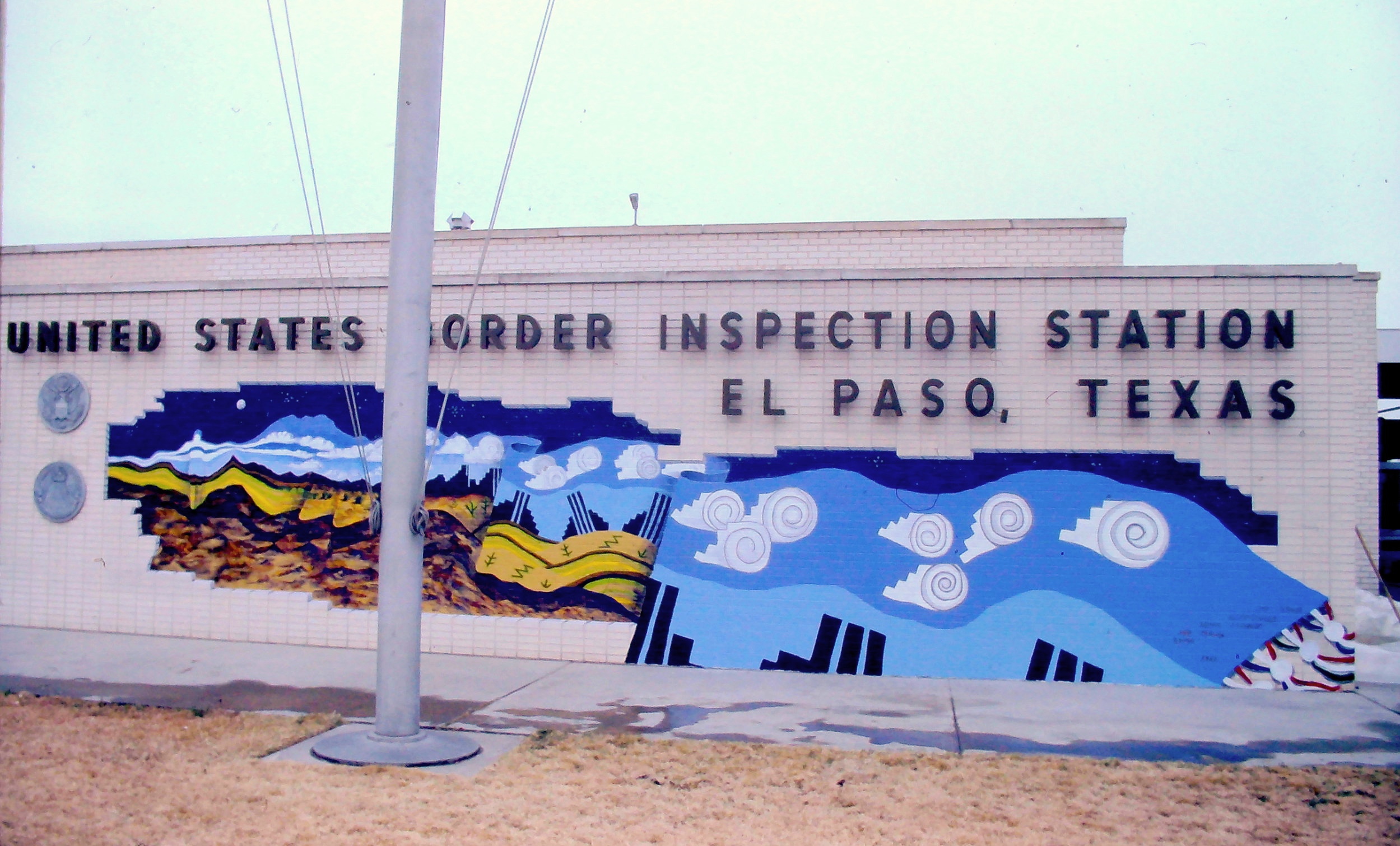
Acrylic on brick, 45’ x 10’.
Painted as part of the 400th birthday celebration of El Paso, we worked with six artists from El Paso, Texas and six artists from Juarez, Mexico to design and paint the mural on this US Border Inspection Station. Tens of thousands of travelers watched us paint.
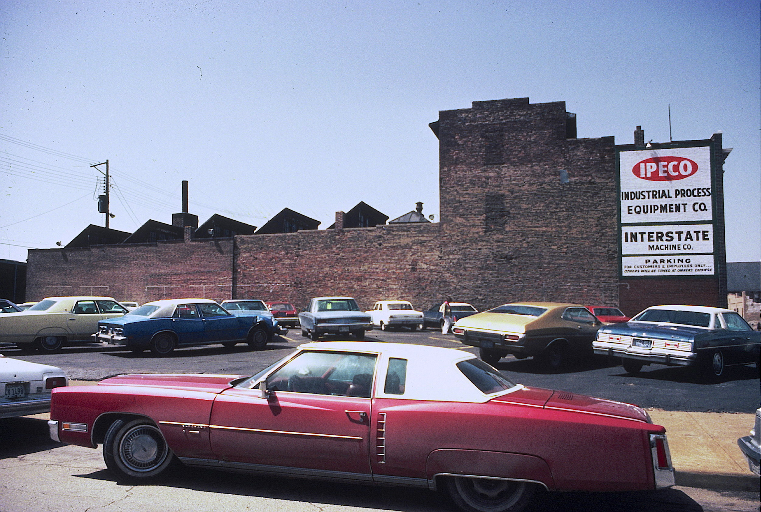
This building is located in the area of St. Louis where cars were repaired and sold in the earlier part of the 1900’s. Most of these cars were no longer made or sold in St. Louis when we did the mural so we show them in that great parking lot up in the sky!
The building owners appreciated our work and commissioned us to do a mural as a gift to the city. The entire wall needed to be repaired to do the painting.
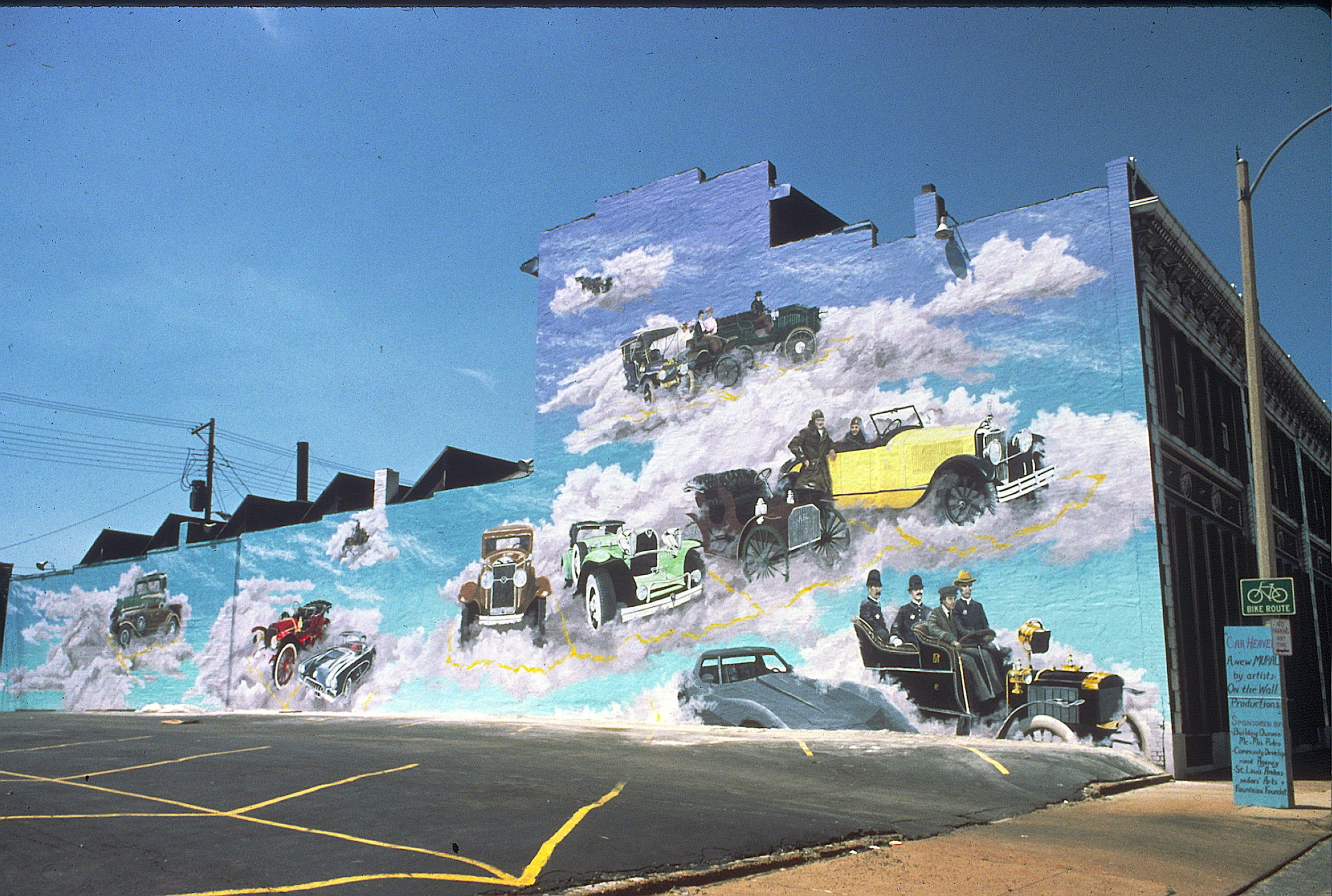
Acrylic on stucco, 130’ x 15’-28’
This building is located in the area of St. Louis where cars were repaired and sold in the earlier part of the 1900’s. Most of these cars were no longer made or sold in St. Louis when we did the mural so we show them in that great parking lot up in the sky!
The building owners appreciated our work and commissioned us to do a mural as a gift to the city. The entire wall needed to be repaired to do the painting.
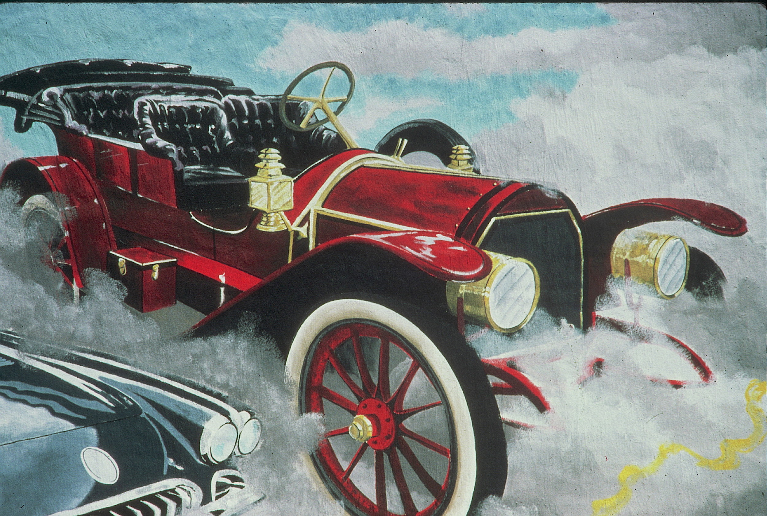
One of the amazing cars we actually were able to see that we included in the mural. They don’t make them like this anymore!
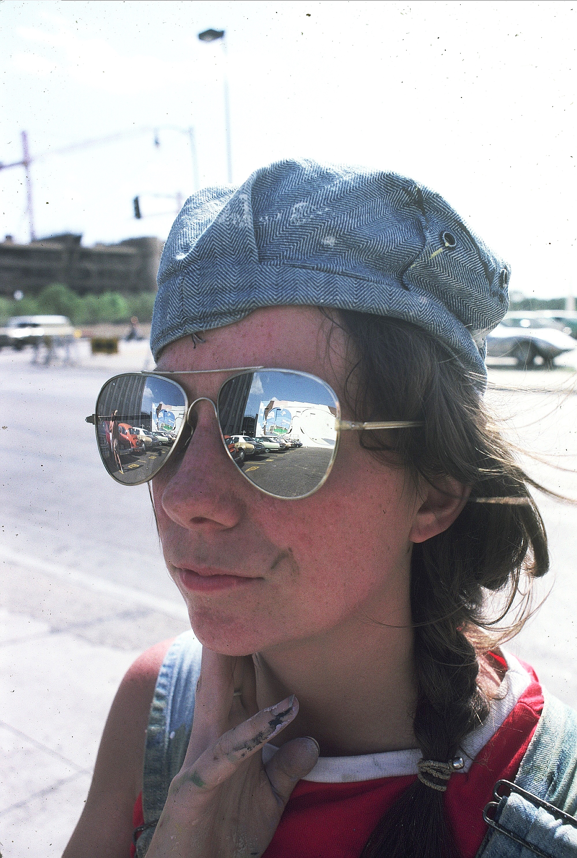
Acrylic on stucco, 85’ x 22’, commissioned by the building owner
We were amazed to see how many reflecting glass buildings were located throughout the downtown area of Dallas, so we decided to do a more personal reflection. This in-progress shot shows the mural reflected in Sarah’s sunglasses…what is reality?

One of our artists is seen here working from our design for the mural.
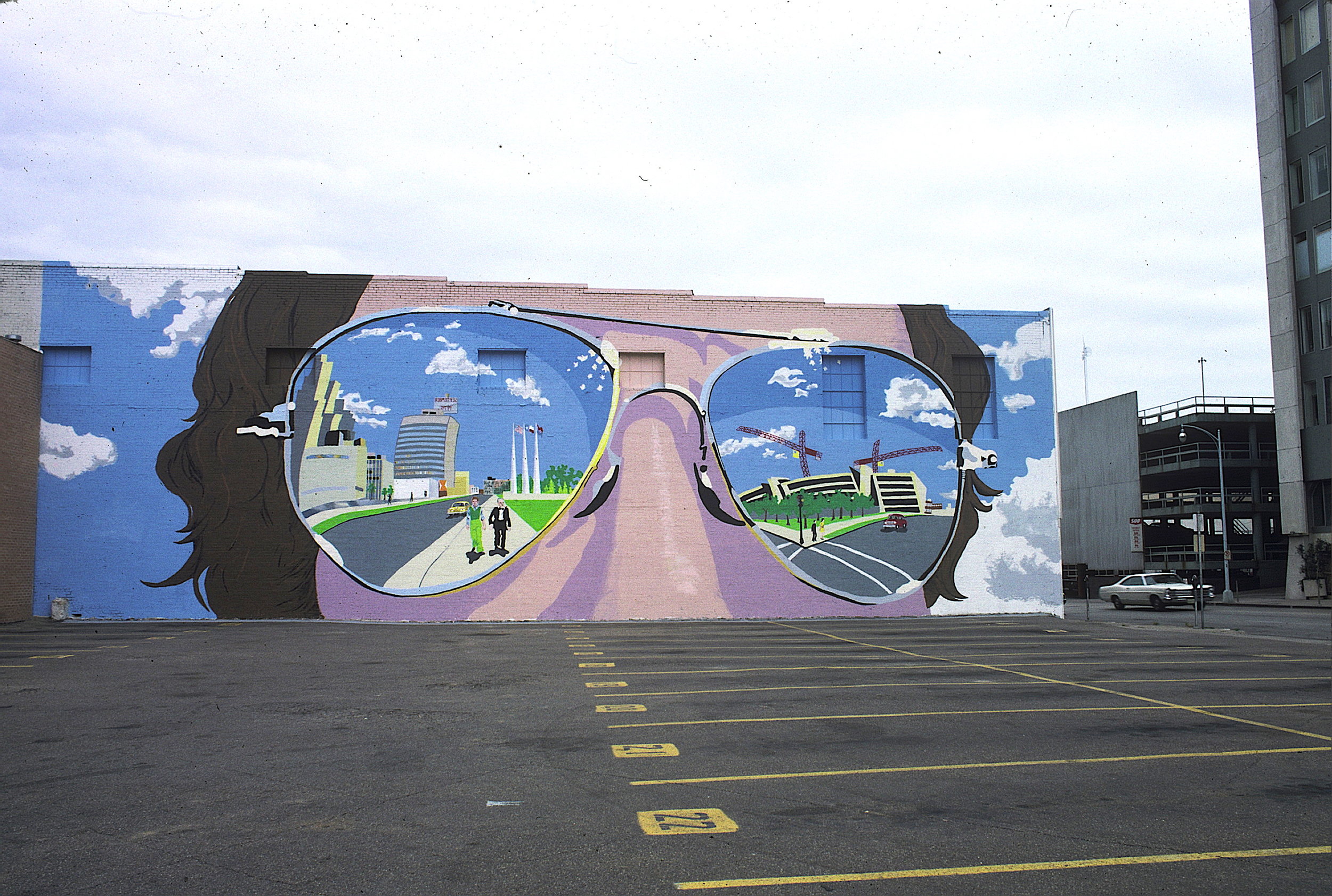
Acrylic on Stucco, 68’ x 22’, This painted reflection of the downtown area shows Sarah walking down the street with the building owner, as well as the new City Hall that was being constructed while we painted.
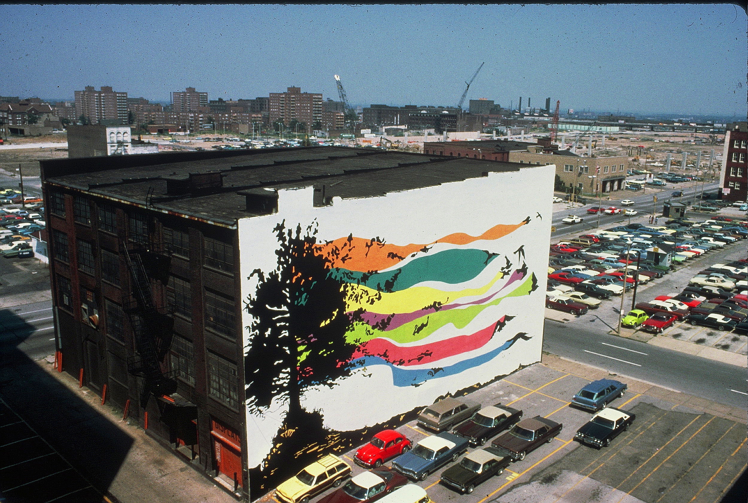
Acrylic on stucco, 100’ x 60’.
Faced with a 6,000 square foot wall and a limited budget, we chose to render as a solid color graphic, a wind swept tree, which leaves transform to become swooping birds. The long ribbons of color help to link it all together.
When faced with a giant wall, simple sometimes works best.
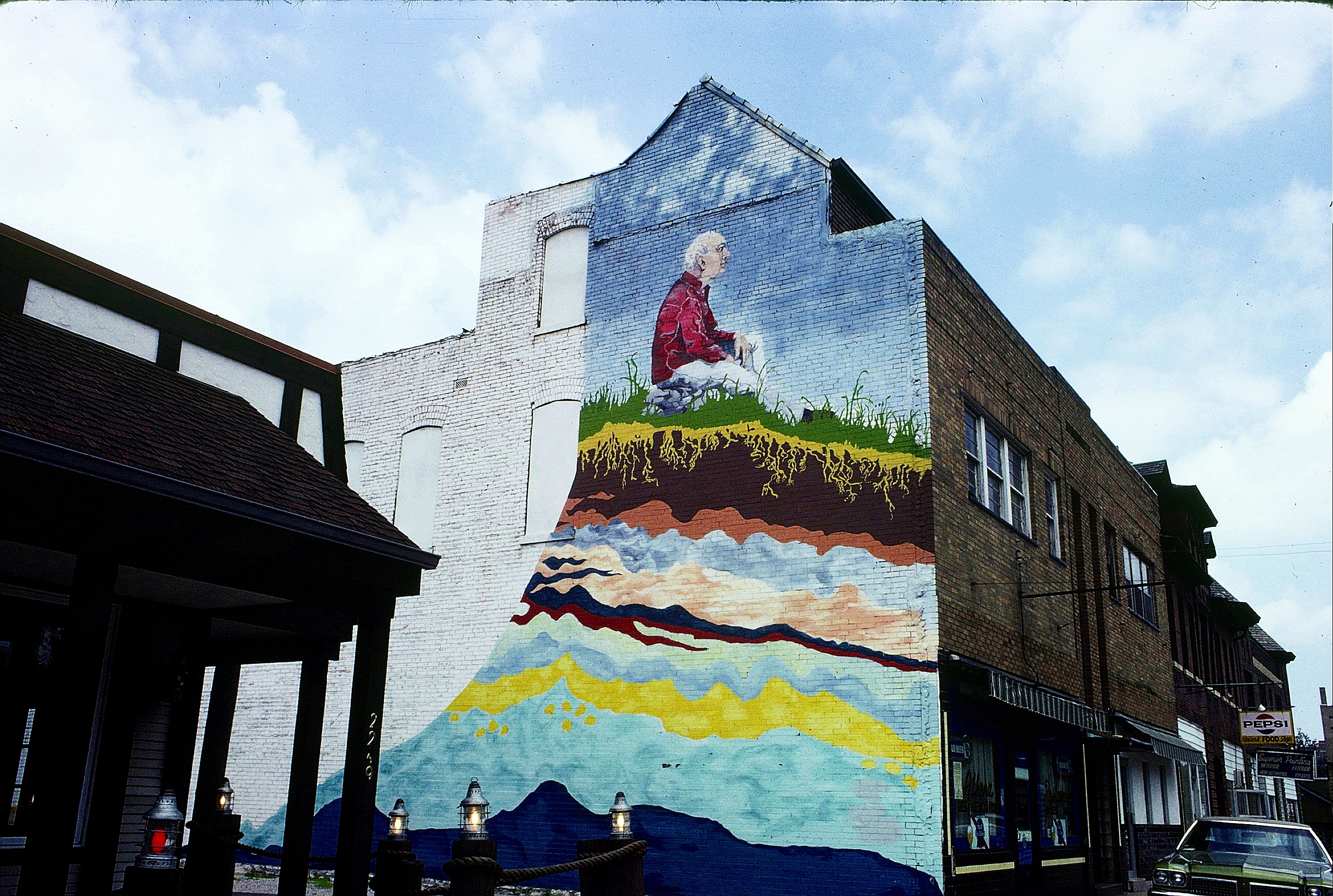
One Shot Bulletin Sign Painters Paint (never ever use oil paints for a mural!!!) 18’ x 30’
In our third year as mural painters, we received a grant from the NEA to do several murals along well traveled roads throughout St. Louis City. The St. Louis Beautification Commission, which we found out were already fans of our work, doubled the project, which mostly meant we would actually get paid for the five murals completed.
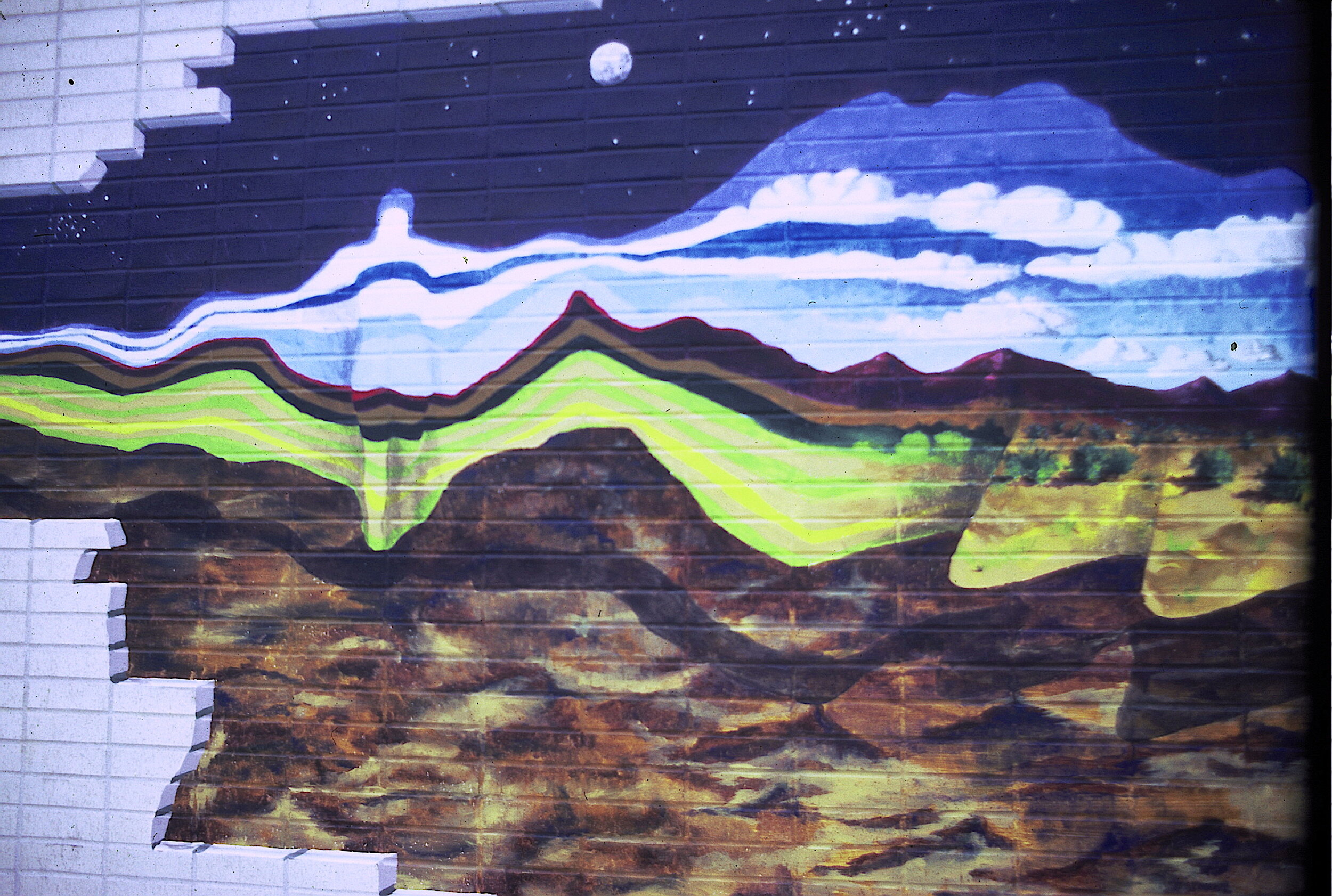
This mural shows the serenity that can come with aging, and pictures a man sitting on a cutaway hillside. The revealed layers, going from realistic to whimsical, are a metaphor for the depths that can be reached through meditation. On the other hand, some folks said we needed to put a fishing rod in his hands. Different practice, similar goals.
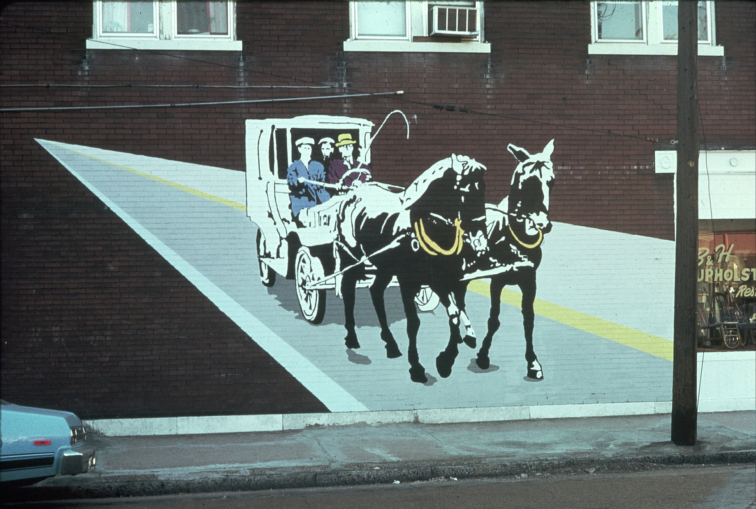
Acrylic on brick, six small murals on six separate walls. Part of an NEA grant.
We chose to recreate the feel of the area from a time when the still remaining, centrally located horse trough served a functional purpose. This painting depicts gasless Sunday. But people loved their new fangled cars so much, they would pull them around with their horses!
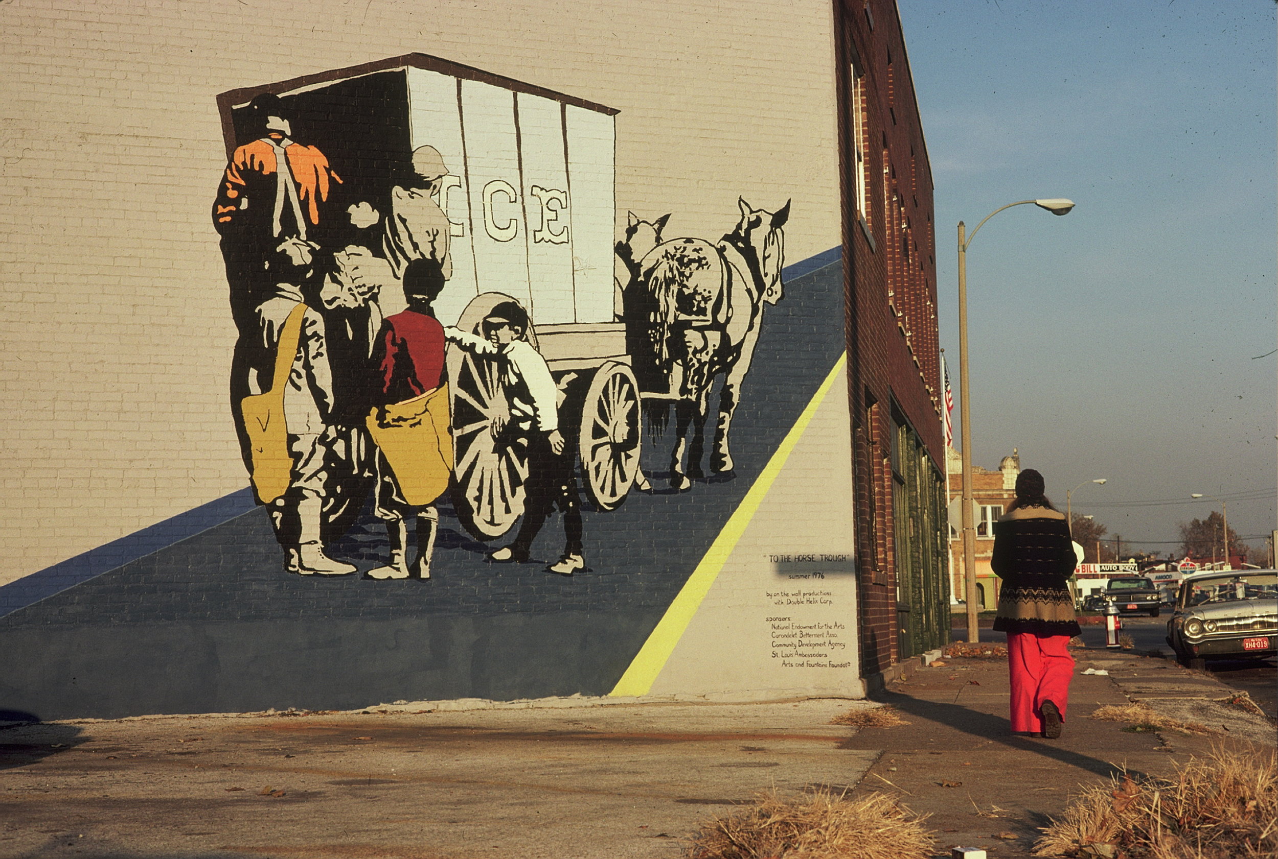
Acrylic on brick. Another one of the six small murals painted through an NEA grant.
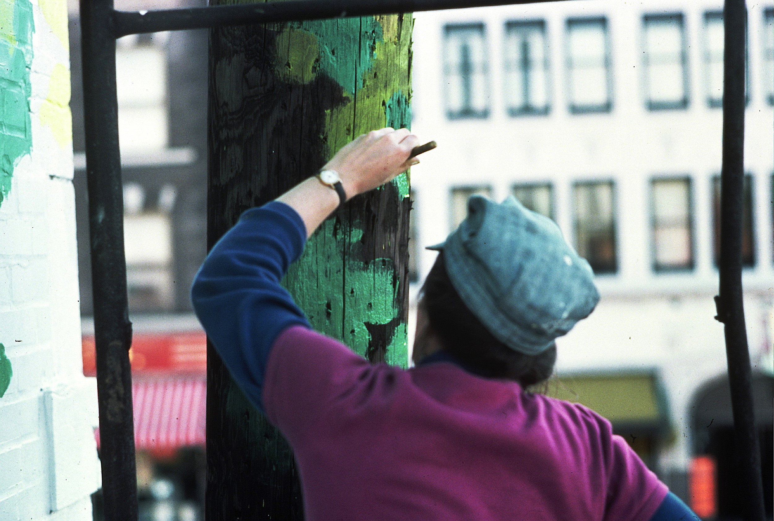
Mural painters often have to deal with environmental factors like odd building shapes, traffic patterns, windows, chimneys, fences and utility poles, all of which can be seen as problematic.
Since our designs are always site specific, we often look for a solution in these problems, let them speak to us. The utility poles were the most prominent blocking feature of this site, and since there is a beautiful Victorian Park nearby they became…
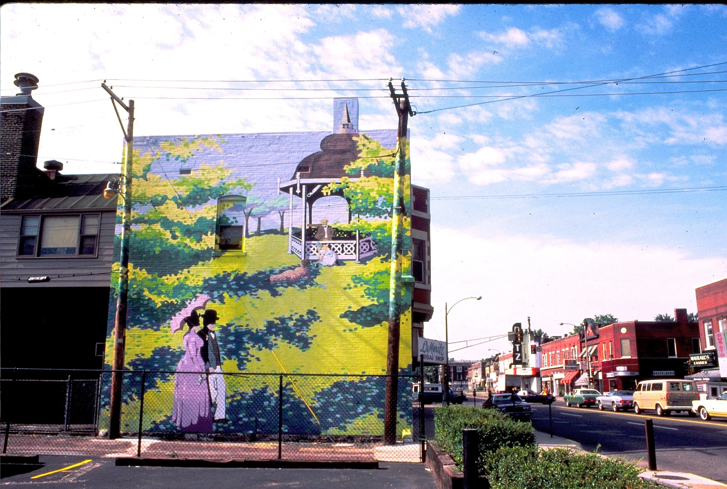
Inspired by the Victorian, Tower Grove Park across the street, we transformed the utility poles into trees, and did a play on Seurat’s, “A Sunday Afternoon on the Island of La Grande Jatte”. However, where Seurat used very tiny dots of paint, our points were several inches across to match the scale of the mural. It became a landmark for this part of St. Louis.
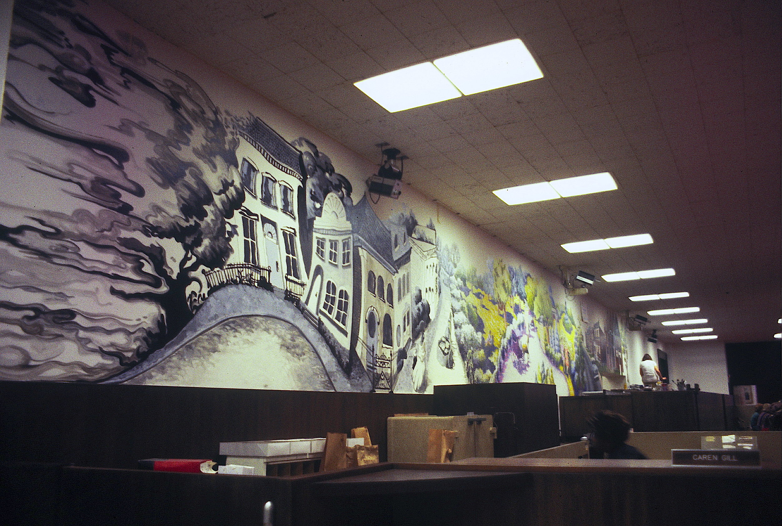
Acrylic on drywall, 95’ x 5’
After commissioning us to do an outdoor mural on a nearby building (see ‘Que sera, Seurat’, just previous in this decade), Tower Grove Bank asked us to design and paint an interior mural for the bank depicting the history of the area. In this shot you can see that it is a time lime, which evolves through different painting styles to evoke the feeling of the era, from mid-1800’s through the future!
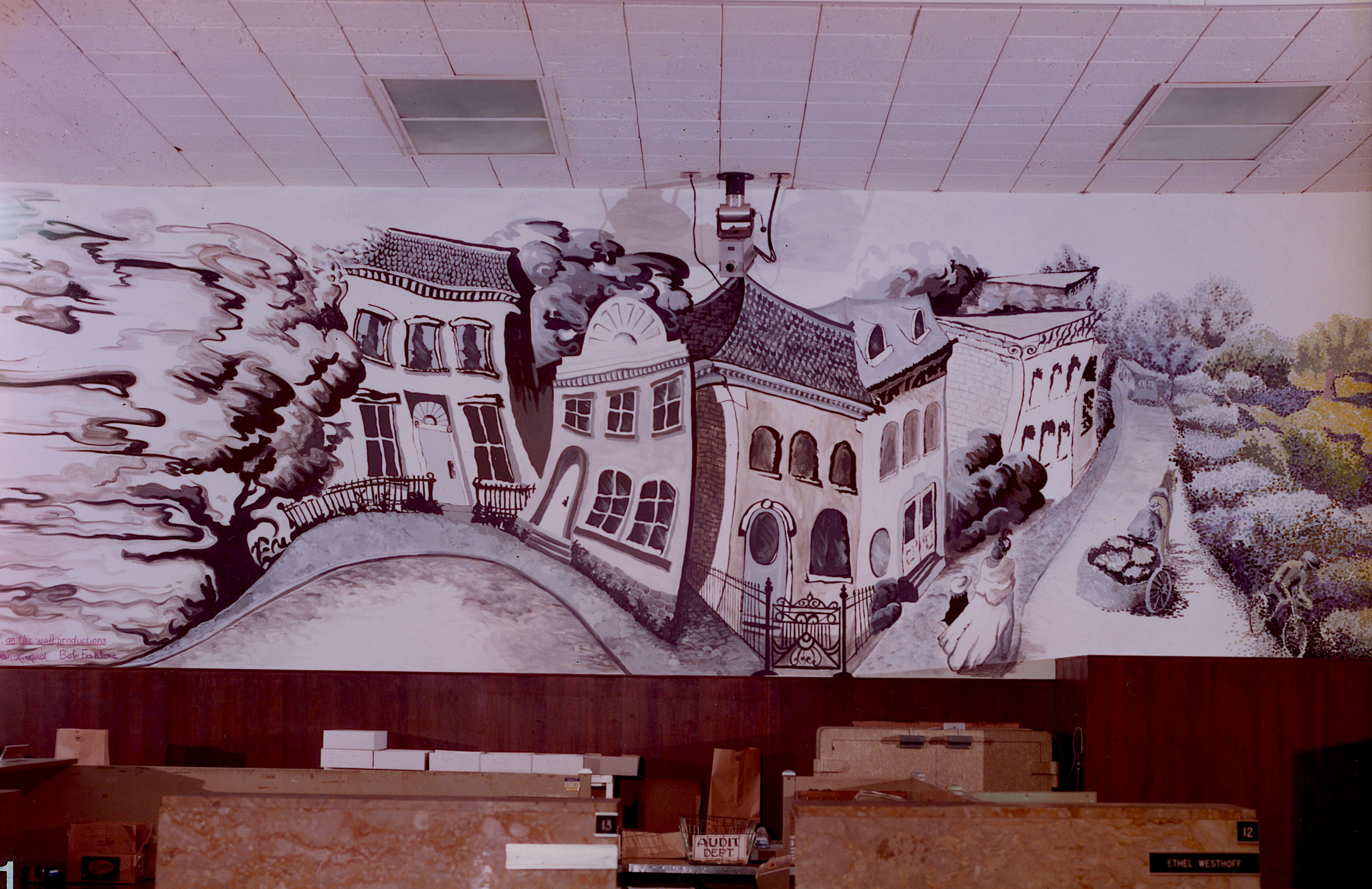
Acrylic on drywall, 95’ x 5’
The mural begins with cloud shapes, done in shades of gray, hazy like foggy memories. These form a tree from which actual historic homes emerge.
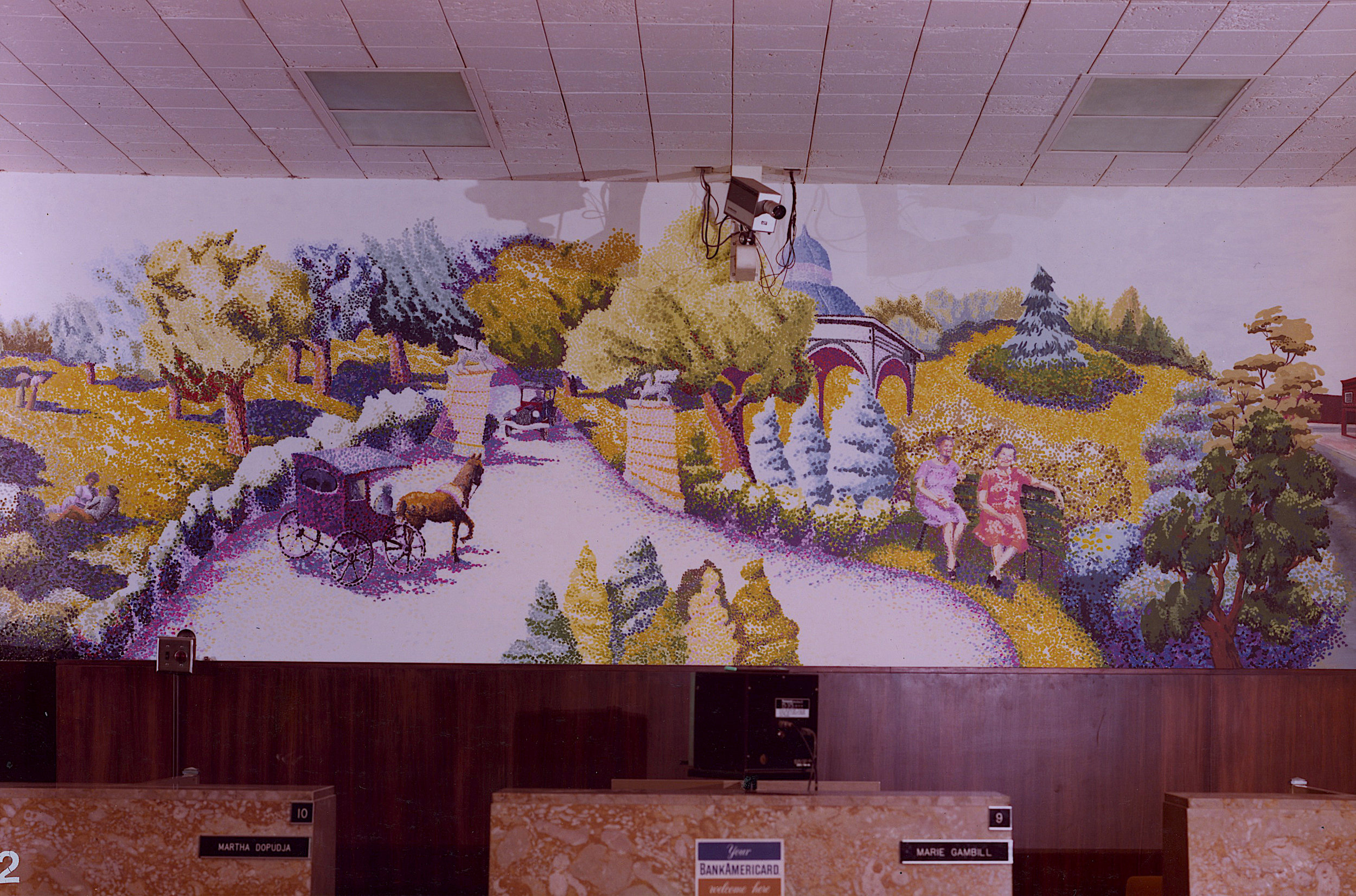
Acrylic on drywall, 95’ x 5’
The late 1800’s to early 1900’s focus on the exquisite Tower Grove Park, rendered in a pointillist painting style, popular in that time period. This is the same style we used to paint ‘Que sera, Seurat?’. The two ladies on the bench were long time customers of the bank.
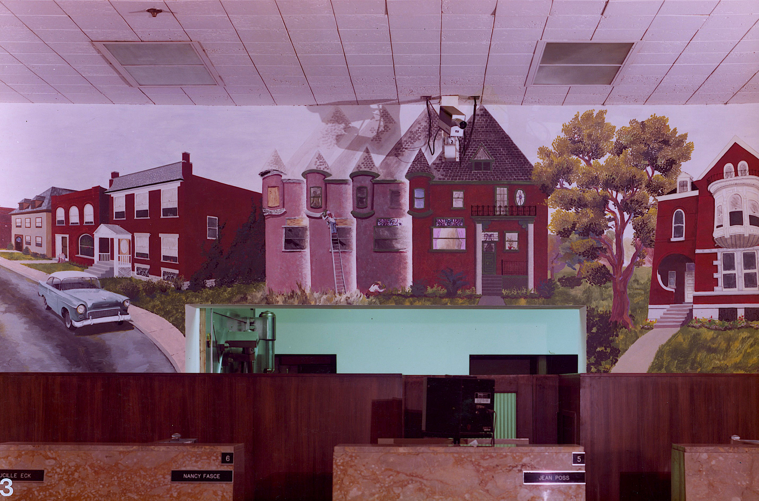
Acrylic on drywall, 95’ x 5’
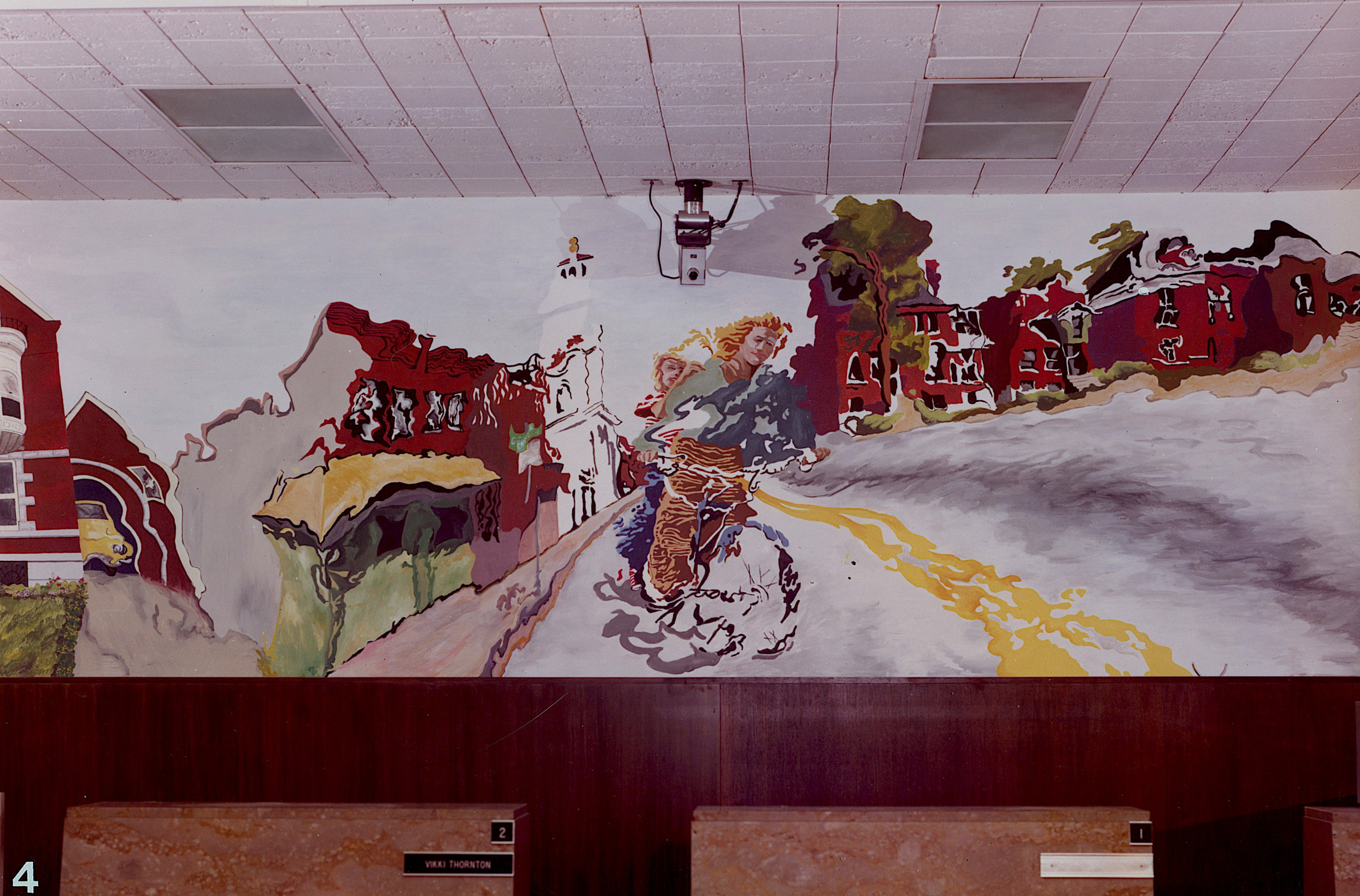
This section depicts the 1950’s - 1970’s when people began to seriously look at renovating some of the beautiful old homes. This one is transforming before our very eyes!
Acrylic on drywall, 95’ x 5’
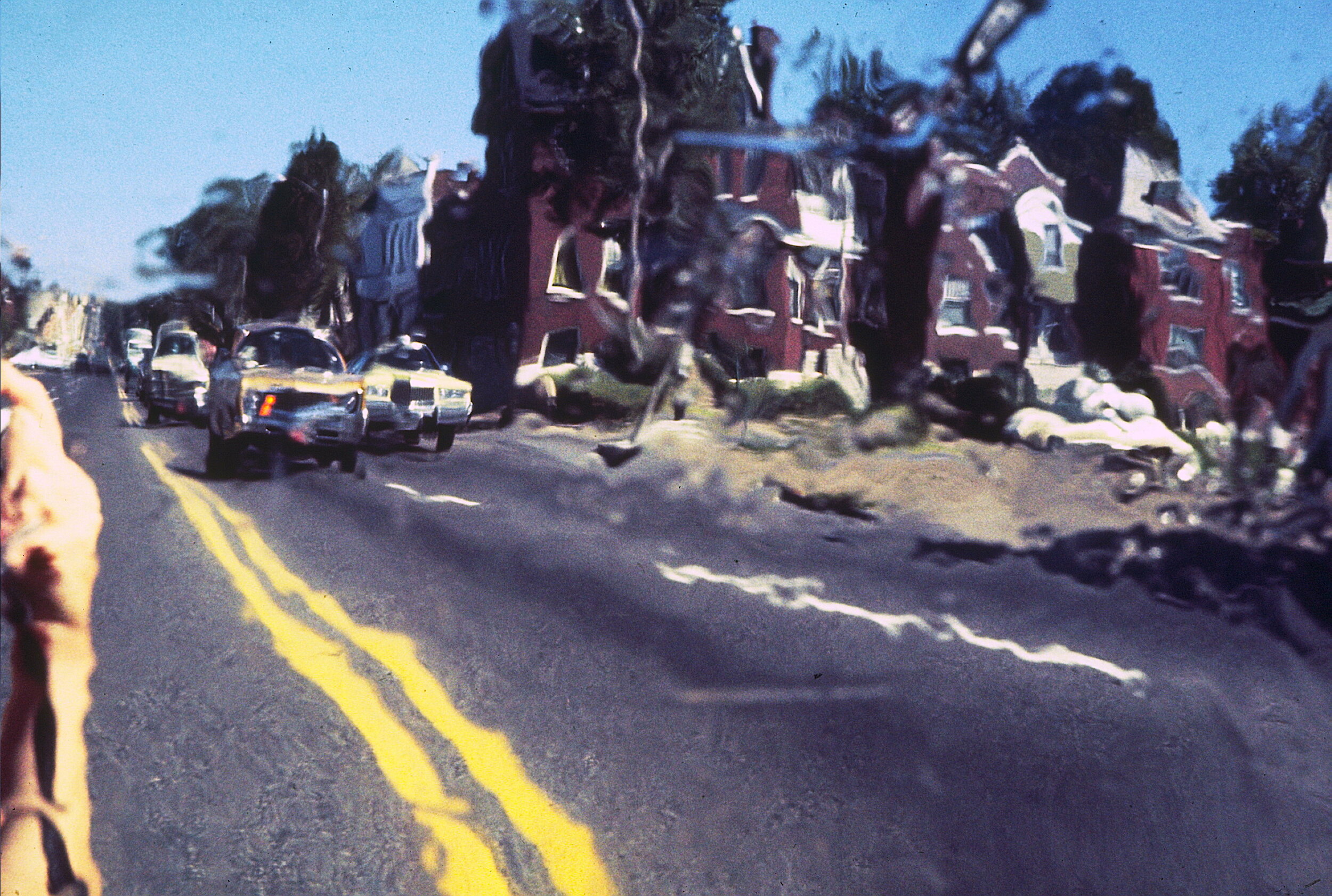
From renovations, we look towards the future which, like the past, is not easy to conjur. To make this section we stood in the street with a very thin and flexible sheet of mylar plastic film, then took pictures of the wavy reflection which included these two kids on a bike. It’s dangerous work being a mural painter!
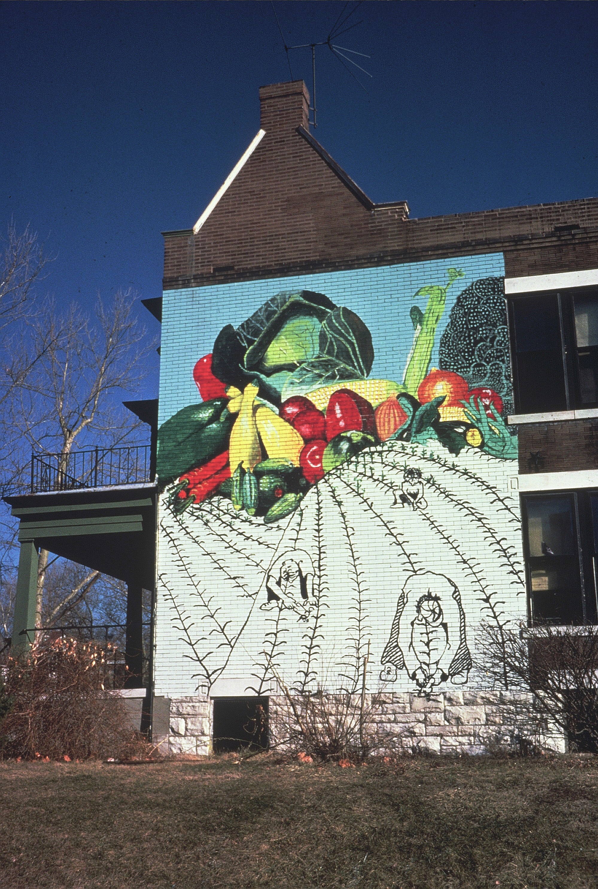
Even way back in 1975 there was an awareness of inner cities being food deserts, and there was a movement to create community gardens. This house was the project headquarters and shows that hard work (in black and white) can yield an explosion of colorful and healthy vegetables. We also did smaller, stenciled murals on walls adjacent to the 30 gardens that were created in vacant lots around the city.
Acrylic on brick, 24’ x 24’
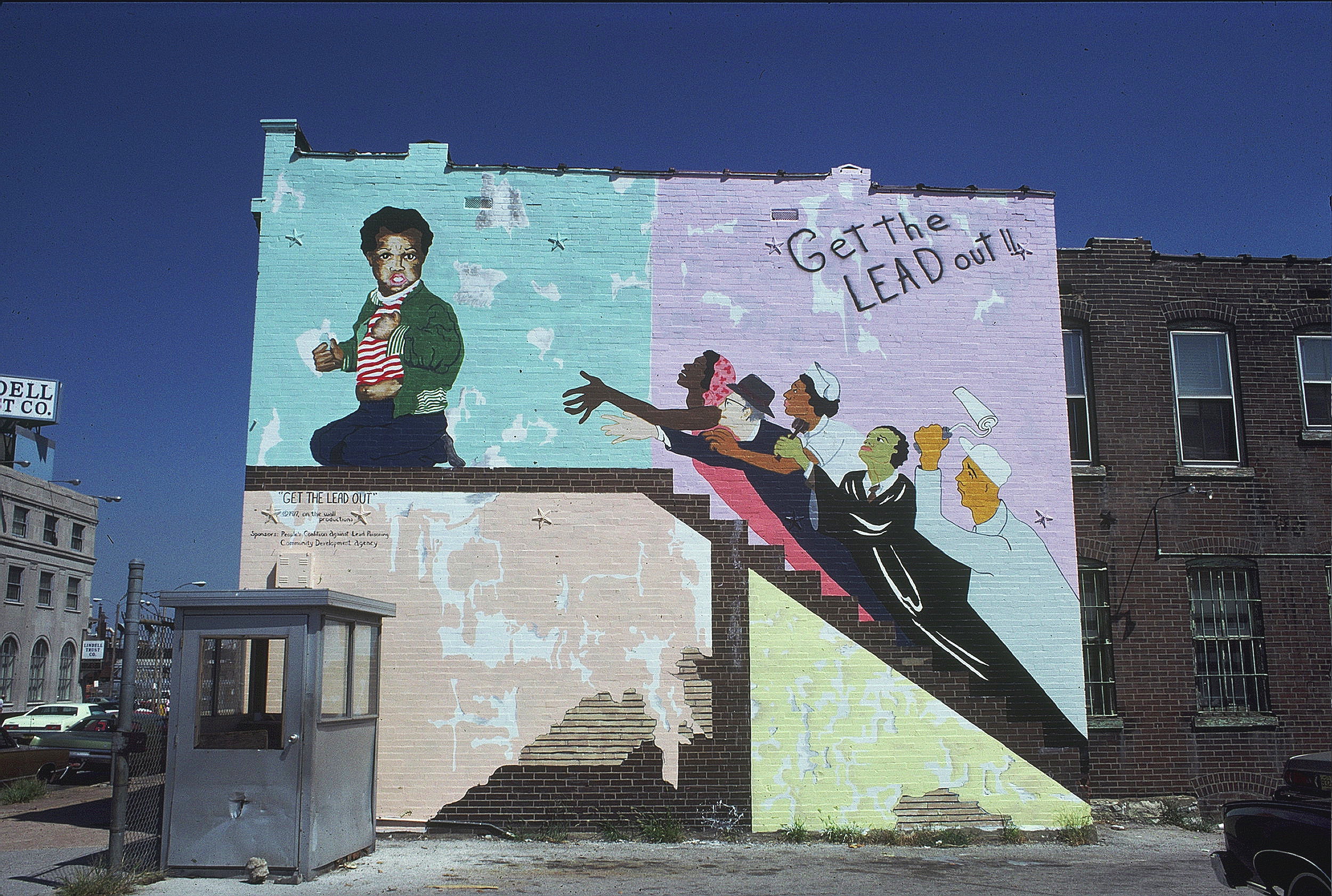
The lead paint that was often used to paint walls and woodwork in older buildings is toxic, especially for young children, It’s sweet taste doesn't help. When a building is torn down, it often reveals the painted, interior walls from the connecting building. In this case, it has exposed a child holding a paint chip while a parent, a landlord, a nurse, a judge and a painter are swooping up the stairs to try and stop the child from eating the paint chip. They are the five groups that need to work together to solve this really scary problem.
The mural was completed on the Yeatman Community Health Clinic in north St. Louis, that provides lead paint testing of children. The mural makes it really easy to find the clinic.
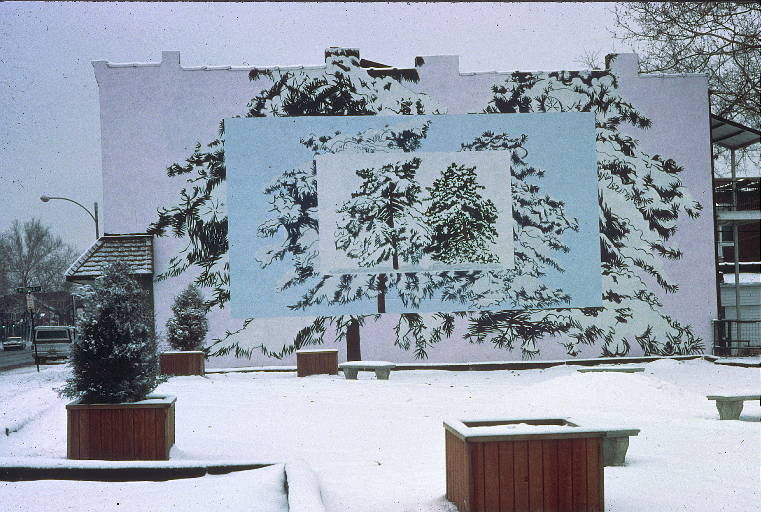
In 1974, after just arriving in St. Louis, there was a huge snow storm. I took a picture of two very large, snow covered trees in the park across from our home, somehow knowing it would be used for some piece of art, someday.
When doing a mural there are two main factors, the content or theme, and the style. It is the latter that really makes for a unique art piece. Here we see those same two trees repeated, or echoed, three times, with color changes in each layer. It seems to change when seen in different seasons. Completed as part of an NEA grant.
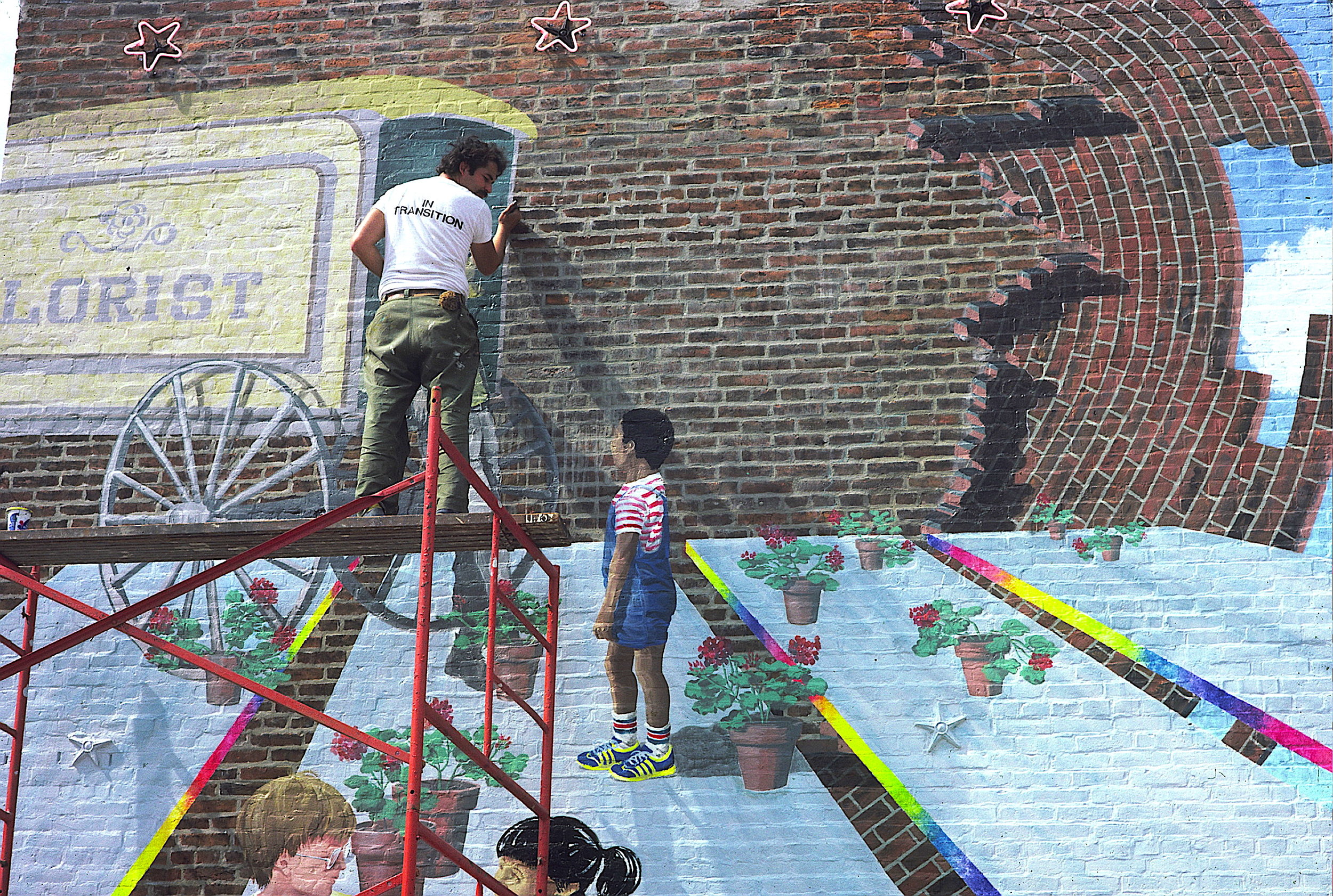
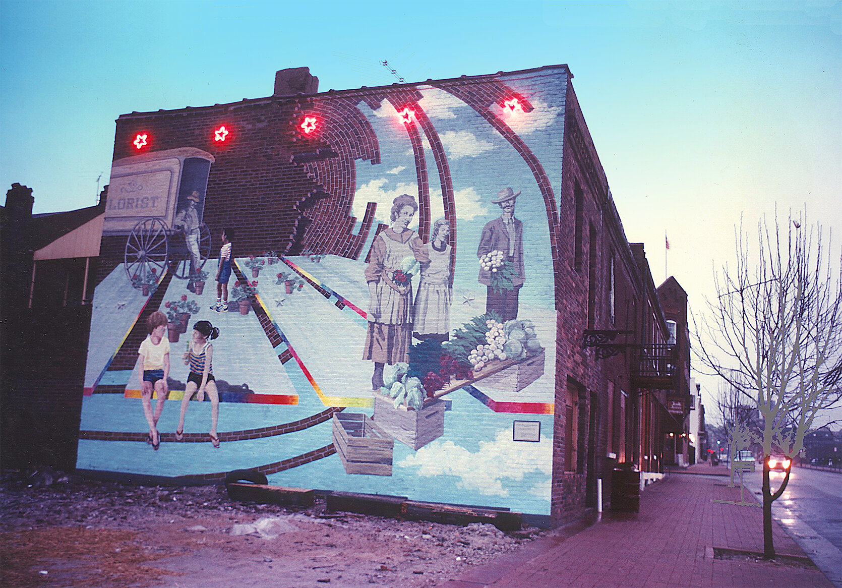
Directly across the street from this mural site is the very historic, Soulard Farmers Market. Like most urban areas, the ethnic makeup has shifted over the decades, and in this case, two centuries. At the time we designed this mural, the original predominance of Germans and other Central Europeans had come to include African-Americans and Asians; Hispanics arrived after.
We chose to depict the past and the present makeup of the area and added some more surreal design elements to this brick wall: animated, painted brick;, 3-D planes with rainbow edges; and neon stars around the metal stars.
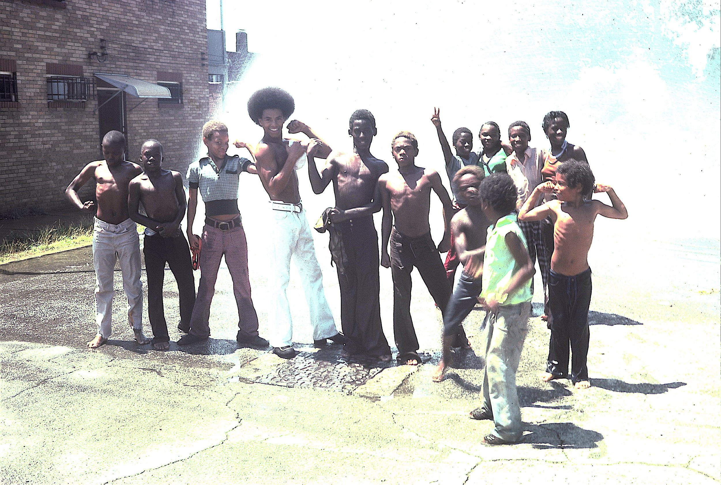
When scouting out the nearby neighborhood of a mural site, I never know what I’ll see. It was a very hot day and these kids were cooling off under the spray of an open fire hydrant. When I asked if I could take their picture they all got into posing and voguing for me. This became the basis of the mural (see next picture).
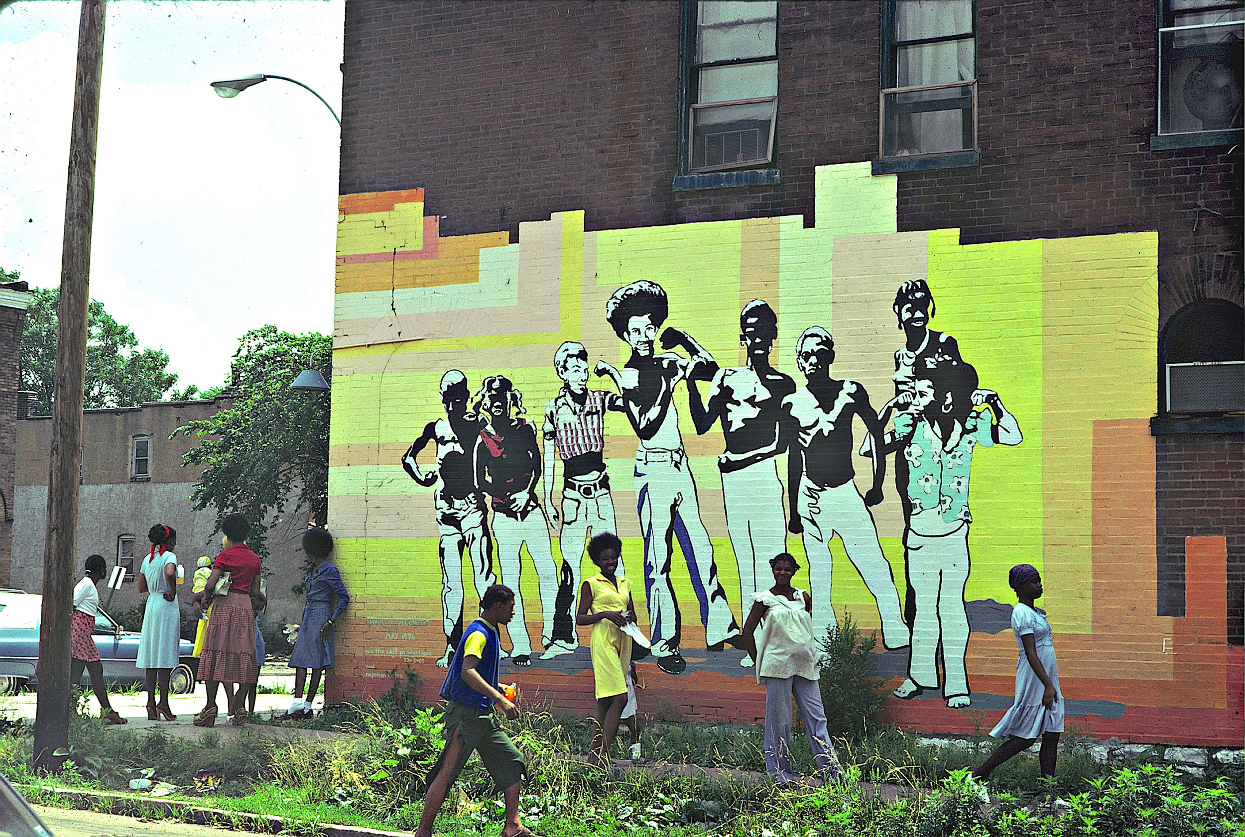
Acrylic on brick, 35’ x 15’
This has always been one of my favorite murals. Not only did it cover up a very old and decayed advertisement, it transformed the feel of the corner.
Just imagine what it would be like to see people just like yourselves, feeling their courage, pride and power, gracing a public mural. Paid for by the building owner, the building housed a corner church.
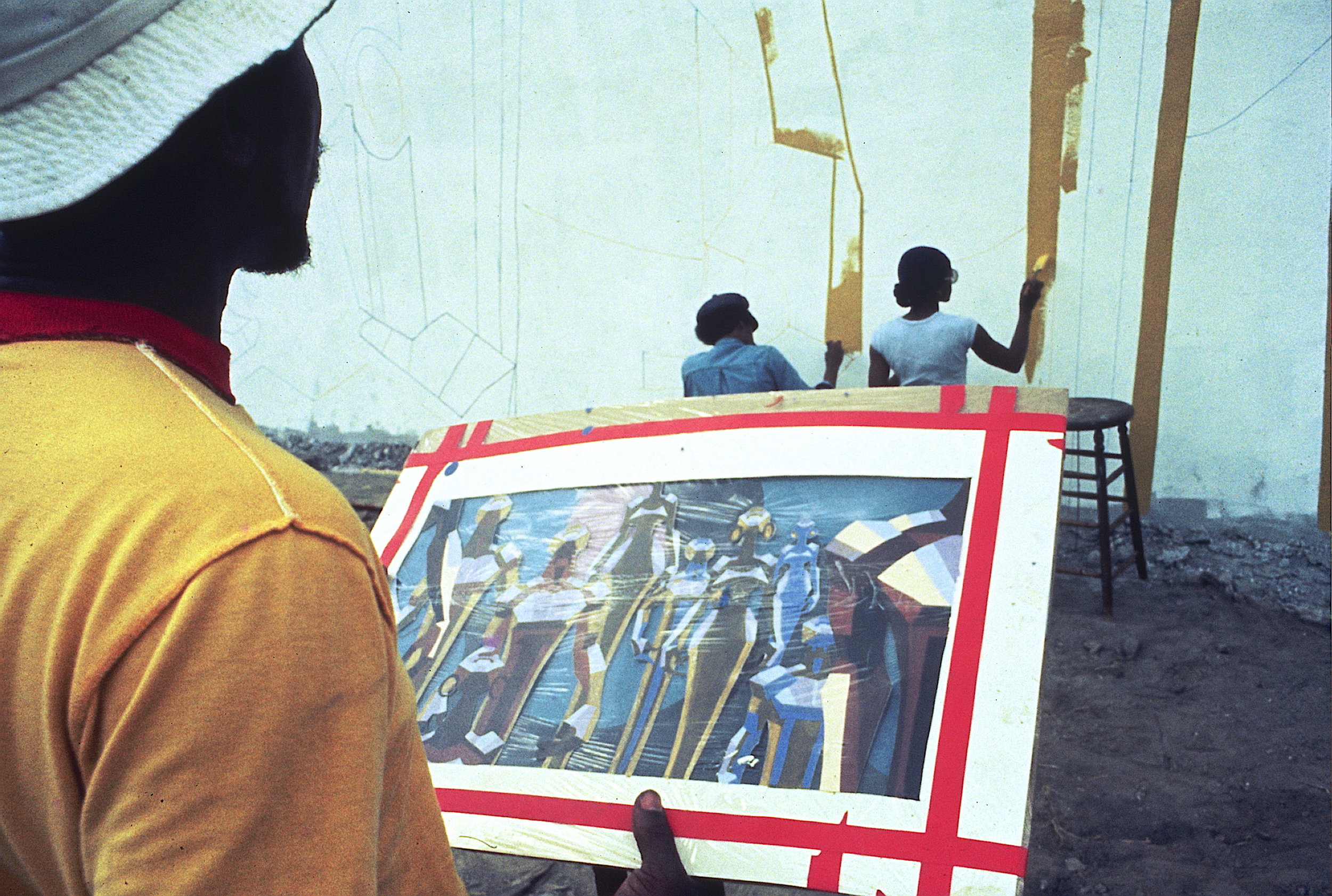
As part of our NEA grant, we asked the Creative Coalition, a group of African American artists, if they would like to learn how to design and paint large scale murals…”Yes!”
After several days of group designing one of the artists brought in his idea which was a perfect distillation of all of our discussions and sketches.
It was painted by about a dozen artists on a well known, community corporation headquarters.

The finished mural designed and painted with the Creative Coalition, a group of African-American artists.
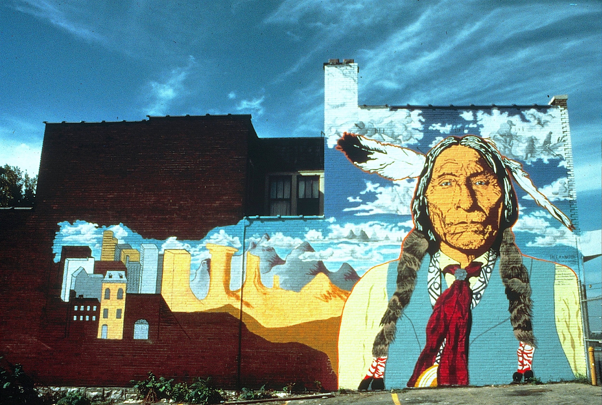
As part of our NEA grant we asked the Mid American Indian Cultural Center if they would like murals on their building to help identify the location. We designed for both the front and side.
The larger, side facing mural features Wolf Robe, a well known Cheyenne chief. It also depicts the change in living faced by many Native Americans, from open spaces to urban areas.
The shading in the clouds shows scenes from daily life, including the Trail of Tears, one of the many forced relocations endured by Native Americans.
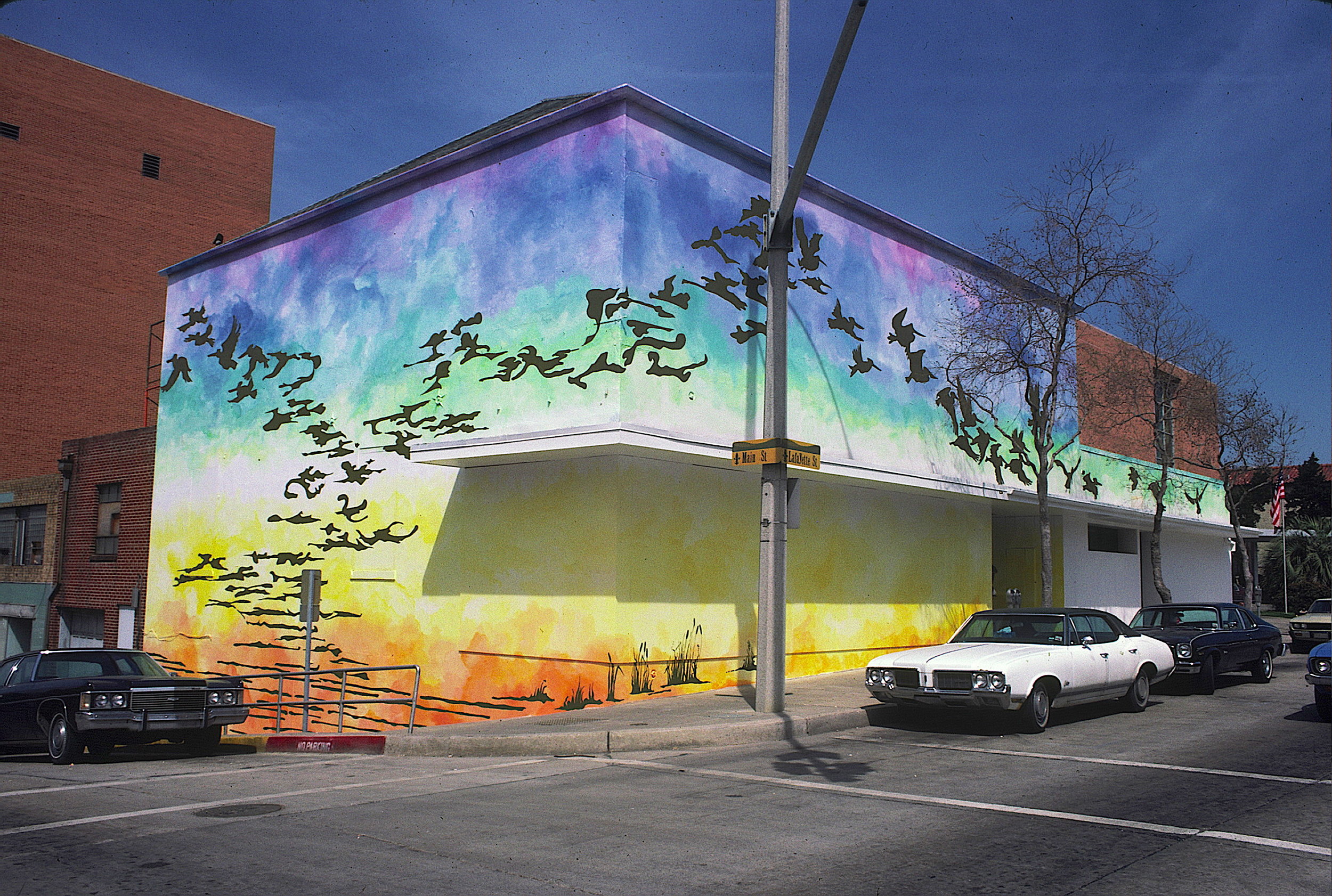
Acrylic on stucco, Whole building
We were brought to Baton Rouge to consult on their soon to be launched mural program. We gave presentations and discussed options. While there, they commissioned us on the spot to design and paint a mural on this building. We chose to do a metamorphosis, a popular theme for us. River reflections rise up from the water into a rainbow washed sky to transform into brown pelicans, the state bird, and fly away. Only later did we find out that this building used to be the Grand Old Pelican Furniture Store.
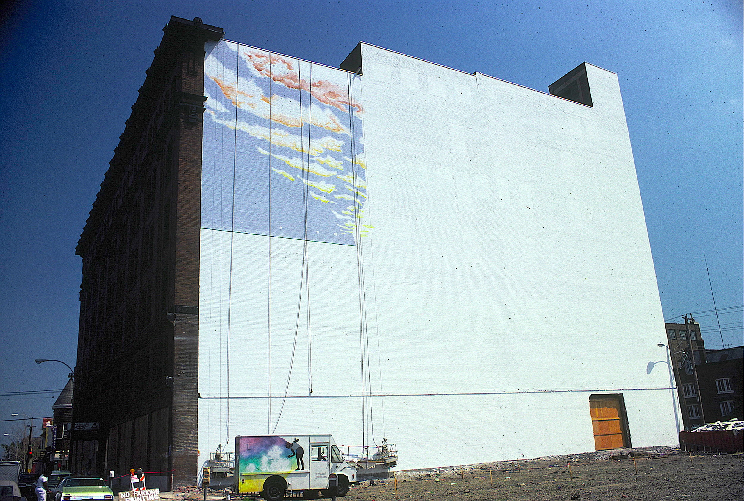
Acrylic on Brick and cement, 100’ x 100’, completed with Libby Reuter from Tah Dahs, Unltd.
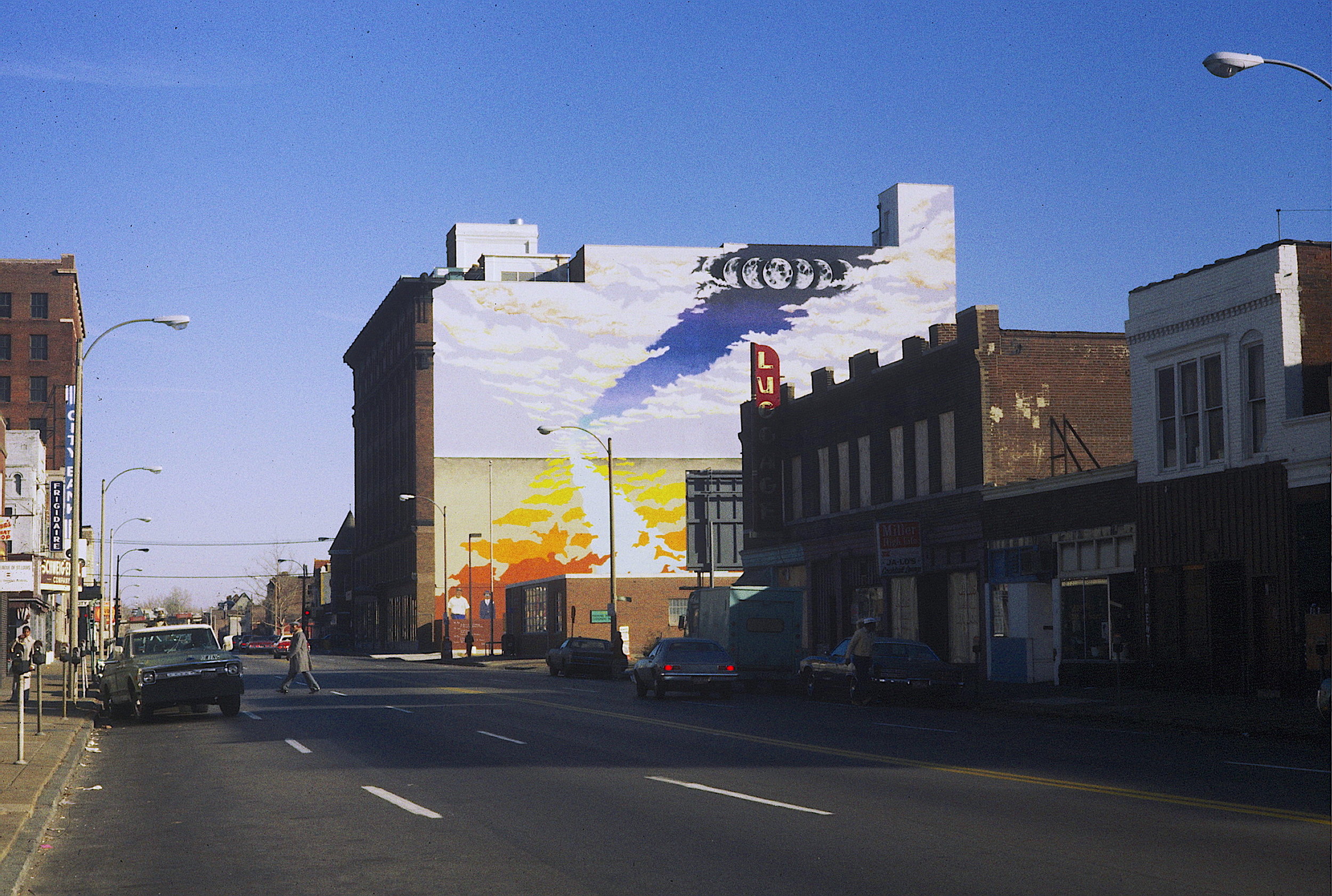
Working with the Union Sarah Economic Development Corporation, they wanted a landmark that would speak to both the day and night life of this centrally located part of St. Louis, as well as its integrated makeup. Because of the massive size we picked large, recognizable elements for the upper portions, and then included 10’ to 15’ tall portraits of actual people who either lived or worked in the area.
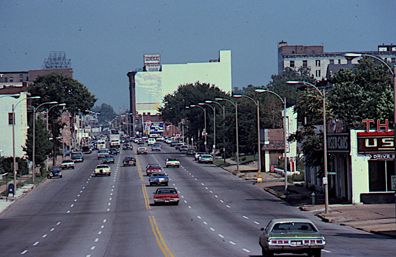
Acrylic on brick and cement, 100’ x 100’, completed with Libby Reuter from Tah Dahs, Unltd.
This huge wall had tremendous visibility and added to the landmark status they hoped the mural would achieve.
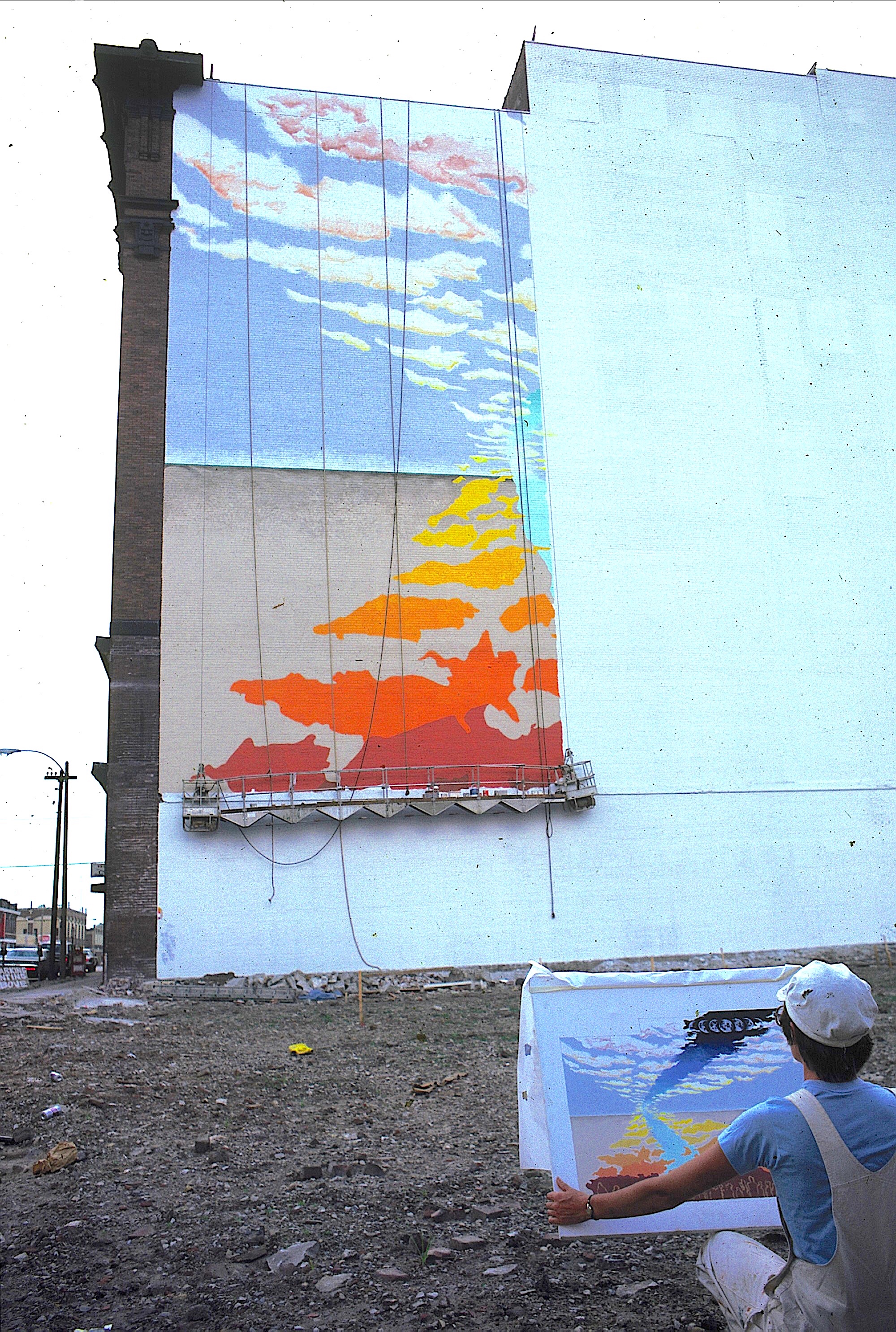
Acrylic on Brick and cement, 100’ x 100’, completed with Libby Reuter from Tah Dahs, Unltd.
We always work from a full color scale rendering of our design. Here, Libby Reuter is checking our progress against the canvas we painted.
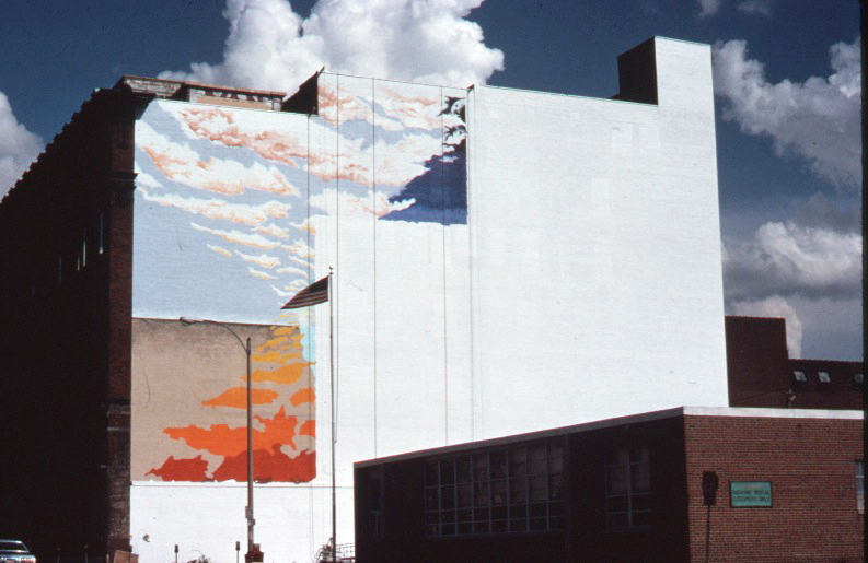
Acrylic on brick and cement, 100’ x 100’, completed with Libby Reuter from Tah Dahs, Unltd.
While we often do out best to have the mural blend into the environment, rarely do the sky and clouds cooperate this much!

Acrylic on brick and cement, 100’ x 100’, completed with Libby Reuter from Tah Dahs, Unltd.
Libby Reuter painting one of the oversized people at the bottom of the mural…its actually her son Tobias…shhhhh!
Acrylic on brick and cement, 100’ x 100’, completed with Libby Reuter from Tah Dahs, Unltd.
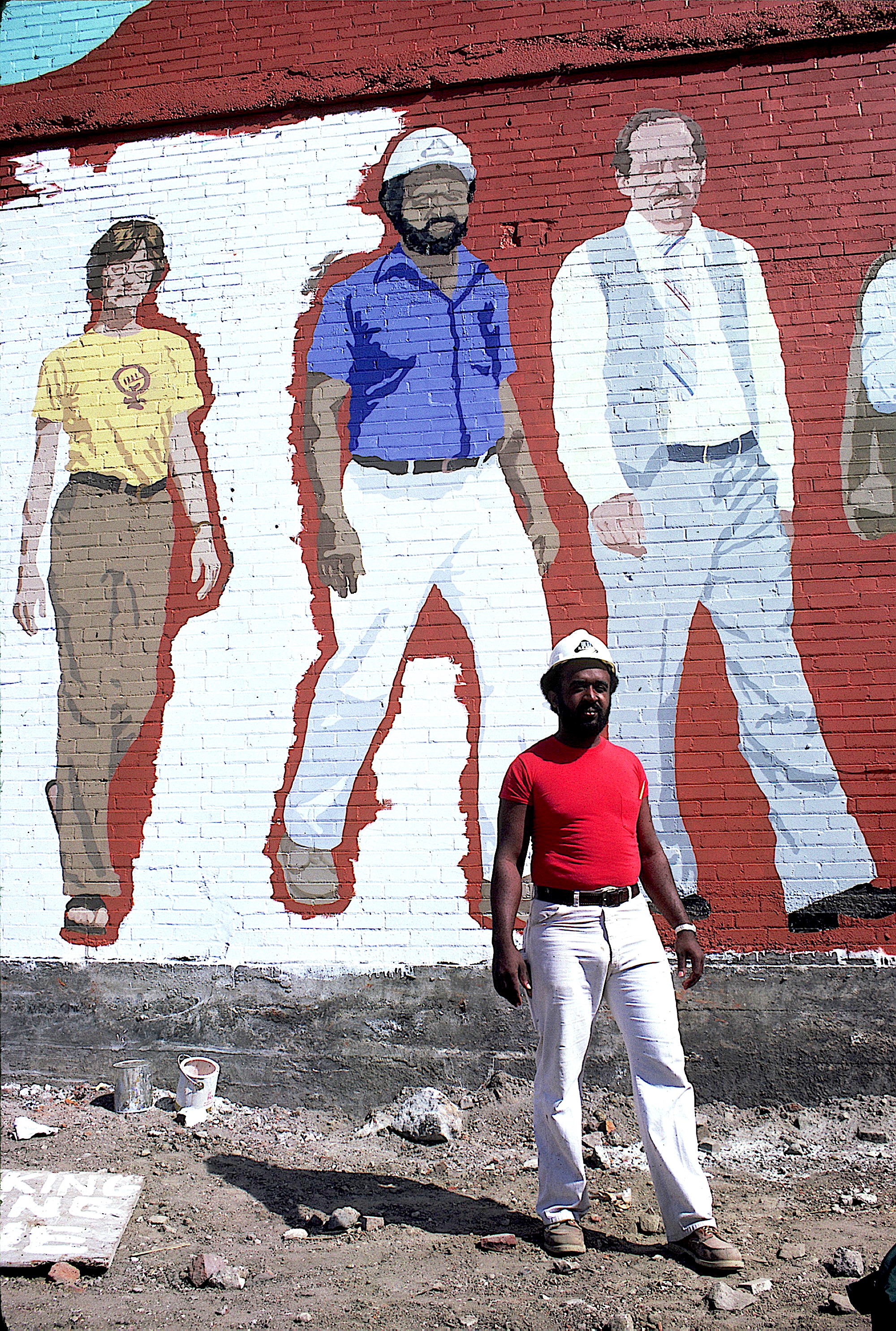
Several of the construction workers on the renovation of the building were included in the mural. The woman in the yellow t shirt is Kris Kleindienst, co-owner of the very well known Left Bank Books, just down the street.

Acrylic on brick and cement, 100’ x 100’, completed with Libby Reuter from Tah Dahs, Unltd.
Acrylic on brick and cement, 100’ x 100’, completed with Libby Reuter from Tah Dahs, Unltd.


Acrylic on brick and cement, 30’ x 40’.
1200 squares painted in 72 shades of gray, seen as an abstract matrix close up, it resolved into a continuous-tone photograph from far away.
Located in the heart of downtown St. Louis, this became a much visited and much loved landmark for the short time it was up. A new version will be put on display at the Missouri History Society Museum in 2023/2024.
Acrylic on stucco, 125’ x 45’
Located in the heart of downtown St. Louis
The artists, Robert Fishbone and Sarah Linquist, just out of Antioch College
Volks and Vans Auto Repair
Building before mural
Acrylic on brick, 65’ x 20’
People asked if we painted muriels (murals), so we painted our second and named it Muriel. You would drive your ‘Bug’ into the frog’s mouth to get it repaired.
Commuters would pass these three walls as they drove to downtown St. Louis in the morning.
Acrylic on brick, total of 60’ x 28’ on three stair-stepping buildings. From far away you only saw the left most building. As you approached the walls they would spread out to line up at one moment. At some times of the year you could see the real sunrise as well as our painted sunrise. Some people described this as the mural with the Arch in it…
Acrylic on brick, total of 60’ x 28’ on three stair-stepping buildings. After the buildings lined up for a moment, they would separate into three distinct walls as you continued down the avenue. Like with Lindy Squared, we played with the viewers spacial relationship with the artwork.
Acrylic on brick, 45’ x 10’.
Painted as part of the 400th birthday celebration of El Paso, we worked with six artists from El Paso, Texas and six artists from Juarez, Mexico to design and paint the mural on this US Border Inspection Station. Tens of thousands of travelers watched us paint.
This building is located in the area of St. Louis where cars were repaired and sold in the earlier part of the 1900’s. Most of these cars were no longer made or sold in St. Louis when we did the mural so we show them in that great parking lot up in the sky!
The building owners appreciated our work and commissioned us to do a mural as a gift to the city. The entire wall needed to be repaired to do the painting.
Acrylic on stucco, 130’ x 15’-28’
This building is located in the area of St. Louis where cars were repaired and sold in the earlier part of the 1900’s. Most of these cars were no longer made or sold in St. Louis when we did the mural so we show them in that great parking lot up in the sky!
The building owners appreciated our work and commissioned us to do a mural as a gift to the city. The entire wall needed to be repaired to do the painting.
One of the amazing cars we actually were able to see that we included in the mural. They don’t make them like this anymore!
Acrylic on stucco, 85’ x 22’, commissioned by the building owner
We were amazed to see how many reflecting glass buildings were located throughout the downtown area of Dallas, so we decided to do a more personal reflection. This in-progress shot shows the mural reflected in Sarah’s sunglasses…what is reality?
One of our artists is seen here working from our design for the mural.
Acrylic on Stucco, 68’ x 22’, This painted reflection of the downtown area shows Sarah walking down the street with the building owner, as well as the new City Hall that was being constructed while we painted.
Acrylic on stucco, 100’ x 60’.
Faced with a 6,000 square foot wall and a limited budget, we chose to render as a solid color graphic, a wind swept tree, which leaves transform to become swooping birds. The long ribbons of color help to link it all together.
When faced with a giant wall, simple sometimes works best.
One Shot Bulletin Sign Painters Paint (never ever use oil paints for a mural!!!) 18’ x 30’
In our third year as mural painters, we received a grant from the NEA to do several murals along well traveled roads throughout St. Louis City. The St. Louis Beautification Commission, which we found out were already fans of our work, doubled the project, which mostly meant we would actually get paid for the five murals completed.
This mural shows the serenity that can come with aging, and pictures a man sitting on a cutaway hillside. The revealed layers, going from realistic to whimsical, are a metaphor for the depths that can be reached through meditation. On the other hand, some folks said we needed to put a fishing rod in his hands. Different practice, similar goals.
Acrylic on brick, six small murals on six separate walls. Part of an NEA grant.
We chose to recreate the feel of the area from a time when the still remaining, centrally located horse trough served a functional purpose. This painting depicts gasless Sunday. But people loved their new fangled cars so much, they would pull them around with their horses!
Acrylic on brick. Another one of the six small murals painted through an NEA grant.
Mural painters often have to deal with environmental factors like odd building shapes, traffic patterns, windows, chimneys, fences and utility poles, all of which can be seen as problematic.
Since our designs are always site specific, we often look for a solution in these problems, let them speak to us. The utility poles were the most prominent blocking feature of this site, and since there is a beautiful Victorian Park nearby they became…
Inspired by the Victorian, Tower Grove Park across the street, we transformed the utility poles into trees, and did a play on Seurat’s, “A Sunday Afternoon on the Island of La Grande Jatte”. However, where Seurat used very tiny dots of paint, our points were several inches across to match the scale of the mural. It became a landmark for this part of St. Louis.
Acrylic on drywall, 95’ x 5’
After commissioning us to do an outdoor mural on a nearby building (see ‘Que sera, Seurat’, just previous in this decade), Tower Grove Bank asked us to design and paint an interior mural for the bank depicting the history of the area. In this shot you can see that it is a time lime, which evolves through different painting styles to evoke the feeling of the era, from mid-1800’s through the future!
Acrylic on drywall, 95’ x 5’
The mural begins with cloud shapes, done in shades of gray, hazy like foggy memories. These form a tree from which actual historic homes emerge.
Acrylic on drywall, 95’ x 5’
The late 1800’s to early 1900’s focus on the exquisite Tower Grove Park, rendered in a pointillist painting style, popular in that time period. This is the same style we used to paint ‘Que sera, Seurat?’. The two ladies on the bench were long time customers of the bank.
Acrylic on drywall, 95’ x 5’
This section depicts the 1950’s - 1970’s when people began to seriously look at renovating some of the beautiful old homes. This one is transforming before our very eyes!
Acrylic on drywall, 95’ x 5’
From renovations, we look towards the future which, like the past, is not easy to conjur. To make this section we stood in the street with a very thin and flexible sheet of mylar plastic film, then took pictures of the wavy reflection which included these two kids on a bike. It’s dangerous work being a mural painter!
Even way back in 1975 there was an awareness of inner cities being food deserts, and there was a movement to create community gardens. This house was the project headquarters and shows that hard work (in black and white) can yield an explosion of colorful and healthy vegetables. We also did smaller, stenciled murals on walls adjacent to the 30 gardens that were created in vacant lots around the city.
Acrylic on brick, 24’ x 24’
The lead paint that was often used to paint walls and woodwork in older buildings is toxic, especially for young children, It’s sweet taste doesn't help. When a building is torn down, it often reveals the painted, interior walls from the connecting building. In this case, it has exposed a child holding a paint chip while a parent, a landlord, a nurse, a judge and a painter are swooping up the stairs to try and stop the child from eating the paint chip. They are the five groups that need to work together to solve this really scary problem.
The mural was completed on the Yeatman Community Health Clinic in north St. Louis, that provides lead paint testing of children. The mural makes it really easy to find the clinic.
In 1974, after just arriving in St. Louis, there was a huge snow storm. I took a picture of two very large, snow covered trees in the park across from our home, somehow knowing it would be used for some piece of art, someday.
When doing a mural there are two main factors, the content or theme, and the style. It is the latter that really makes for a unique art piece. Here we see those same two trees repeated, or echoed, three times, with color changes in each layer. It seems to change when seen in different seasons. Completed as part of an NEA grant.
Directly across the street from this mural site is the very historic, Soulard Farmers Market. Like most urban areas, the ethnic makeup has shifted over the decades, and in this case, two centuries. At the time we designed this mural, the original predominance of Germans and other Central Europeans had come to include African-Americans and Asians; Hispanics arrived after.
We chose to depict the past and the present makeup of the area and added some more surreal design elements to this brick wall: animated, painted brick;, 3-D planes with rainbow edges; and neon stars around the metal stars.
When scouting out the nearby neighborhood of a mural site, I never know what I’ll see. It was a very hot day and these kids were cooling off under the spray of an open fire hydrant. When I asked if I could take their picture they all got into posing and voguing for me. This became the basis of the mural (see next picture).
Acrylic on brick, 35’ x 15’
This has always been one of my favorite murals. Not only did it cover up a very old and decayed advertisement, it transformed the feel of the corner.
Just imagine what it would be like to see people just like yourselves, feeling their courage, pride and power, gracing a public mural. Paid for by the building owner, the building housed a corner church.
As part of our NEA grant, we asked the Creative Coalition, a group of African American artists, if they would like to learn how to design and paint large scale murals…”Yes!”
After several days of group designing one of the artists brought in his idea which was a perfect distillation of all of our discussions and sketches.
It was painted by about a dozen artists on a well known, community corporation headquarters.
The finished mural designed and painted with the Creative Coalition, a group of African-American artists.
As part of our NEA grant we asked the Mid American Indian Cultural Center if they would like murals on their building to help identify the location. We designed for both the front and side.
The larger, side facing mural features Wolf Robe, a well known Cheyenne chief. It also depicts the change in living faced by many Native Americans, from open spaces to urban areas.
The shading in the clouds shows scenes from daily life, including the Trail of Tears, one of the many forced relocations endured by Native Americans.
Acrylic on stucco, Whole building
We were brought to Baton Rouge to consult on their soon to be launched mural program. We gave presentations and discussed options. While there, they commissioned us on the spot to design and paint a mural on this building. We chose to do a metamorphosis, a popular theme for us. River reflections rise up from the water into a rainbow washed sky to transform into brown pelicans, the state bird, and fly away. Only later did we find out that this building used to be the Grand Old Pelican Furniture Store.
Acrylic on Brick and cement, 100’ x 100’, completed with Libby Reuter from Tah Dahs, Unltd.
Working with the Union Sarah Economic Development Corporation, they wanted a landmark that would speak to both the day and night life of this centrally located part of St. Louis, as well as its integrated makeup. Because of the massive size we picked large, recognizable elements for the upper portions, and then included 10’ to 15’ tall portraits of actual people who either lived or worked in the area.
Acrylic on brick and cement, 100’ x 100’, completed with Libby Reuter from Tah Dahs, Unltd.
This huge wall had tremendous visibility and added to the landmark status they hoped the mural would achieve.
Acrylic on Brick and cement, 100’ x 100’, completed with Libby Reuter from Tah Dahs, Unltd.
We always work from a full color scale rendering of our design. Here, Libby Reuter is checking our progress against the canvas we painted.
Acrylic on brick and cement, 100’ x 100’, completed with Libby Reuter from Tah Dahs, Unltd.
While we often do out best to have the mural blend into the environment, rarely do the sky and clouds cooperate this much!
Acrylic on brick and cement, 100’ x 100’, completed with Libby Reuter from Tah Dahs, Unltd.
Libby Reuter painting one of the oversized people at the bottom of the mural…its actually her son Tobias…shhhhh!
Acrylic on brick and cement, 100’ x 100’, completed with Libby Reuter from Tah Dahs, Unltd.
Several of the construction workers on the renovation of the building were included in the mural. The woman in the yellow t shirt is Kris Kleindienst, co-owner of the very well known Left Bank Books, just down the street.
Acrylic on brick and cement, 100’ x 100’, completed with Libby Reuter from Tah Dahs, Unltd.
Acrylic on brick and cement, 100’ x 100’, completed with Libby Reuter from Tah Dahs, Unltd.